


Exhibitions, conferences and festivals are ephemeral events, generally characterised and evaluated by their participant line-up and the quality of the catering. But an event is equally defined by its graphic identity – which serves some very real functions (are the bathroom signs clearly labelled?) – often turning the event into a brand. Given that the corporatisation of technology and the hyper-visual nature of contemporary culture were key issues at this year’s transmediale festival in Berlin – with its theme afterglow – the branding of this five-day event took on a particular resonance. uncube’s Elvia Wilk grabbed a chance to speak with two members of the event design team, Manuel Bürger and Timm Häneke, about how design can be corporate and critical at the same time.
“The digital revolution was a dinner party but its afterglow is not.” So reads the introduction to transmediale’s 2014, titled afterglow. Post-cyber-utopia, are we on a sugar-high, are we let down, or are we just exhausted? Or perhaps, as the artist Mierle Laderman Ukeles put it in 1969 after the 60s social liberation movement had slowed: “after the revolution, who’s going to pick up the garbage on Monday morning?”
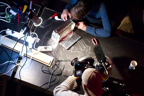
The roster of events this year at Haus der Kulturen der Welt was as manic as it always is during the art/technology/culture marathon, but rather than drown in the plethora of possibilities the artistic director, Kristoffer Gansing, choreographed a brilliant roster of the most interesting practitioners in the field of... well, people who are interested in this sort of thing. And he didn’t shy away from the political. The speaker list included the likes of Laura Poitras, Jacob Applebaum, Trevor Paglen, Benjamin Bratton, Methaven, Philip Ronnenberg and Bill Binney – and there were performances by Dinos Chapman, MSHR, Lucky Dragons, and Fatima Al-Qadiri – not to mention a 48-hour “Art Hack Day“ with 70 artists and hackers.
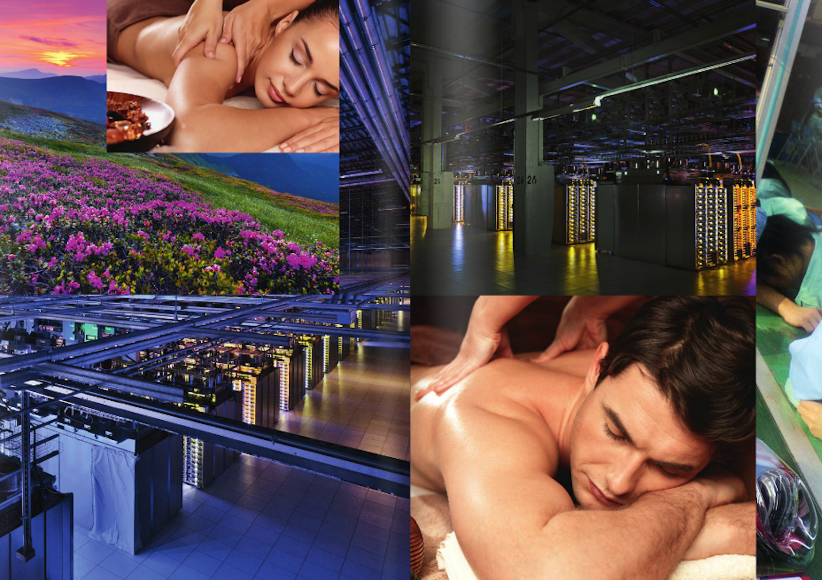
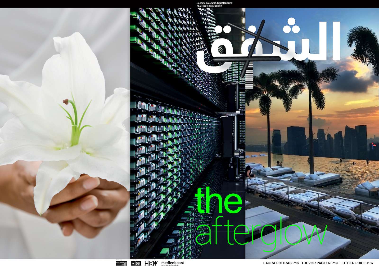
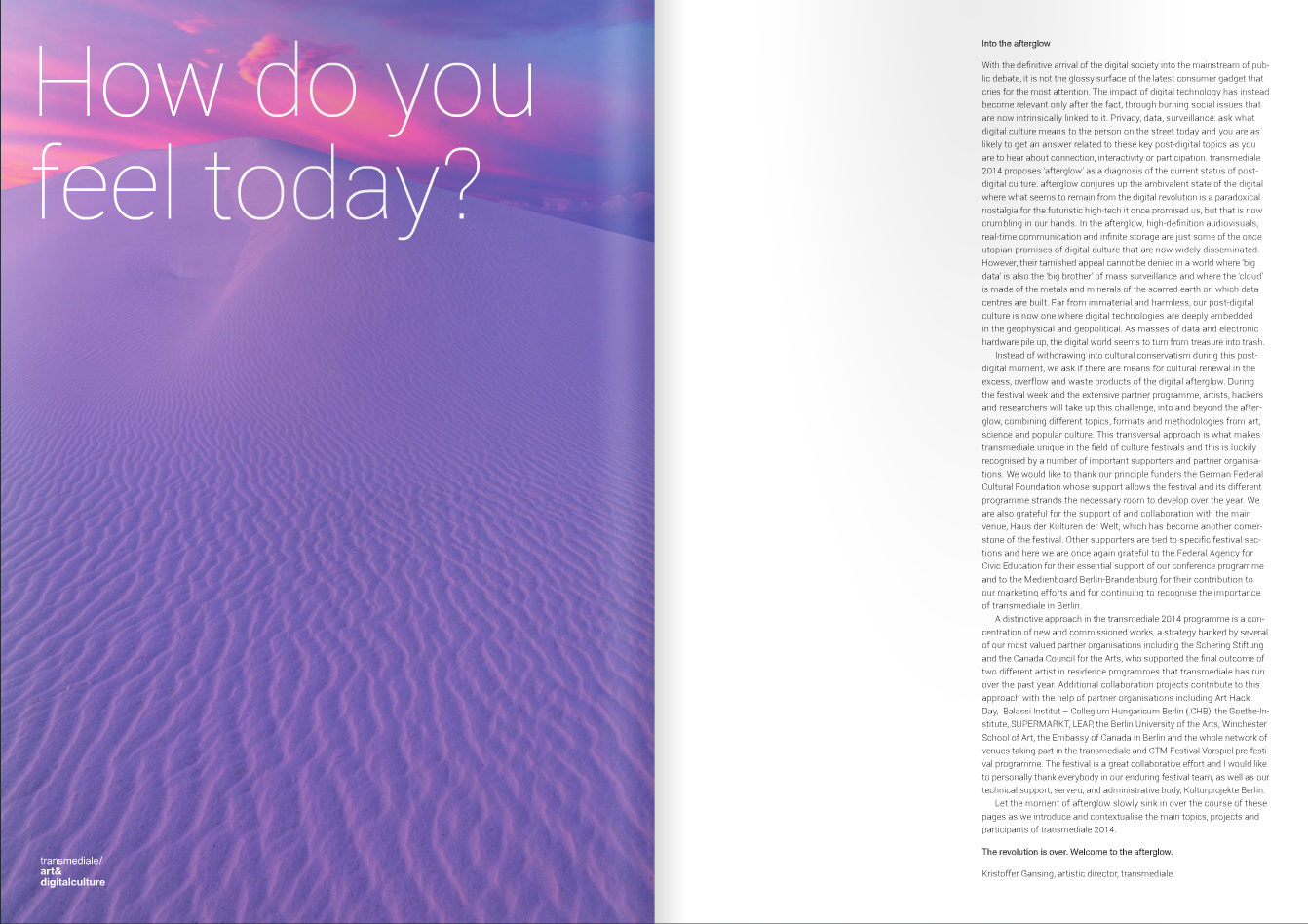
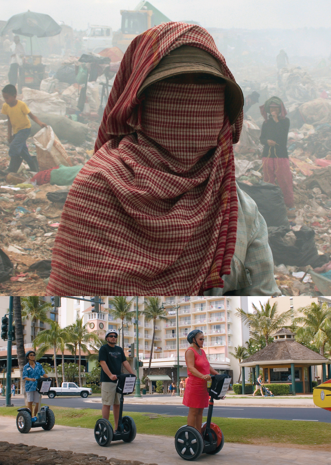
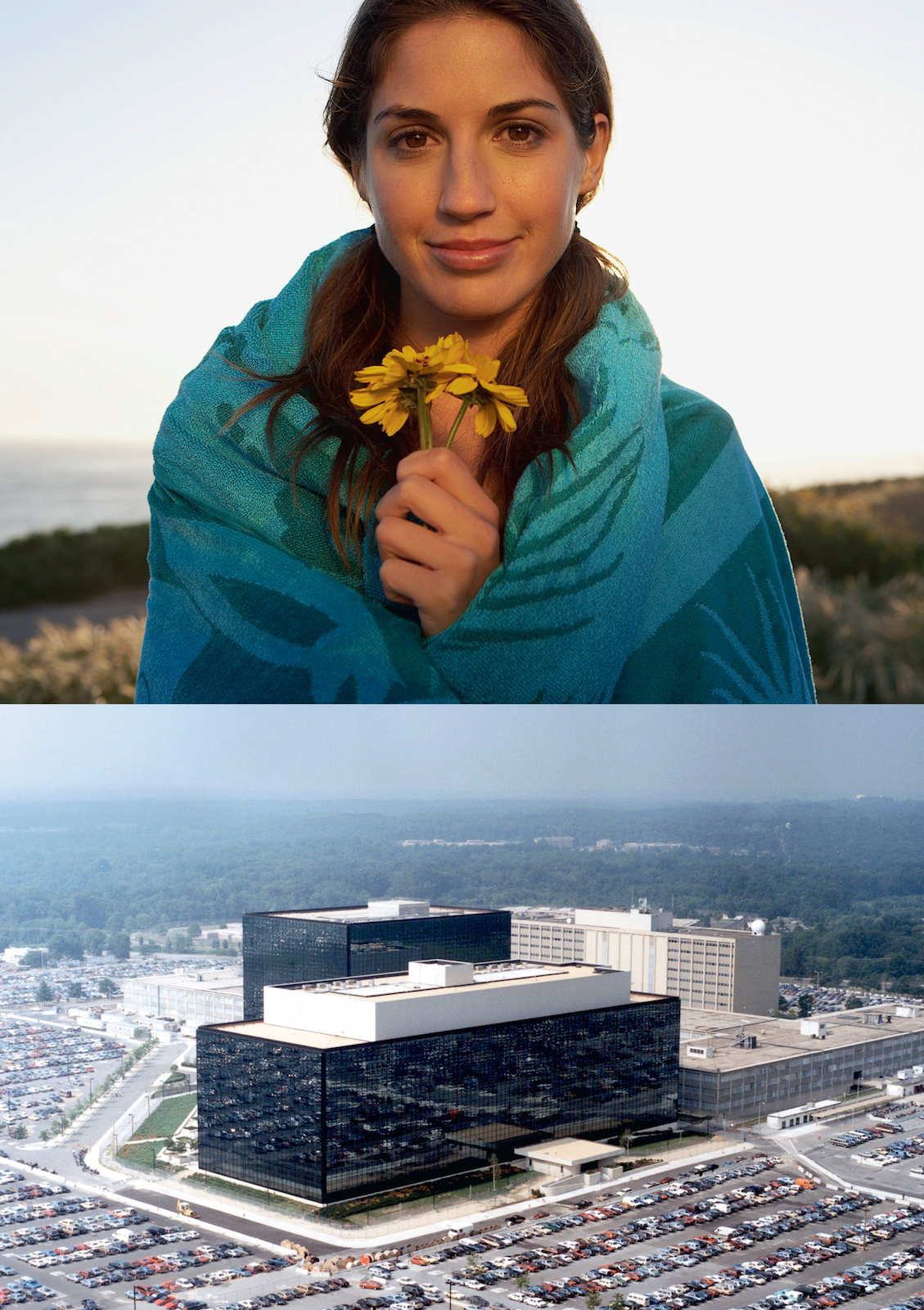
In providing a cohesive identity to match the high-frequency, politically-charged programme, the designers at The Laboratory of Manuel Bürger twisted highly familiar visual material into an uncanny space. All images were taken from user-generated platforms like Flickr or the stock photography catalogs Corbis and Shutterstock, and headline text was printed in Roboto, the google glasses (free) campaign font. The identity extended across the website, festival passes, and even a video trailer projected at the start of every presentation. The result is a consistent and recognizable brand – albeit one deeply ambivalent about the power of branding.
––
Your festival graphics clearly reference corporate aesthetics and advertising, through your use of stock photos/videos and a google-inspired font. How does a critical position emerge through your appropriation of these visual elements?
On the one hand, people are attracted by the visual world they know from advertising, finding it very easy to identify with the imagery. But on the other hand, or after a second glance, an uneasy feeling emerges below this slickness. It's not really sarcasm – maybe more like black humor. The idea wasn’t to judge branding and the branded environment but to create a moment in which observers realise their position in that environment and find a new vocabulary to discuss this complex situation. Of course we were assuming that the majority of transmediale visitors would be sensitive towards interpreting the aesthetics and able to deconstruct the references we put on the plate, like our allusion to the classic Microsoft campaign: “Where do you want to go today?”
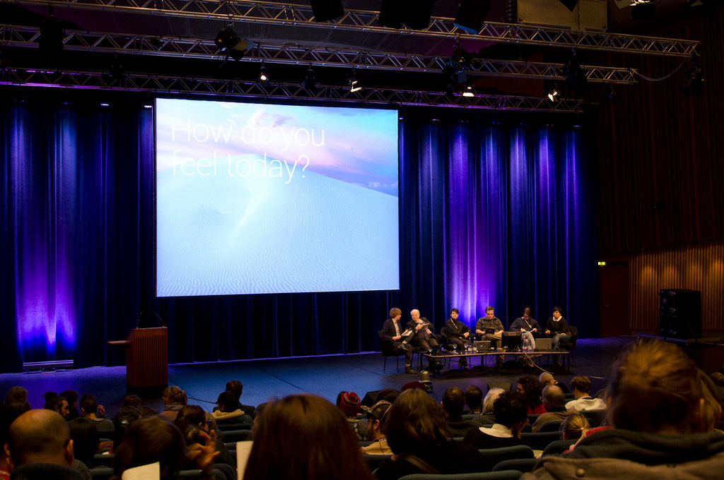
With our design we pose the modified question: “How do you feel today?” We were trying to generate a discourse that sets the human in between technological and anthrosophic dogmas, which have started to intermingle today. In a talk on Friday evening, Jacob Applebaum told transmediale's audience that he does yoga as compensation for the stress of his work as a hacker. We recognised that the hippie ideas of the early internet have been turned inside out.
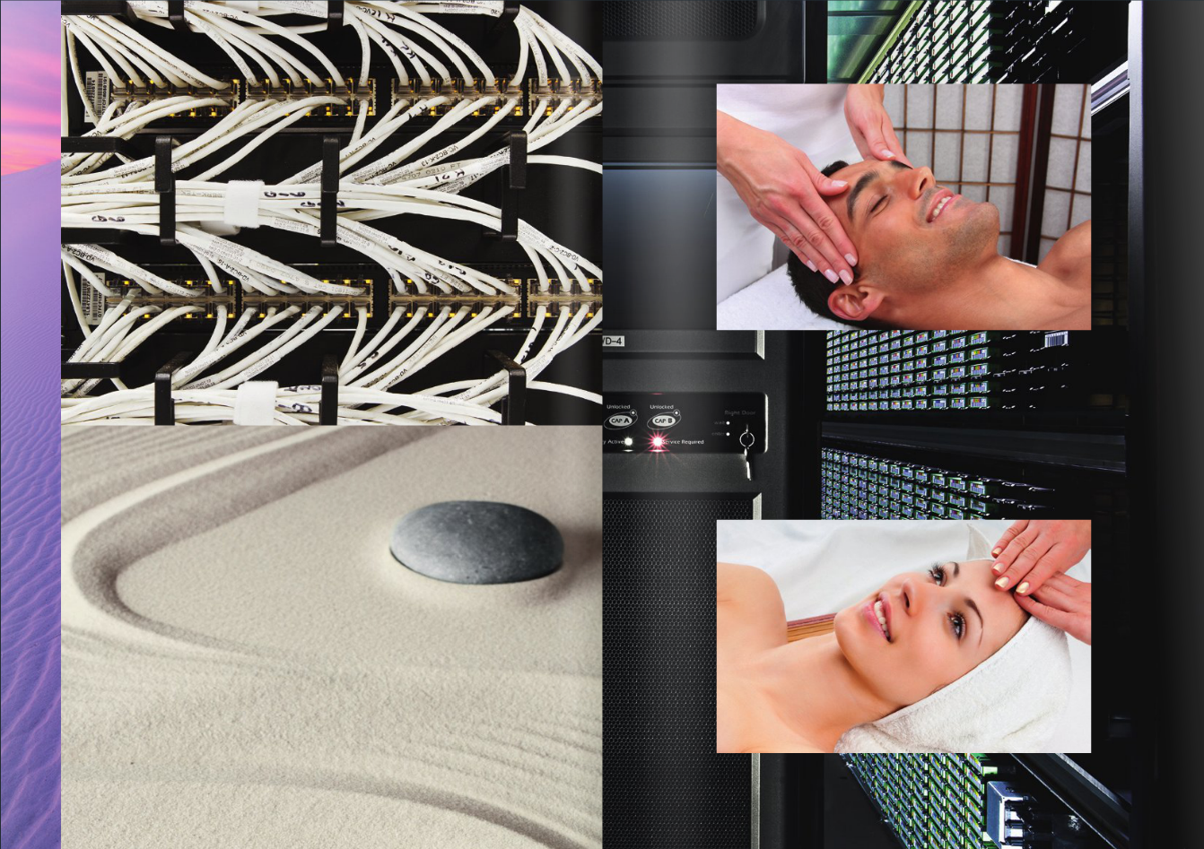
In the contemporary post-digital condition we are starting to reflect on our relationship to daily habits of (digital) culture and their consequences. Our design approach was to articulate these thoughts and push the dichotomies – big data center vs. the spa; technology vs. the body – to even greater extremes, thereby generating tensions and inciting a need for reflection
You also worked on the transmediale identity in 2012. How did you approach this year’s theme differently, especially with its implication of a “pre-” and a “post-” era?
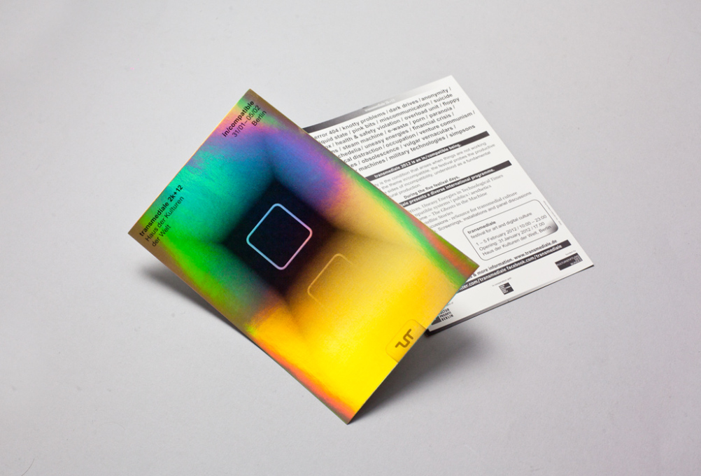
Our design for transmediale's 2012 theme in/compatible questioned the relationship of the striving human user as fundamentally in/compatible with digital culture. The ideas of a digital utopia and dystopia were very prominent within that framework and the design. We created posters which were printed on shiny golden paper and made catalogues that imitated Indian advertisements with an obviously trashy feel. The website was just as visually in/compatible.
Whereas the 2012 aesthetic was one of a 1.0 website trying to shape up, the afterglow design feels like a comfortable template provided by a slick web company. So yes, this “pre” / “post” feeling – also regarding to the question of trash – combines the topics of both transmediale editions. The most interesting part is that the last two years have seen many huge events: the NSA story, Anonymous, the endless rise of start ups and apps, and also the increasing influence of the internet in our lives. And of course, speaking as designers, dominant aesthetics have totally changed as well. On a website two years ago, you hardly found full-screen images! The “post” feeling of today is corporate, catchy, big, and speaks the language of perfection; but it also offers a space for self-reflection and criticism, for those who try to see.
– Elvia Wilk