-
Every Image is a
ConstructionKersten Geers on ambiguity in images and architecture – and avoiding photorealism
Text by Florian Heilmeyer
-
Founded in 2002, the Belgian architecture office of Kersten Geers and David van Severen, simply called “OFFICE,” has produced architecture that manages to be precise and ambiguous at the same time, modern and full of references to the past – and the images they produce reflect this: they steer clear of any kind of photorealism, doing good old collages instead.
We met Kersten Geers where he works in the heart of Brussels, in a rather ugly little 1970s office building offering a panorama view of the roofs in the old city centre.
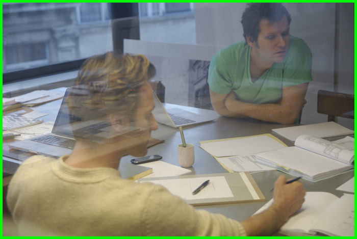
David Van Severen (left) and Kersten Geers (right) at OFFICE in Brussels. (Photo: OFFICE)
-
Today, architecture seems to be forced to produce visuals that are as realistic as possible. Kersten, it seems that OFFICE has always refused to produce any imagery like that. Your images are collages with bright colours, very accessible and clear. Yet there is always a play with perspective, with the construction of the image, which makes them spatially slightly confusing, creating an uncertainty in the image: something distorted and disturbing. How did you develop this visual language?
We didn’t develop it. It emerged from our interests and influences – from the things that we like. What interests us is a complex approach to realities. We are interested in a lot of things: the art of John Baldessari, David Hockney, Ed Ruscha; in Aldo Rossi, James Stirling, Reyner Banham.
We are also interested in O.M. Ungers – well, at least in a few things by Ungers! More in his way of thinking: as an architect he was often rather disappointing. Sometimes it is only a very definite period of an artist’s or architect’s work that we find interesting. The young Koolhaas was a genius. The short period when Koolhaas and Kollhoff were working in the office of Ungers must have been an absolutely fantastic time! The sad thing is that Koolhaas’ epigones are not in the least exciting. They lack his radical quality and complexity, they’re only interested in the pictures.
We are interested in early modern Viennese architecture, before it became labeled as such. When, for a short time, people were finding simplified shapes that could produce huge spatial complexity. We’re also interested
»The young Koolhaas was a genius. The short period when Koolhaas and Kollhoff were working in the office of Ungers must have been an absolutely fantastic time!«
-
Interior of a summerhouse extension, Ghent, Belgium, 2004-2007.
(Photo: Bas Princen) -
Collage study for Jacob and Wilhelm Grimm University Library International Competition with Dan Budik, Berlin, Germany, 2004.
(Image: OFFICE)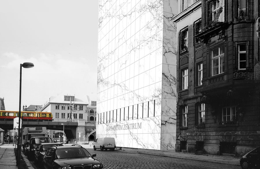
in the Italian Renaissance, in fact, I think it is absurd to be interested in architecture without being interested in the Renaissance. To me, Donatello Bramante was probably the best architect of the past 600 years!
Yet you are certainly neither retro nor nostalgic in your work.
No, we are not. We don’t celebrate what’s been and gone. We use it. Some of the things we like lead to the past, some to the present … and some lead to Los Angeles. For example, Hockney and Banham, both being European, observed the city closely with the eye of a foreigner, studying it in minute detail. It is fascinating the way that Hockney plays with perspectives, which always look rather clumsy and non-spatial, yet produces pictures that are very spatial in a contradictory way, remaining two-dimensional. -
They also have strong references to the early perspectives of the Italian Renaissance, which you mentioned…
Yes. There are quite a few similarities, but the longer you look, there are similarities everywhere. Los Angeles, Europe, Brussels, where we work – they are all melting pots. Maybe we are attracted by this?And naming references is of course always difficult. It seems naïve to mention a big name like Hockney: when we talk to artist friends, of course they raise their eyebrows. But some pictures of his were really, really seminal for David and me. “A Bigger Splash” for example: the water, the wall, the pool, the house, the two palm trees, the fact that there’s nobody there. In some strange way this picture has been very important to us and how we look at images.
Project for Architecture Biennial of Rotterdam, Special Mention Award
Ceuta, Morocco/Spain 2007 (Photo: Bas Princen)
Project for Architecture Biennial of Rotterdam, Special Mention Award
Ceuta, Morocco/Spain 2007.
(Photo above: Bas Princen, Image right: OFFICE)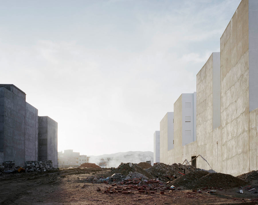
-
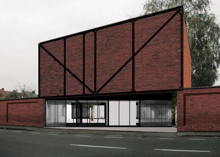
Computer Shop, Tielt, Belgium, 2008-10
(Photo: Bas Princen)
»We don’t celebrate what’s been and gone. We use it. Some of the things we like lead to the past, some to the present … and some lead to Los Angeles.«
-
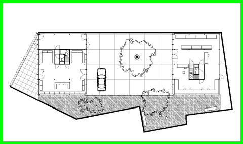
Computer Shop, Tielt, Belgium, 2008-10.
Two identical buildings mirror each other across a courtyard -- one containing the public face of shop and reception area, and the other the logistics and office spaces.(Photo left: Bas Princen, Plan below: OFFICE)
-
After the Party. The exterior / courtyard of the Belgium Pavilion for the Venice Biennale of Architecture 2008. (Photo: Bas Princen)
-
When I was in LA, I discovered a few copies of Banham’s “Architecture Of Four Ecologies” with its original cover picture: “A Bigger Splash.” It’s been reprinted many times but unfortunately they haven’t used the Hockney image. I guess it got too expensive.
But it is perfect! It represents the entire content of the book: Hockney and Banham were both Europeans who fell in love with LA. The hedonism, the seriousness, the climate, the light... it's all in this picture. So when I found these copies I immediately bought two – one for me, one for David – because I knew that he would feel the same way.
So you are saying that it was pictures like this that were lingering in your head when David and you started OFFICE back in 2002?
Yes. On top of that, David and I are quite simply unable to produce renderings, let alone something photorealistic. We have never been interested in computers in that way. When we started working together, we had to look for other ways of expressing ourselves. We were also from the beginning working very closely with Bas Princen...
...the Dutch photographer...
He’s a close friend. We share a lot of interests and we’ve always spoken together about architecture, art, building and photography. I think we learned a lot from each other just by looking at pictures and talking about them. It’s a very natural thing if you like the same stuff. We share a lot of aesthetic references, so we somehow also share the same language.
When you were invited by Kazuyo Sejima in 2010 to be part of her main Venice Architecture Biennale exhibition, you worked in an old garden shed, hidden in a small garden at the back of the Arsenale. In its seven very small rooms you showed a few of your collages and of Bas’ pictures, mixing images of fictitious spaces with ones of real spaces. Was this your intention?
You know what? Working on that exhibition was a very important moment for OFFICE because we’d never realized before just how closely we really work with Bas. But when we were putting together our own images and combining them with Bas’, we were surprised how easy it was. It was done very quickly. Suddenly we realized his pictures have had a huge impact on our work over the last years – and vice versa. As I said: we’ve discussed all our projects with him for years now and he’s taken the pictures of all our built work: he’s like a third partner.
-
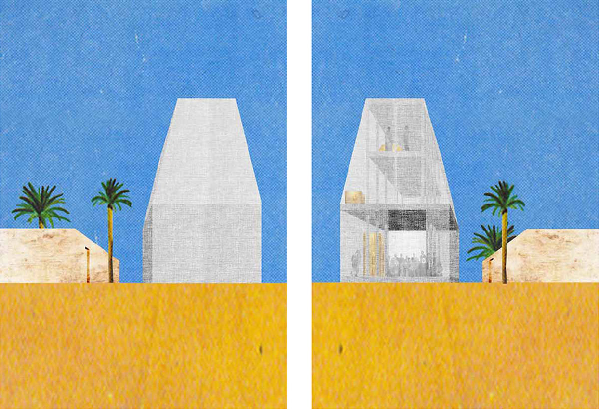
Villa in Ordos. A collage study of the design for a 1000-square meter residence in the Mongolian desert, part of the Ordos 100 project, selected by Herzog & De Meuron, curated by Ai Weiwei, Inner-Mongolia, China, 2008. (Image: OFFICE)
-
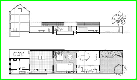
The Weekend House in Merchtem, Belgium (2008-12), echoes David Hockney’s “A Bigger Splash.” An existing small terrace house and its long back-garden were transformed into an enfilade of different spaces -- from guest house to courtyard, to poolhouse and living room, that can all be enclosed as a single house with a sliding glass roof.
(Photo: Bas Princen, Plan and section top right: OFFICE)
-
We liked the notion that by combining collages and photographs, reality and fiction get jumbled up together. And then we hit on the idea of Bas taking a photo of the building, and then making a collage out of it and exhibiting it. We put it in a room together with another picture of Bas’ that he took in 2008 of the Belgian pavilion we did back then. It was the only room with two “real” pictures and no collage at all. People were standing in front of this picture, a little confused and unsure, asking us: is this a collage or a real photo? We knew that it would confuse visitors – and we are very fond of bizarre moments like that. Every image is a construction. It was a nice additional aspect to our exhibition helping making that small project more and more complex – which is exactly what we like.
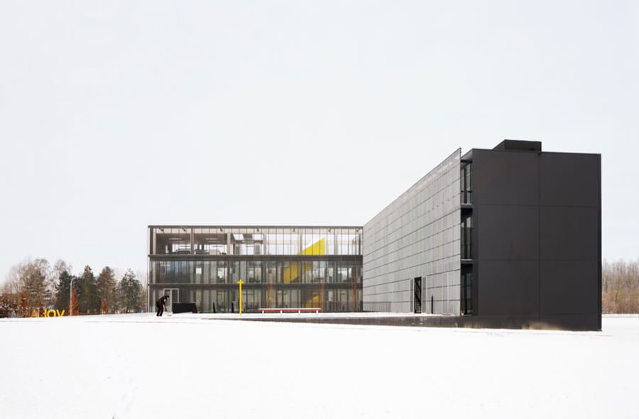
An office building for VOKA, West-Flanders Chamber of Commerce. In collaboration with Bureau Goddeeris Architectenvennootschap and Bureau Bas Smets.
(Photo: Bas Princen)»David and I are quite simply unable to produce renderings, let alone something photorealistic.«
-
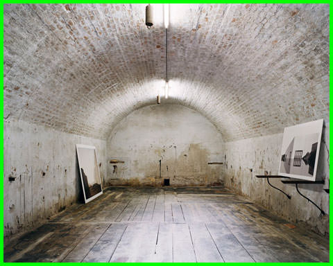
OFFICE + Bas Princen's Garden Pavilion, Venice, 2010
This installation won the Silver Lion Award at the 12th International Architecture BiennaleLeft: Exterior, Above: Interior of Room 1. (Photos: Bas Princen)
-
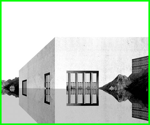
Dar al Riffa, Bahrain.
Collages showing a Hockney-esque use of perspective in studies for an urban renewal project in Bahrain. (Images: OFFICE) -
It seems it’s exactly these references that make your images – like your architecture – appear so precise and radically reduced on the one hand yet so rich and ambiguous on the other?
In a way, all our projects are like members of a family: they can be very different like brothers and sisters can be very different, but they’re all related to one another. It often surprises us: we start a new project, try out a few things and are suddenly wild about some completely bizarre aspect – only to find at the end of the day it resembles an older project in some strange way. Not because that was what we intended, but because it came about through the subjects we’re interested in and because the logic of the project demanded it.
That’s the kind of thing that happens to us. I think it’s a good thing. The fact that we are interested in certain topics gives rise to recurring series in our work that have the same roots. But we don’t repeat ourselves – we’d soon be bored.
We are not interested in precision per se, in perfection. The idea of designing a perfect building would be absurd. Perfection is doomed to failure. Otherwise, an entire perfect universe would have to be created. And this would probably be uninteresting.
Do you feel that in your pictures and collages you can be far more radical than in the projects you realize?
No, because I think that we are very good at translating our concepts into reality. We come to terms with the conditions and still remain true to our ideas, even in the details. Of course, the feelings triggered by a real building are completely different from those a collage or picture evoke. It’s a different medium. But the original intention remains the same.

»The idea of designing a perfect building would be absurd. Perfection is doomed to failure.«
-
Search
-
FIND PRODUCTS
PRODUCT GROUP
- Building Materials
- Building Panels
- Building technology
- Façade
- Fittings
- Heating, Cooling, Ventilation
- Interior
- Roof
- Sanitary facilities
MANUFACTURER
- 3A Composites
- Alape
- Armstrong
- Caparol
- Eternit
- FSB
- Gira
- Hagemeister
- JUNG
- Kaldewei
- Lamberts
- Leicht
- Solarlux
- Steininger Designers
- Stiebel Eltron
- Velux
- Warema
- Wilkhahn
FEATURED

-
Follow Us
Tumblr
New and existing Tumblr users can connect with uncube and share our visual diary.
»I hate vacations. If you can build buildings, why sit on the beach?«
Philip Johnson
Keyboard Shortcuts
- Skip Articles
- Turn Pages
- Contents