


Given the theme of our current issue no. 29: After Dark, we look beyond the glare at the recent work of photographer Merijn Koelink, which questions how and why architecture and public space is lit at night and the effect this has on our perception of place. uncube's Fiona Shipwright spoke to Koelink about his Most Efficient project‚ and the changing colours of the illuminated night.
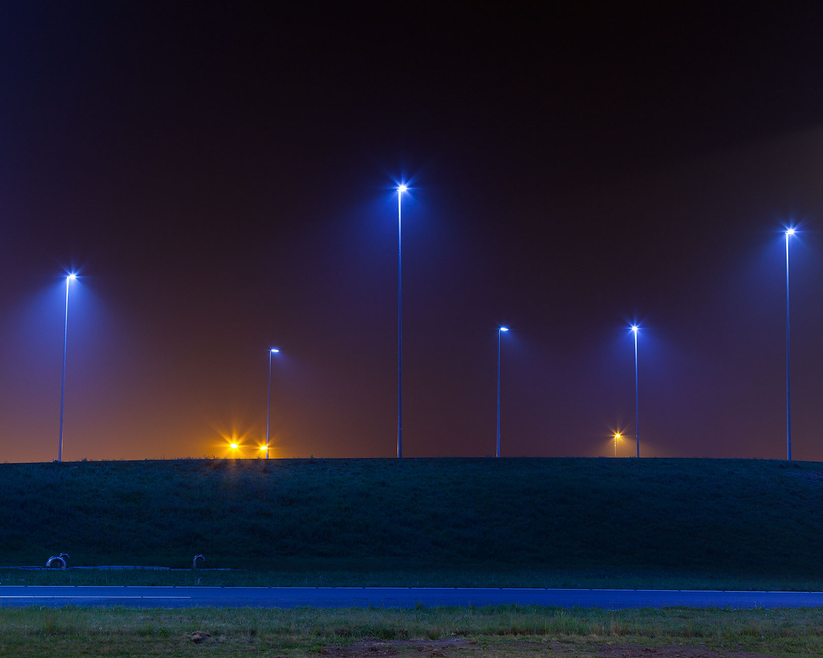
You’ve said that the Most Efficient project takes as its starting point the fact that “the night always used to be orange”, owing to the ubiquitous sodium street lights found in most Western cities. In considering the spectrum of colours now available with LED technology, has orange light now become so “ordinary” as to be unnoticeable?
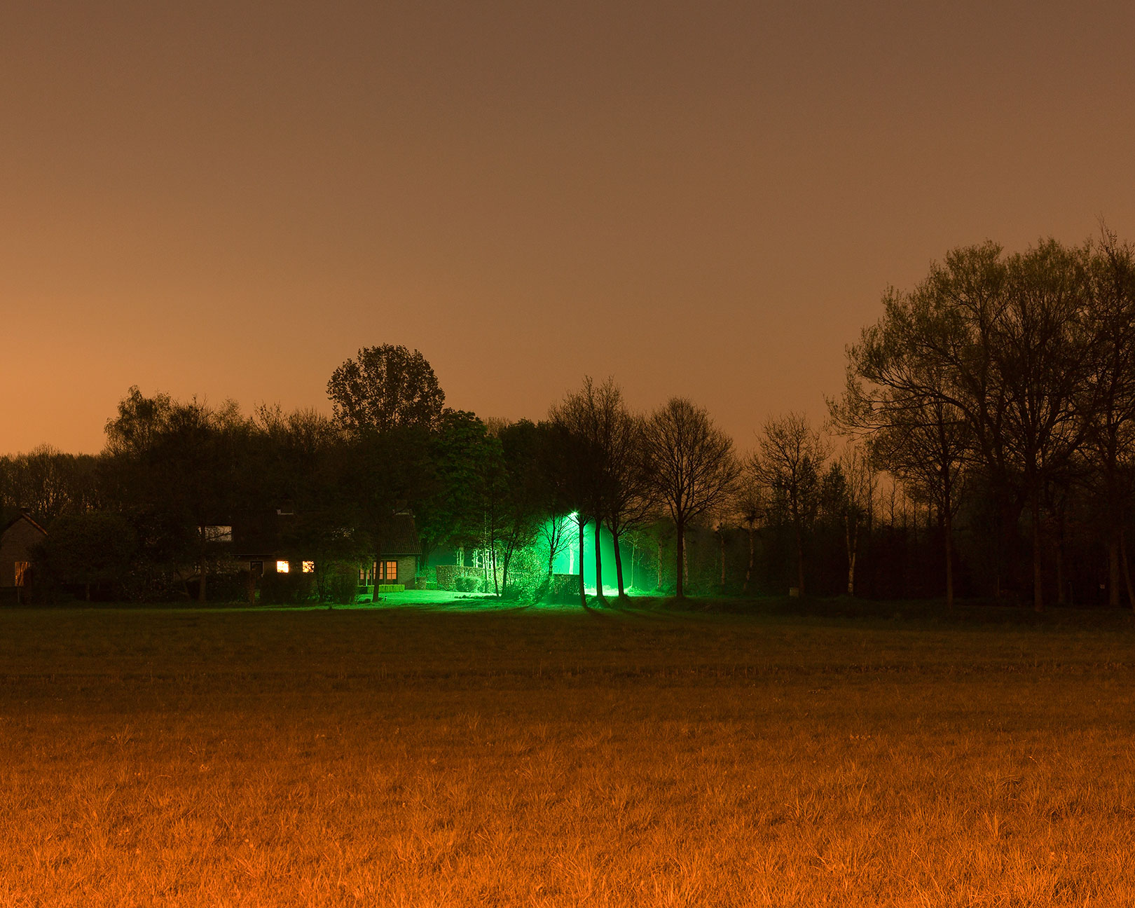
Orange light, or sodium lights have been used since the 80s following the oil crisis. For me this is the starting point; I was born in ′88 so I didn’t know anything else. But apart from that‚ I do think certain colours trigger certain emotions. The difference with coloured light is that it casts its colour onto objects within a space, and in doing so alters our perception of that space.
You’re often asked if you’ve manipulated the colours in your photographs to make them more vivid or intense - which I know you haven’t! – but was it this extreme quality of the light that first attracted you to the subject? What were your influences or reference points at the start?
The project started back in April 2010. I grew up in a residential neighbourhood in a small town called Boxtel in the south of The Netherlands. Before I went to art school I lived at my parent’s house and most of the time‚ just before bedtime, I would walk the dog. At night everything was orange because of the sodium streetlights. When there was snowfall‚ the snow would appear orange as well.
After I left‚ I would travel home from The Hague at weekends to see my family and friends. Then in early spring 2010‚ I came home and some streetlights had been changed to a cold white tone. Only a few had appeared, placed in strategic places – there was still a lot of orange glow. But a week later when I came back‚ the whole neighbourhood had changed colour from a warm orange to a cold white. I was pretty shocked to see the difference. The memories I had as a child playing outside and walking the dog became nostalgic against the tones of white. Everything was picked out clearly‚ as if lit by spotlights every 50 metres; it felt really controlled and cold. Later I saw the same thing happening in other neighbourhoods and noticed a trend. That was the moment I decided to start researching this sudden change.
With these new types of lights coming to be used more widely in public spaces, you’ve suggested that their usage should become in some sense political. How do you envisage this evolving? For good or bad? Are residents of cities too far removed from the decisions on how their cities are lit?
Well luckily there’s a change going on within governmental decision-making. In the case of my neighbourhood‚ there was no questionnaire or anything; the lights were just changed. In some places the local authorities now pilot different kinds of lights and colours, asking the community what they think and so giving it’s inhabitants the feeling they have a choice. It’s always good when local government tries to get feedback from people. But I’ve seen these questionnaires and it’s remarkable how they barely allow for answers that may not favour the government’s approach. If you keep using positive words such as “efficient” and “durable”‚ you give people the idea this is the way forward. The LEDs are low-powered lights‚ so their energy usage is much lower. If you ask either left or right-wing voters‚ most will say that durability is good. So labelling something “durable” immediately justifies any decision – it’s effectively freed from discussion.
But the problem is also that those working at the local government level making decisions on public lighting unfortunately have almost no knowledge of colour management‚ how light works within public space or how it affects the spatial perception of a place.
If orange is no longer to be the default hue of cities at night‚ is there a colour in particular which you see taking on the mantle? With us spending so much of our time now looking at blue light on phones‚ tablets etc‚ do you think is changing our relationship with this area of the colour spectrum?
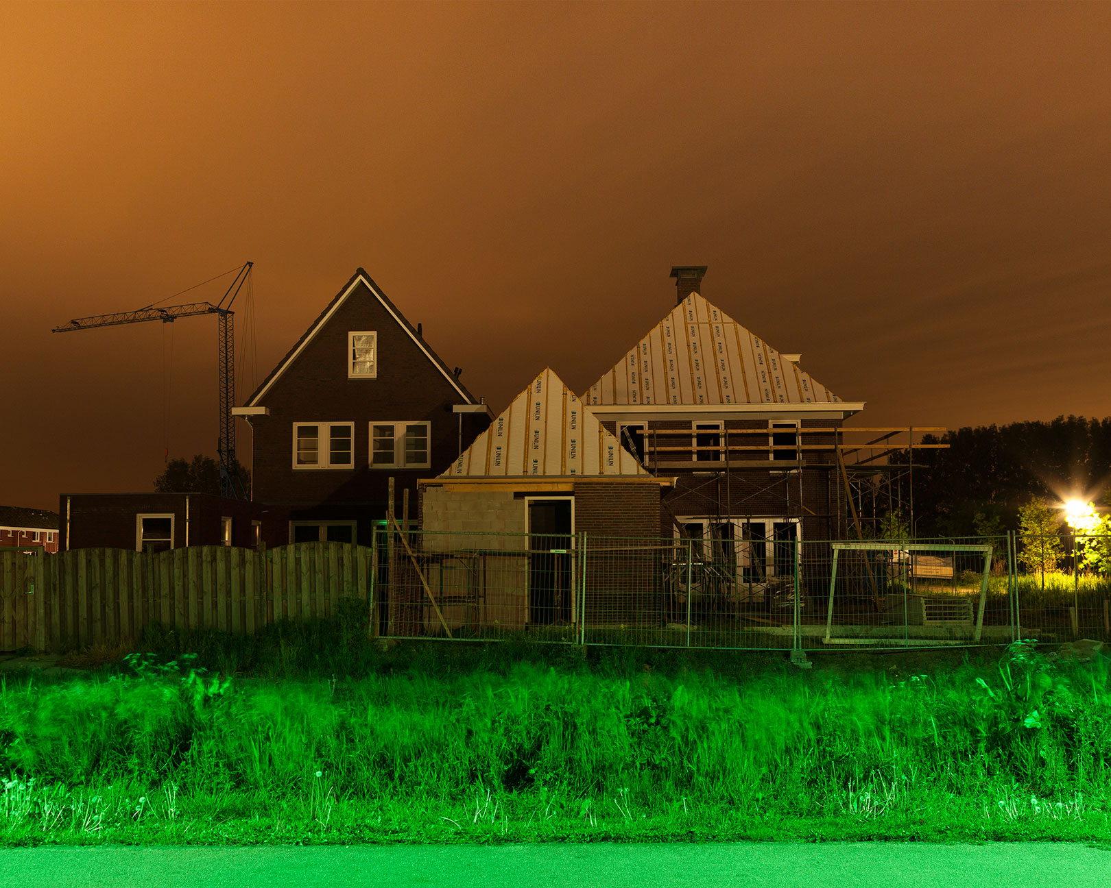
I like the connection you make. The trend that I predict is that we’ll see more white tones lighting urban streets. On the edges of cities and towns and the zones between you’ll see more greenish colours. The reason I like this connection you make between white streetlights and tablets is that they use the same technology - white LEDs. There are two problems with this. Firstly‚ white light is perceived as being harsher than warmer-coloured light. Secondly‚ when exposed to white light our brains think it’s still daytime. So the production of the hormone melatonin gets out of balance‚ resulting in sleep trouble. Much of the architecture here is from the 70s and 80s‚ so houses built with low ceiling heights. As a result‚ the lamps of streetlights are at roughly the same height as the first floor‚ where bedrooms tend to be located. I’ve heard stories of people now complaining about the white light in their bedrooms. But the actual output of the streetlights is the same as when they were orange‚ so the government didn’t see why there was a suddenly an issue. But‚ as said earlier, white light is perceived differently.
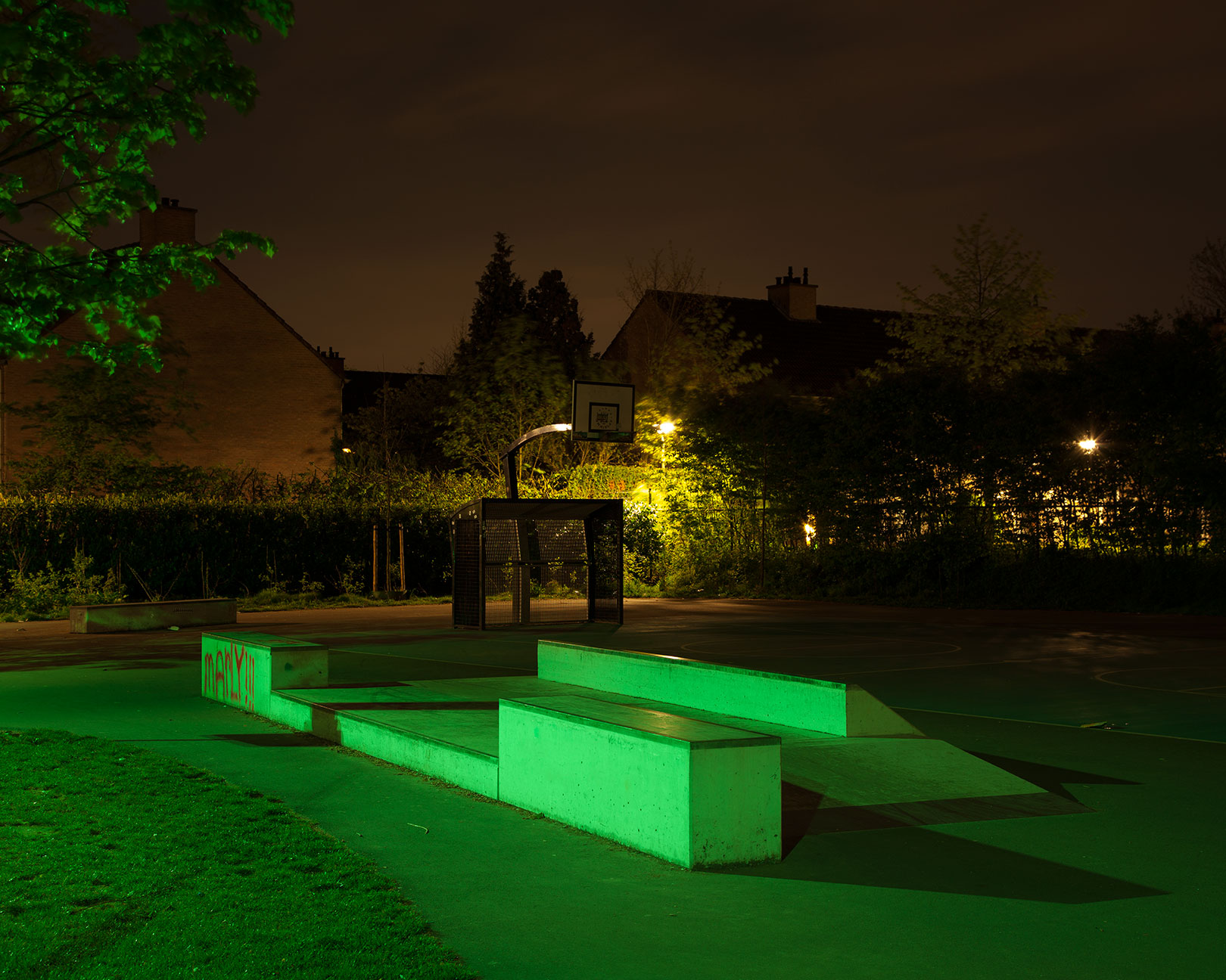
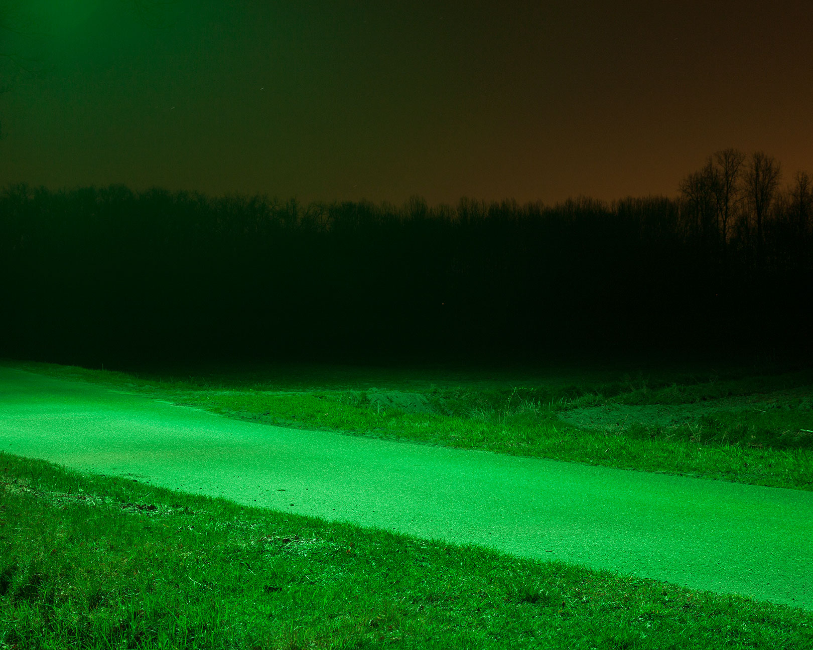
The colour of light also influences our behaviour and emotion. In the West we mostly use warm coloured lights in our interiors. It creates an atmosphere that’s perceived as safe and some might say “cosy”. Restaurants use light in the same way. The same rules apply with public space. The lighting companies justify the use of a colour. For example‚ with green you’re supposed to see more. The receptors in our eyes are‚ at night, more sensitive to the green spectrum – called mesopic vision. So it’s said that with less power you’ll see more! But they seem to forget that it takes up to 15 minutes to actually adjust to this mesopic vision and we are mostly just passing through public spaces at night. With the vivid blue it’s just a matter of watts and output. More blue means less power with the same amount of light output. Cyan coloured light produces what’s called scotopic vision which is again similar to mesopic. And then of course you can argue whether or not you want your house to look green or cyanic at night!
How much say do you think the architects versus the occupants should have in lighting their buildings? Is this relationship imbalanced?
Well it would be an interesting experiment if the lighting of the inside and outside of buildings adopted the same kind of the atmosphere. I wrote my thesis on the use of colour in architecture and public space and in my opinion architects tend to care more about aesthetics than how to fully use colour. In my research I found that the generation of architects currently in training aren’t being taught how colour really works. It doesn’t tend to go beyond how different colours reflect light and that white is spacious and black isn’t. Based on my research and observations, I think there’s an imbalance in how colour and light are treated inside and outside. These days you see many buildings being lit at night – sometimes in muted, sometimes in vivid‚ colours. This is happening more and more often but I don’t think that just generating more light in itself is such a great idea. Architects should be looking more at how you can play with light to create a safe‚ and more importantly‚ humane‚ atmosphere. It’s possible to do this in a durable way as well. You can create all the colours you want with LED technology – only you need to use it wisely.
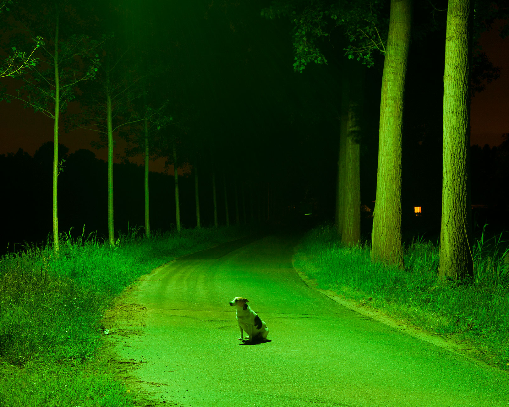
A dog features in one of the pictures. Do you feel that animals are particularly affected by encountering such vivid colours and indeed‚ such amounts of light‚ during their nocturnal hours?
As far as I know‚ a dog doesn’t see the same spectrum as humans do. We can only guess what a dog feels when exposed to different coloured lights. Sure‚ there are some things we can read from its body language but even that’s limited. But I wondered the same thing when I started this project –and it seems there’s a lot going on. The Dutch Institute of Ecology (NIOO-KNAW) and The University of Wageningen are currently investigating the effect of artificial light on flora and fauna in a research project called LichtOpNatuur.
The study has been running for four years and is now in its final year – I was at the presentation of the third year. They have several testing areas where they’ve put different coloured streetlights and measured the effects upon the surroundings. In particular they’re looking at how bats behave and how this in turn affects the food chain. For example‚ they explained that green light as a colour is less visible to birds‚ so its use is good for migratory birds as it won’t distract them from their flight course. But in contrast‚ green lights seem to attract huge numbers of moths. So it’s difficult: it seems that different animals see different spectrums. But one thing is certain. Light at night‚ always affects living organisms.
– Interview by Fiona Shipwright.
– Meridian Koelink graduated from the Royal Academy of Art in The Hague in 2014 and is currently preparing the publication of a book documenting the Most Efficient project and working as a documentary photographer based in Boxtel in The Netherlands. www.merijnkoelink.nl