»Architectural interpretations accepted without reflection could obscure the search for signs of a true nature and a higher order.«

Louis Isadore Kahn

Blog Viewpoint

Stockholm’s Ugly Duckling

In praise of a concrete campus

  • The KTH School of Architecture, as portrayed by photographers Sten Vilson in 1970... 1 / 31  The KTH School of Architecture, as portrayed by photographers Sten Vilson in 1970...
  • ...and Tove Freiij in 2015, for the “Ugly Duckling” exhibition held at the school in May-July 2015. 2 / 31  ...and Tove Freiij in 2015, for the “Ugly Duckling” exhibition held at the school in May-July 2015.
  • Also in the show was “1970-2015” by Klara Källstro?m & Thobias Fäldt. The artists were commissioned to create a project portraying the unnoticed aspects of the school’s architecture. 3 / 31  Also in the show was “1970-2015” by Klara Källström & Thobias Fäldt. The artists were commissioned to create a project portraying the unnoticed aspects of the school’s architecture.
  • The duo used a Super Macro lens to photograph the tabletops of the school’s Upper Atelier, which had been marked by decades of drawing, cutting and painting. (Klara Källström & Thobias Fäldt) 4 / 31  The duo used a Super Macro lens to photograph the tabletops of the school’s Upper Atelier, which had been marked by decades of drawing, cutting and painting. (Klara Källström & Thobias Fäldt)
  • Their photographs make visible the accumulated traces left by all the students of the school – a collective drawing, unwittingly made together by generations of young architects. (Klara Källström & Thobias Fäldt) 5 / 31  Their photographs make visible the accumulated traces left by all the students of the school – a collective drawing, unwittingly made together by generations of young architects. (Klara Källström & Thobias Fäldt)
  • Main façade towards the street in Stockholm’s upscale Östermalm neighbourhood where the ivy intended to cover the raw concrete never really took hold. (Photos: Sten Vilson, 1970 and Tove Freiij, 2015) 6 / 31  Main façade towards the street in Stockholm’s upscale Östermalm neighbourhood where the ivy intended to cover the raw concrete never really took hold. (Photos: Sten Vilson, 1970 and Tove Freiij, 2015)
  • South- and west-facing windows with wooden brise soleils... (Photo: Sten Vilson, 1970) 7 / 31  South- and west-facing windows with wooden brise soleils... (Photo: Sten Vilson, 1970)
  • ...the robust material palette helped the building stay more or less intact, despite negligent upkeep. (Photo: Tove Freiij, 2015) 8 / 31  ...the robust material palette helped the building stay more or less intact, despite negligent upkeep. (Photo: Tove Freiij, 2015)
  • The project’s young interior architect, Bror Martin Nilsson, demonstrates the stackable drawing tables of his design. (Photo: Sten Vilson, 1970) 9 / 31  The project’s young interior architect, Bror Martin Nilsson, demonstrates the stackable drawing tables of his design. (Photo: Sten Vilson, 1970)
  • Upon revisiting the school in 2015, Nilsson compared his emotions to meeting an old friend at a high school reunion. (Photo: Tove Freiij, 2015) 10 / 31  Upon revisiting the school in 2015, Nilsson compared his emotions to meeting an old friend at a high school reunion. (Photo: Tove Freiij, 2015)
  • The stackable display screens were intended to complement and “be friends” with the rough architecture. (Photo: Sten Vilson, 1970) 11 / 31  The stackable display screens were intended to complement and “be friends” with the rough architecture. (Photo: Sten Vilson, 1970)
  • The same concrete wall in 2015. (Photo: Tove Freiij, 2015) 12 / 31  The same concrete wall in 2015. (Photo: Tove Freiij, 2015)
  • Faculty offices were intentionally designed to open directly into the students’ studio spaces without being separated by a corridor. (Photo: Sten Vilson, 1970) 13 / 31  Faculty offices were intentionally designed to open directly into the students’ studio spaces without being separated by a corridor. (Photo: Sten Vilson, 1970)
  • This spatial organization characterised the daily life in the school during its entire time in use. (Photo: Tove Freiij, 2015) 14 / 31  This spatial organization characterised the daily life in the school during its entire time in use. (Photo: Tove Freiij, 2015)
  • Seminar room with typical exposed ceiling installations, embedded acoustic panels and the later addition of a digital projector. (Photos: Sten Vilson, 1970 and Tove Freiij, 2015) 15 / 31  Seminar room with typical exposed ceiling installations, embedded acoustic panels and the later addition of a digital projector. (Photos: Sten Vilson, 1970 and Tove Freiij, 2015)
  • The steel tube and plywood chairs came off-the-shelf from a local manufacturer and became something of a trademark of the school. (Photos: Sten Vilson, 1970 and Tove Freiij, 2015) 16 / 31  The steel tube and plywood chairs came off-the-shelf from a local manufacturer and became something of a trademark of the school. (Photos: Sten Vilson, 1970 and Tove Freiij, 2015)
  • The first generation of students moving in complained about a lack of cosiness, and negotiated for communal kitchens to be added. (Photo: Sten Vilson, 1970) 17 / 31  The first generation of students moving in complained about a lack of cosiness, and negotiated for communal kitchens to be added. (Photo: Sten Vilson, 1970)
  • Microwaves have replaced teapots, but it’s more or less the same. (Photo: Tove Freiij, 2015) 18 / 31  Microwaves have replaced teapots, but it’s more or less the same. (Photo: Tove Freiij, 2015)
  • The exposed concrete structure of the East façade illustrates the design principle of arranging mundane materials in meticulous formations. (Photos: Sten Vilson, 1970 and Tove Freiij, 2015) 19 / 31  The exposed concrete structure of the East façade illustrates the design principle of arranging mundane materials in meticulous formations. (Photos: Sten Vilson, 1970 and Tove Freiij, 2015)
  • The building awash in late-modernist sunlight...and in a more overcast twenty-first century setting. (Photos: Sten Vilson, 1970 and Tove Freiij, 2015) 20 / 31  The building awash in late-modernist sunlight...and in a more overcast twenty-first century setting. (Photos: Sten Vilson, 1970 and Tove Freiij, 2015)
  • 1970s students use the staircase of the south gable entrance; in 2015 the space under the stairs is routinely used by Stockholm’s homeless population. (Photos: Sten Vilson, 1970 and Tove Freiij, 2015) 21 / 31  1970s students use the staircase of the south gable entrance; in 2015 the space under the stairs is routinely used by Stockholm’s homeless population. (Photos: Sten Vilson, 1970 and Tove Freiij, 2015)
  • Studio spaces with flexible furnishing originally designed for around 100 students... (Photo: Sten Vilson, 1970) 22 / 31  Studio spaces with flexible furnishing originally designed for around 100 students... (Photo: Sten Vilson, 1970)
  • ...pushed to 500 students by 2015. (Photo: Tove Freiij, 2015) 23 / 31  ...pushed to 500 students by 2015. (Photo: Tove Freiij, 2015)
  • The studios were designed by Christina Engdahl, who would teach at the school for 20 years. (Photo: Sten Vilson, 1970) 24 / 31  The studios were designed by Christina Engdahl, who would teach at the school for 20 years. (Photo: Sten Vilson, 1970)
  • The overhead hooks remain in place, waiting for the perfect opportunity to be put to use. (Photo: Tove Freiij, 2015) 25 / 31  The overhead hooks remain in place, waiting for the perfect opportunity to be put to use. (Photo: Tove Freiij, 2015)
  • The 100mm square floor tiles were used as a pedagogical tool to learn standard measurements, although they were replaced in the early 2000s. (Photos: Sten Vilson, 1970 and Tove Freiij, 2015) 26 / 31  The 100mm square floor tiles were used as a pedagogical tool to learn standard measurements, although they were replaced in the early 2000s. (Photos: Sten Vilson, 1970 and Tove Freiij, 2015)
  • All of the staff offices faced the street and were of equal size regardless of position. (Photos: Sten Vilson, 1970 and Tove Freiij, 2015) 27 / 31  All of the staff offices faced the street and were of equal size regardless of position. (Photos: Sten Vilson, 1970 and Tove Freiij, 2015)
  • Seminar room in 1970... (Photo: Sten Vilson, 1970) 28 / 31  Seminar room in 1970... (Photo: Sten Vilson, 1970)
  • ...turned student union storage and meeting space by 2015. (Photo: Tove Freiij, 2015) 29 / 31  ...turned student union storage and meeting space by 2015. (Photo: Tove Freiij, 2015)
  • Many of the school’s original details remain intact... (Photos: Sten Vilson, 1970 and Tove Freiij, 2015) 30 / 31  Many of the school’s original details remain intact... (Photos: Sten Vilson, 1970 and Tove Freiij, 2015)
  • ...others have gone up in smoke. (Photos: Sten Vilson, 1970 and Tove Freiij, 2015) 31 / 31  ...others have gone up in smoke. (Photos: Sten Vilson, 1970 and Tove Freiij, 2015)

After forty-five years of service in training Sweden’s architects-to-be, the infamous KTH Royal Institute of Technology School of Architecture has been vacated, making way for a second life as creative incubator. Ugly is now rebranded as bold, while brutalist is sold as authentic. But what is a school without its pedagogy? Björn Ehrlemark, curator of a 2015 exhibition on the old KTH-A as a permanent work-in-progress, delivers a eulogy on a structure full of character that was as much student and teacher as it was a classroom.

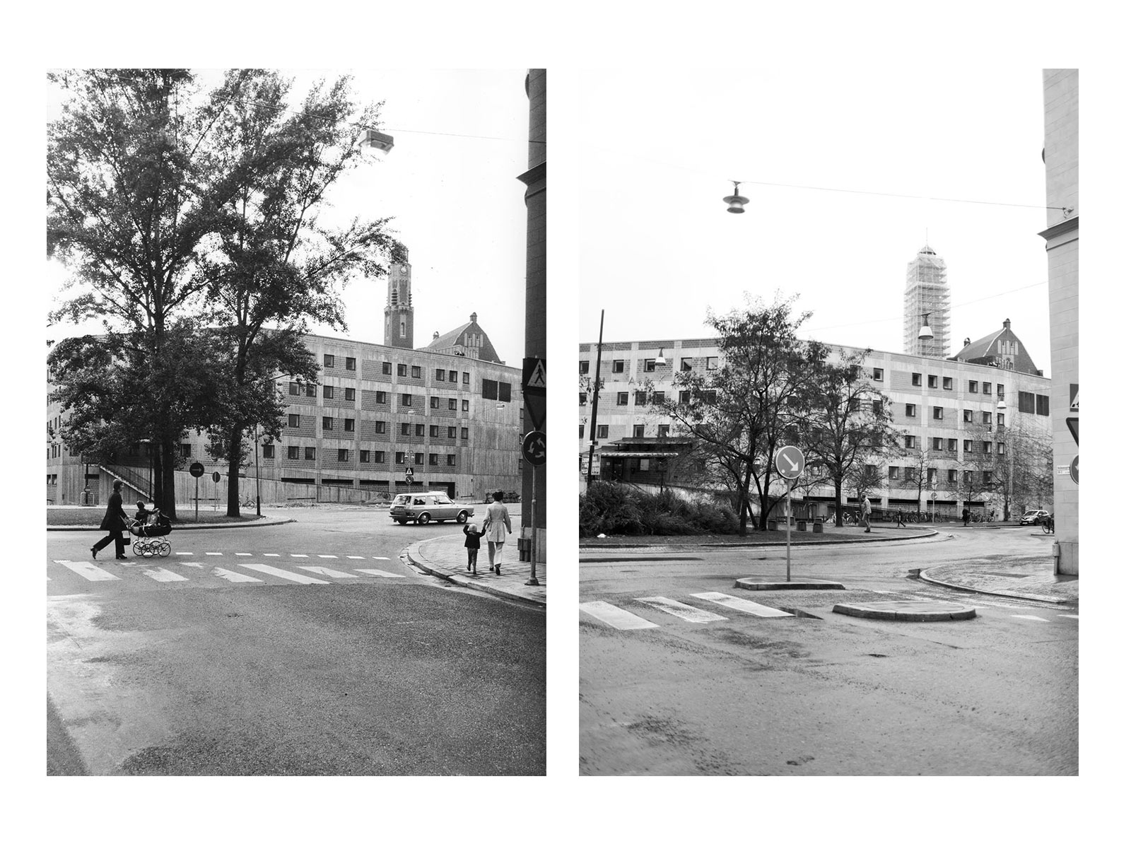
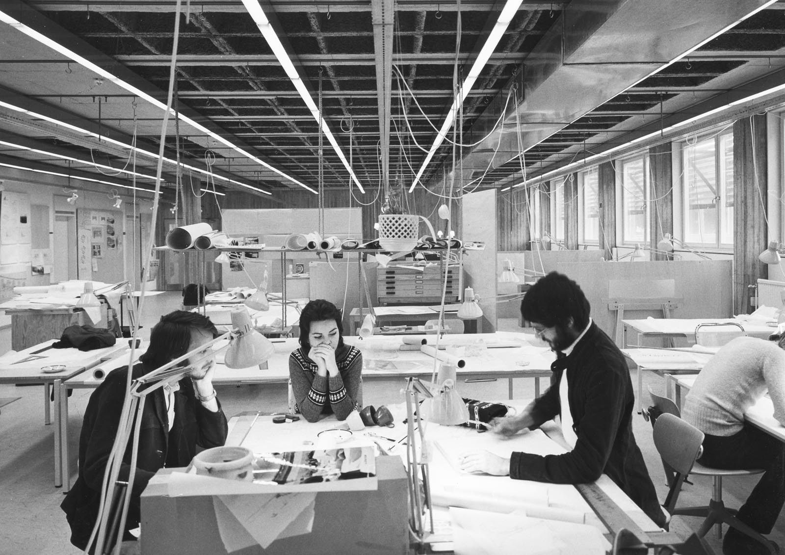
The majority of architects practicing in Sweden today passed through here. This is where they learnt their profession, at the old KTH School of Architecture building on Östermalmsgatan in Stockholm.

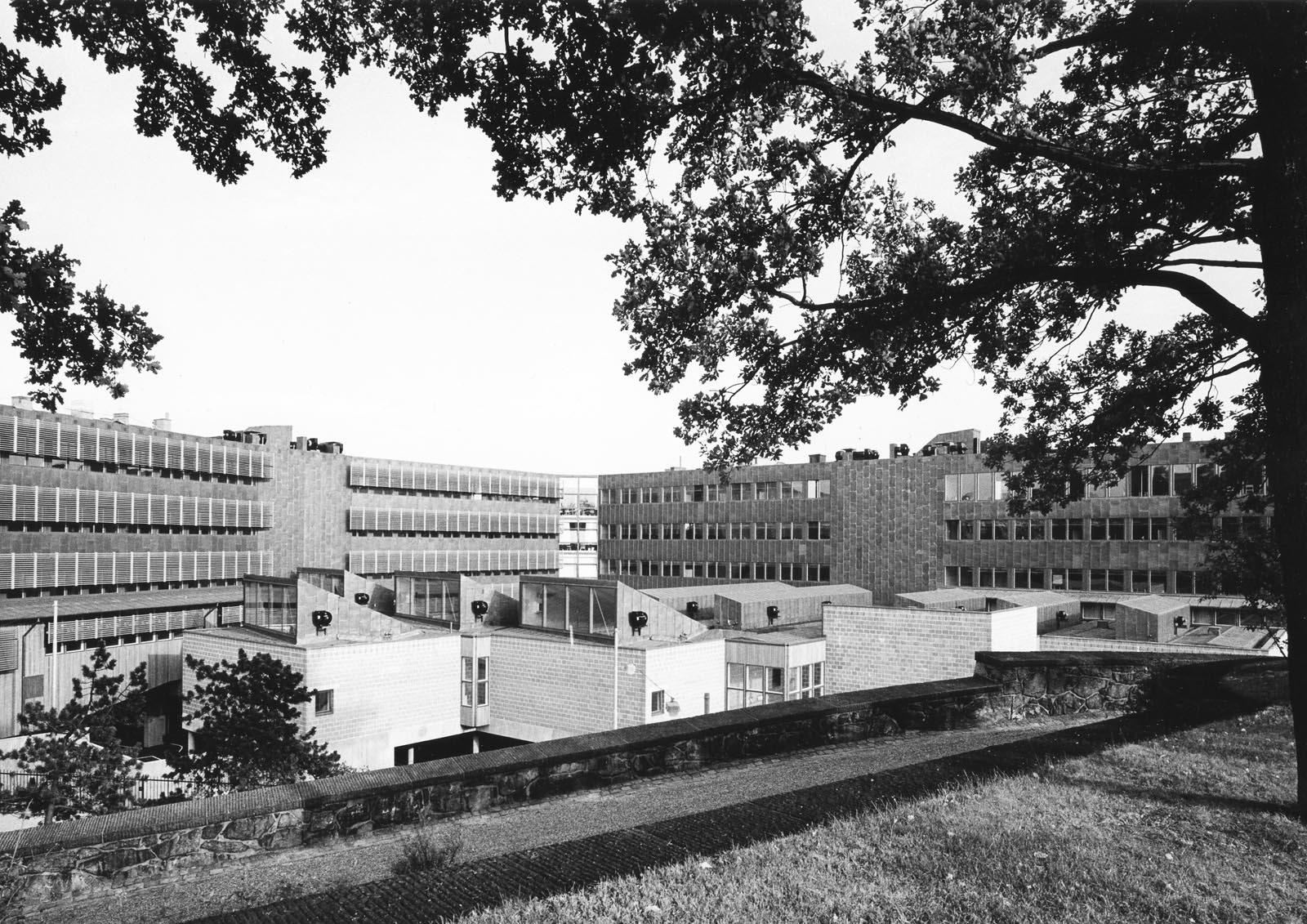
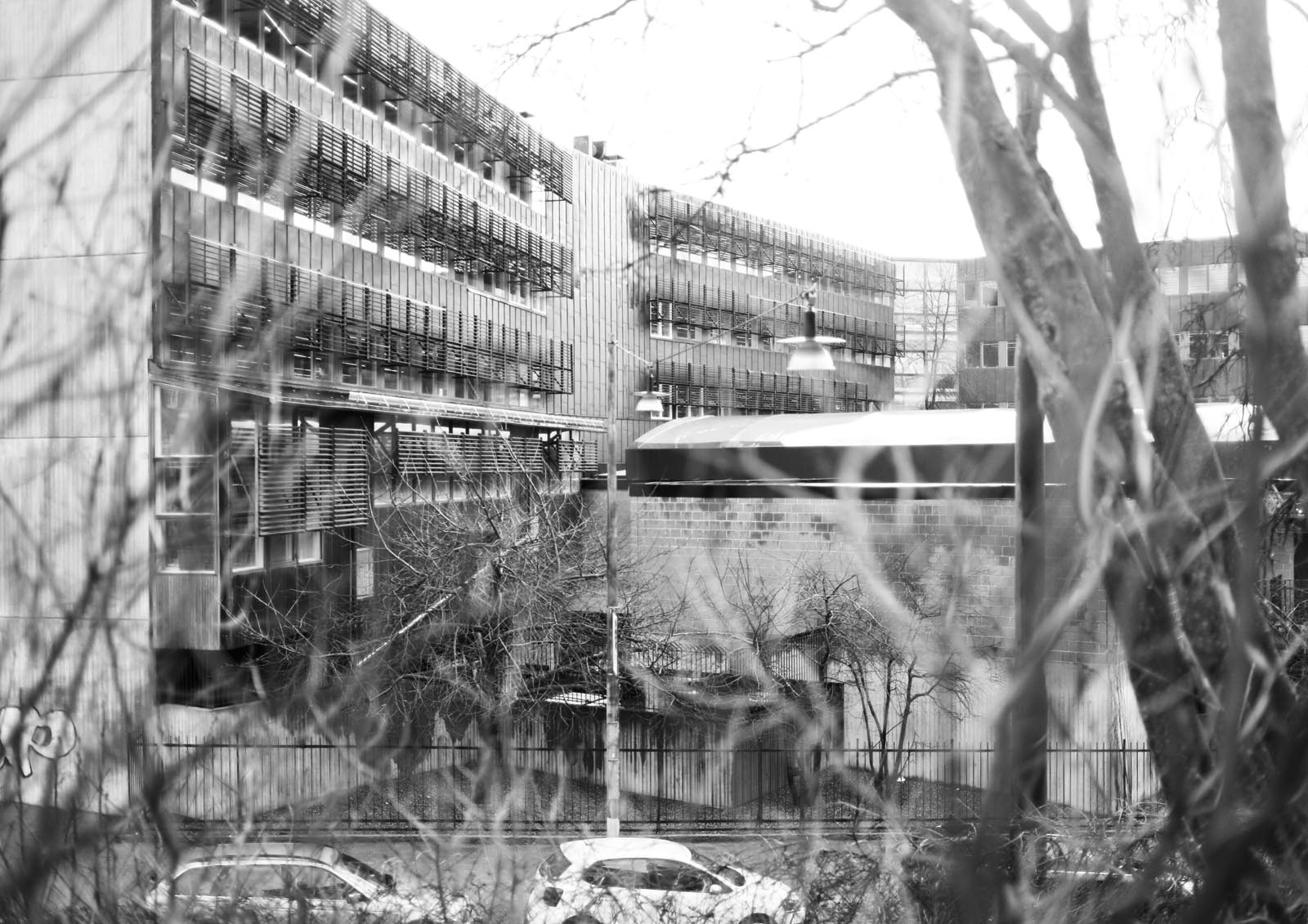
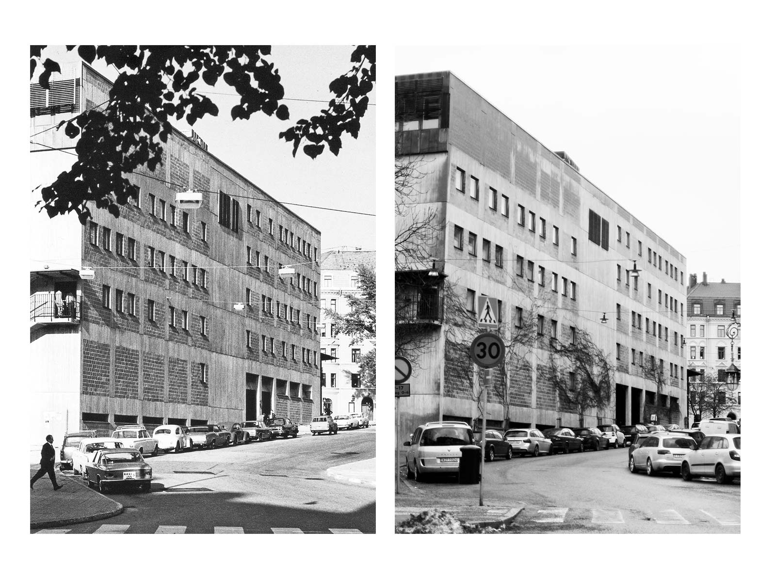
Many Stockholmers already know it. It is notorious for being named the ugliest building in the city several times over by popular vote. Sure, the unapologetic concrete face does not exactly flirt with its pastel-rendered neighbours and the picturesque ivy intended to cover the street façade never took hold. But the epithet is also likely seasoned with added malice both for its contents (“look at the architects in their bunker!”) and its location, the upscale residential neighbourhood of Östermalm. Ten years ago Stockholm’s municipal commissioner for urban planning wanted to see it torn down. But even brutalist bastions become ripe for rebranding with time. The school of architecture has recently moved out to the main KTH campus and the state-owned property company have started to execute their plans to turn the old building into a creative incubator and gastro-foodcourt.

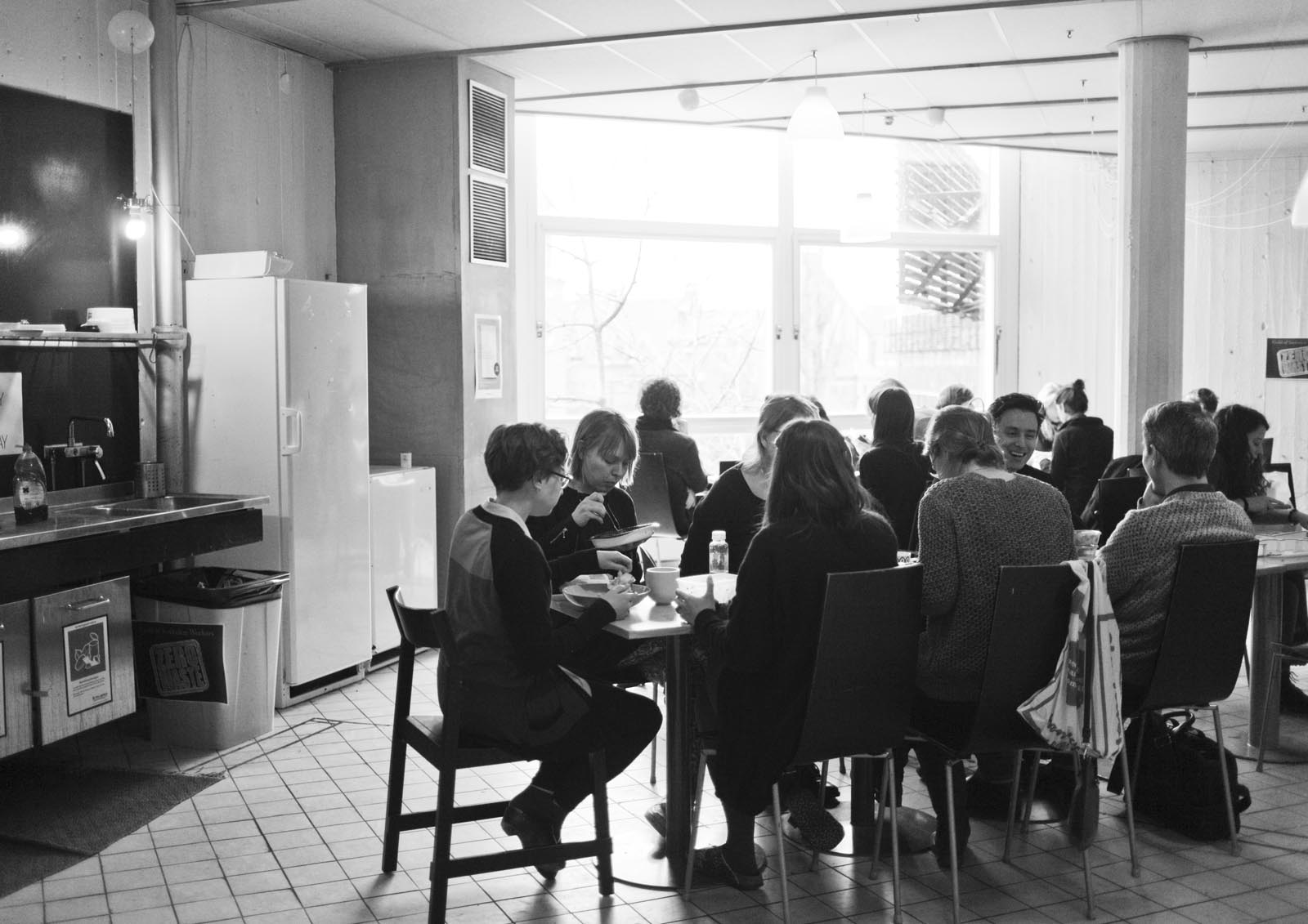
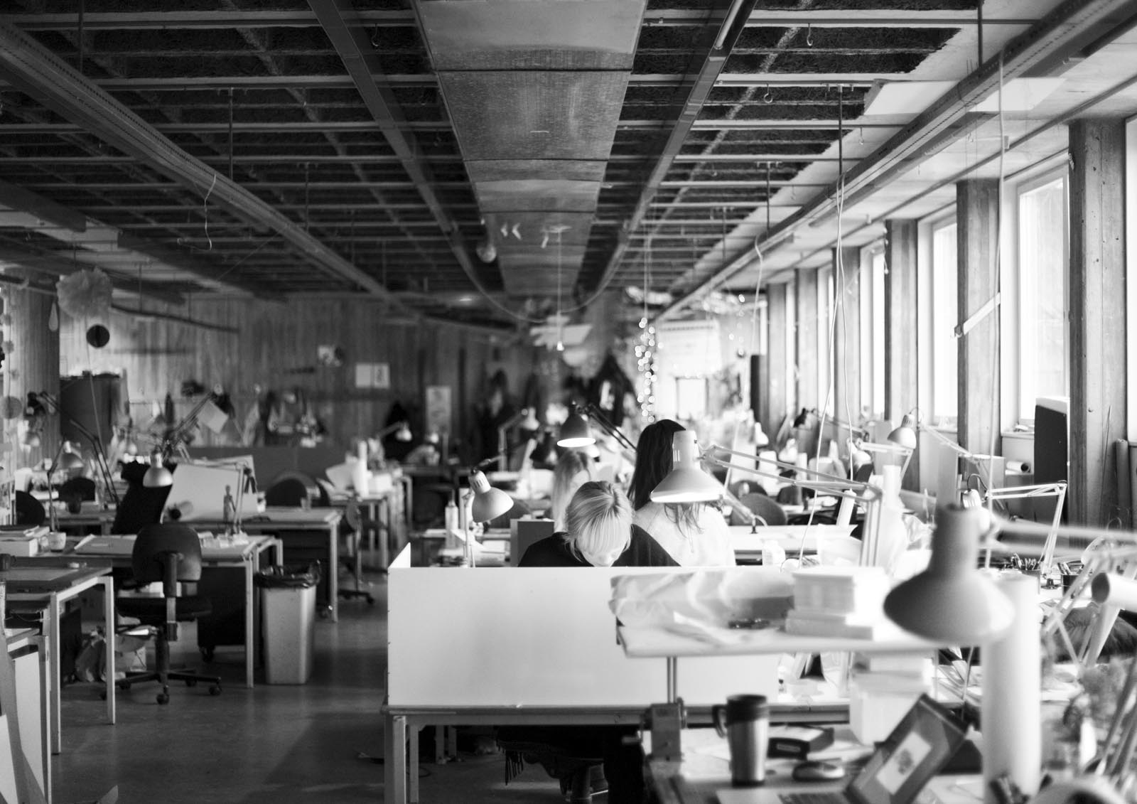
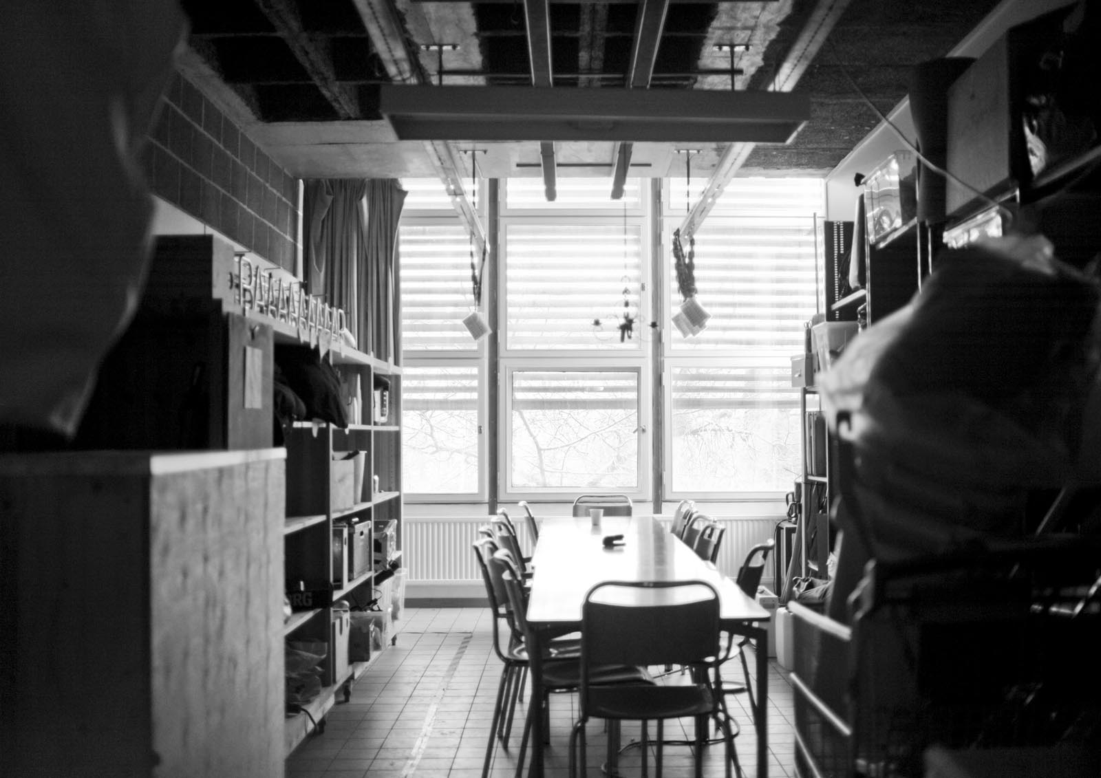
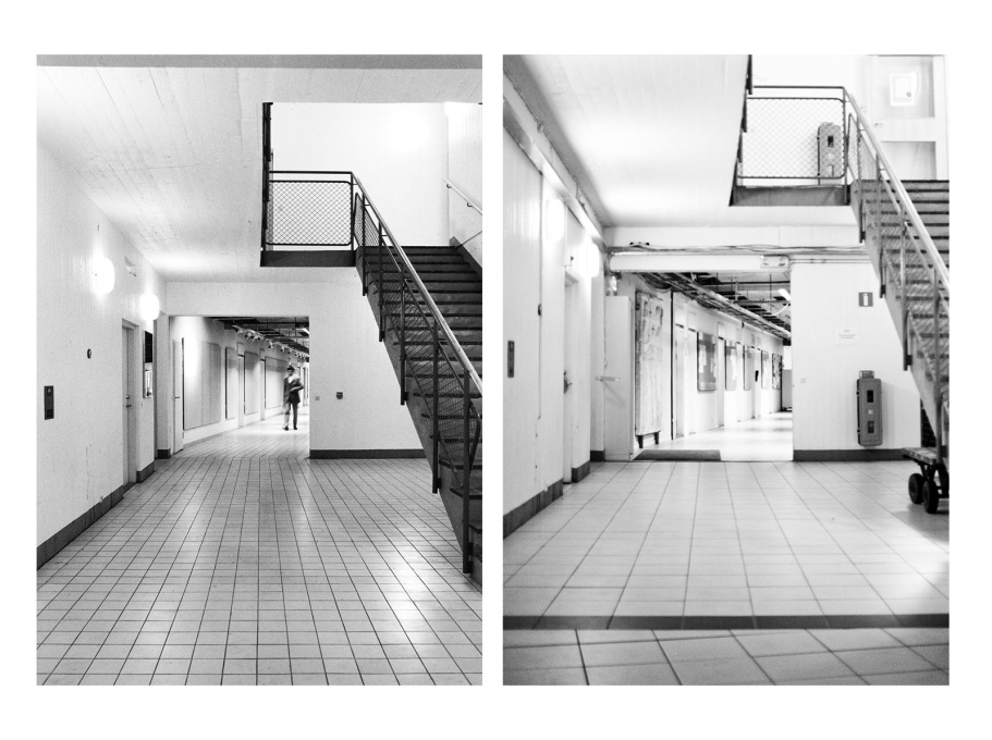
But most non-architects have never seen its insides. Even when it was used as a 1980s bureaucratic backdrop in the Nordic Noir thriller The Fourth Man, it passed widely unnoticed. That is no coincidence. A last-minute concession to a road tunnel that was planned to pass under the site (it never happened) meant the underground parking garage ended up on street level instead. Each of the building’s main entrances are therefore reached via a flight of stairs, giving it the air of a sealed-off medieval castle. So it has been deemed an ugly thing by its critics and praised as a late-modernist gem by New Brutalist connoisseurs for almost half a century now. The truth is of course, that it always has been both, and so much more: workplace, production facility, library, garage, lunch room, garbage dump, courtyard hang-out, storage space, party venue, and too some degree, a second home.

The 100mm square floor tiles were used as a pedagogical tool to learn standard measurements, although they were replaced in the early 2000s. (Photos: Sten Vilson, 1970 and Tove Freiij, 2015)

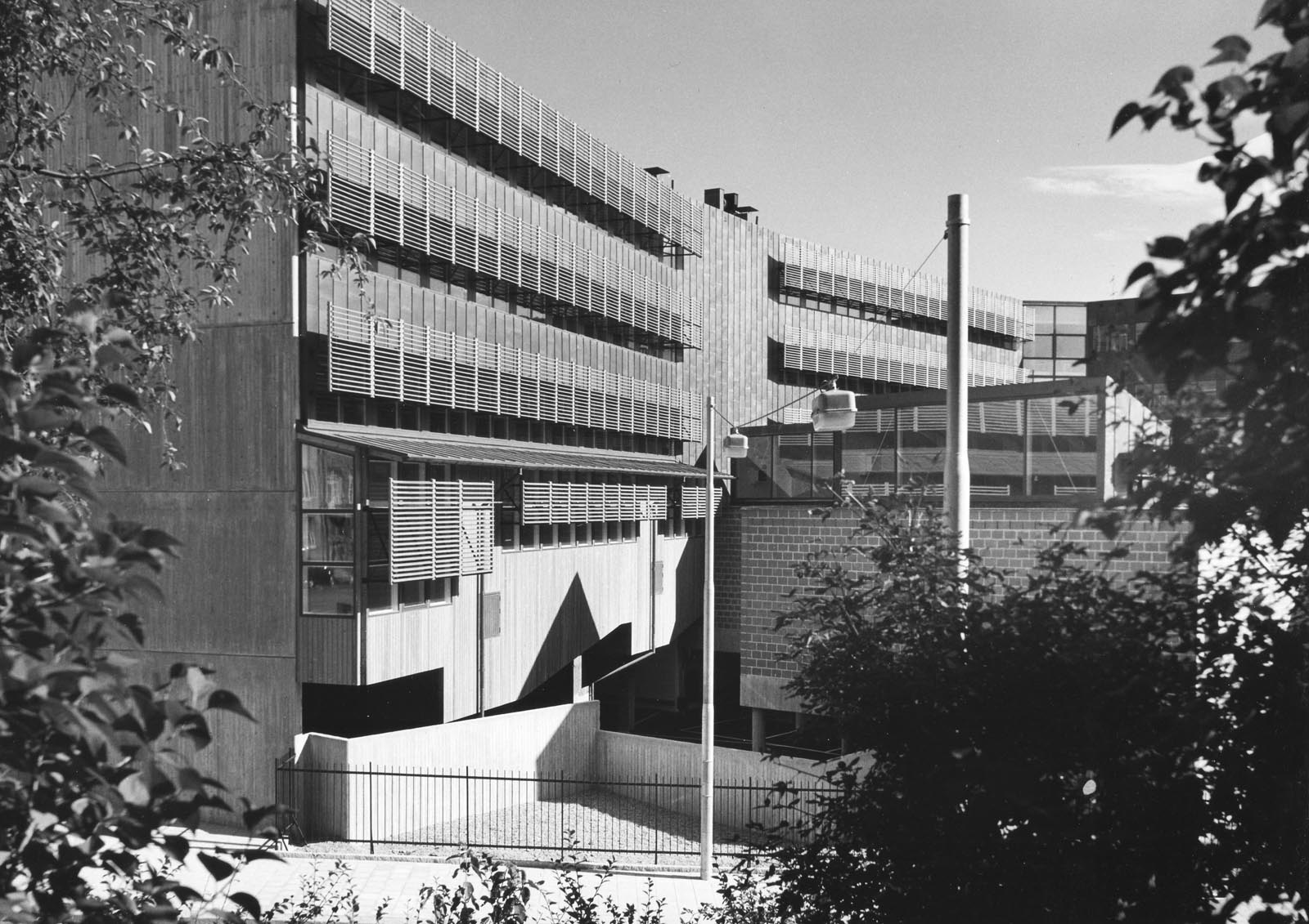
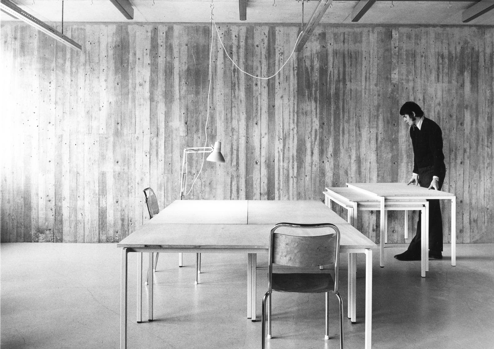
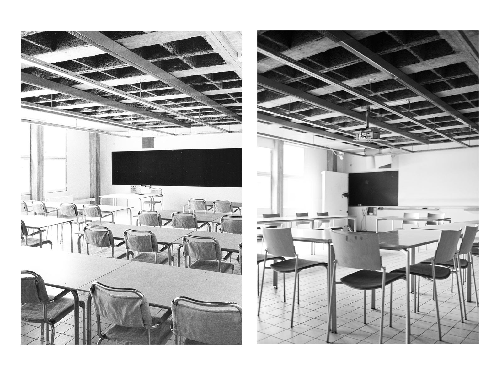
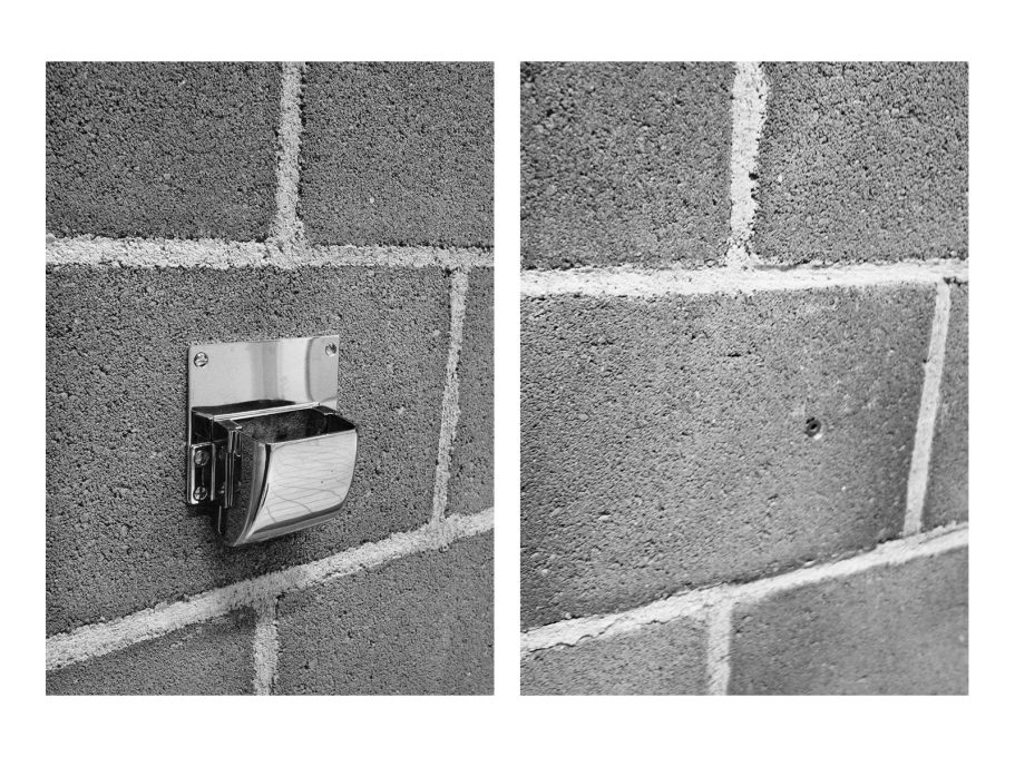
The building was inaugurated in 1970 and was the last to be designed by the university’s in-house architecture office, led by architect and professor Gunnar Henriksson and architect and artist John Olsson. At a time when prefab and standardisation was becoming the norm, the design team worked more or less in isolation on this final project for two years straight. All components – even doors, tables, and light switches – are custom-designed by the architects. And all are drawn up after the same principles as the overall scheme: robust, clean, versatile, discreet.

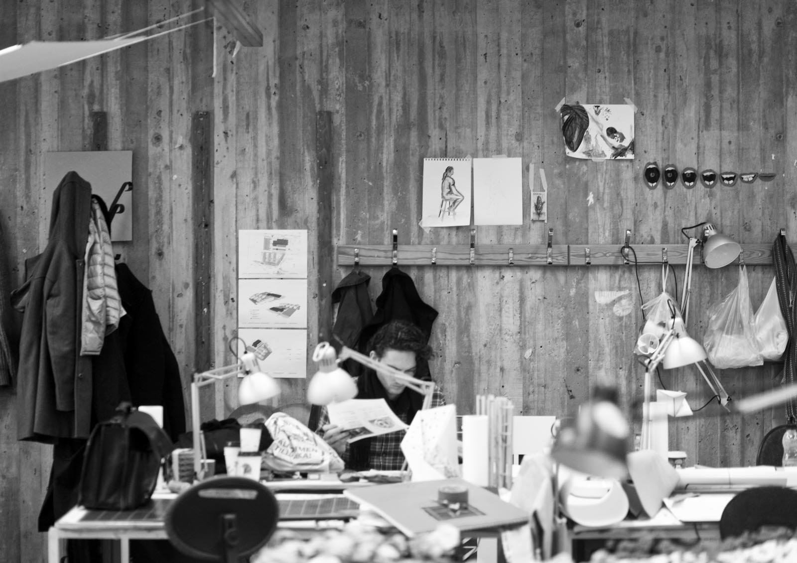
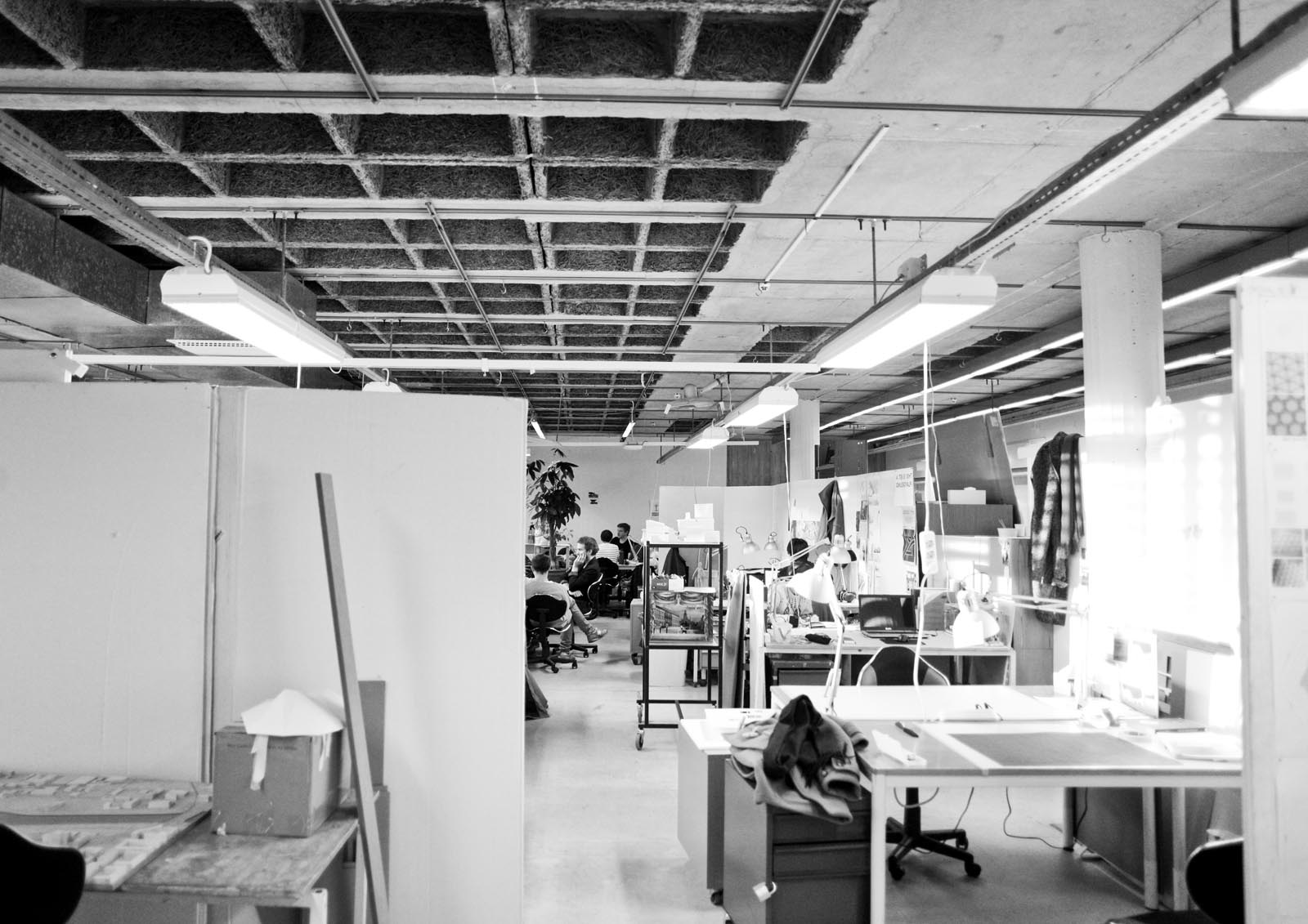
Its expression is that of raw and exposed construction. Columns, floor plates and sheer walls in cast concrete; partition walls made up of stacked ash-grey cinder blocks meticulously fit between the pillars; the lighter courtyard pavilions assembled from I-section steel beams and corrugated plates. It is stripped bare, with a frankness balancing on asceticism. Yet, its lasting impression is one of generosity. The more time you spent here, the more it gave.

Many of the school’s original details remain intact... (Photos: Sten Vilson, 1970 and Tove Freiij, 2015)

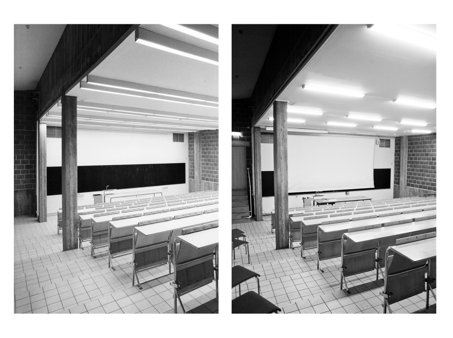
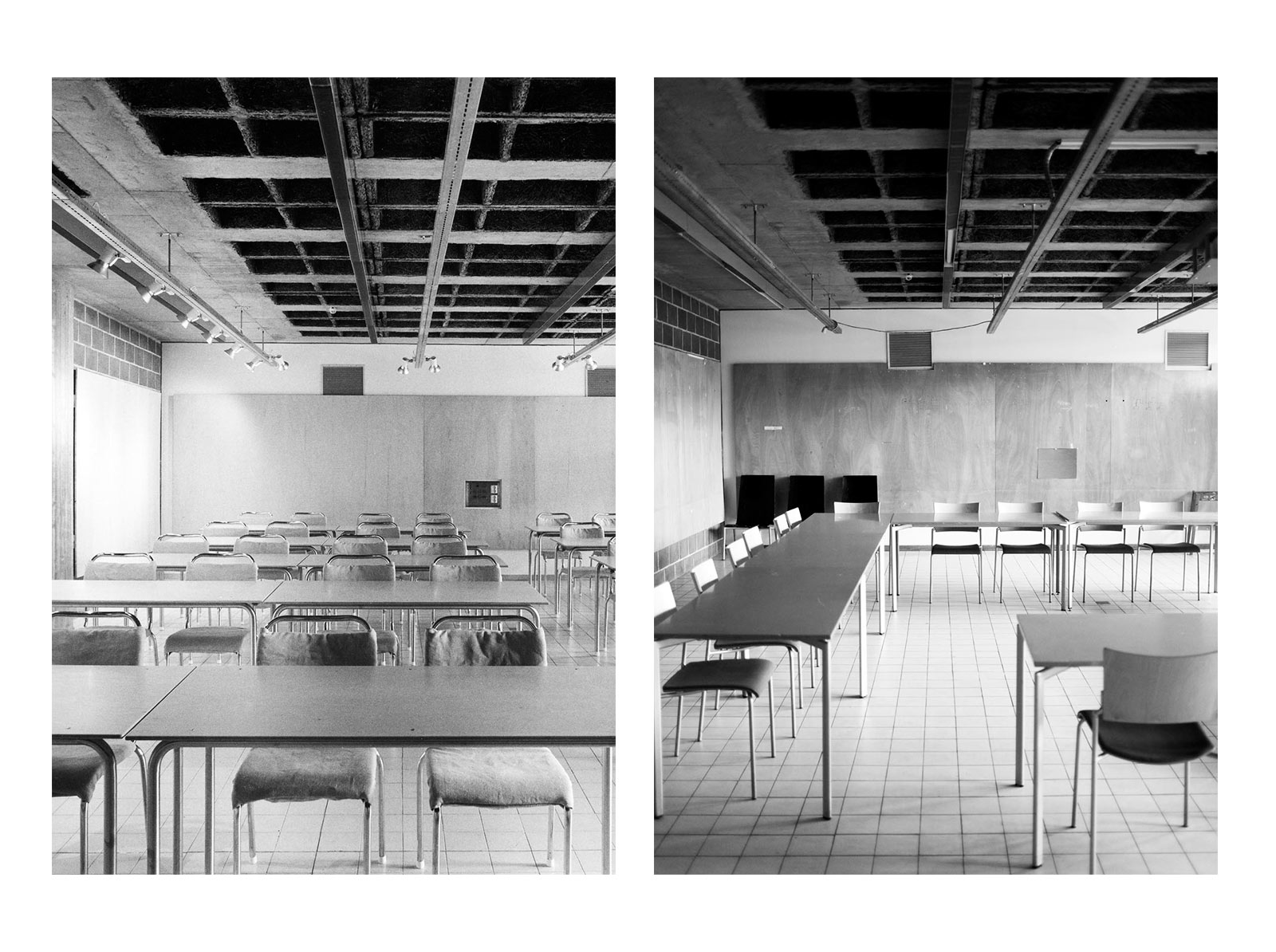
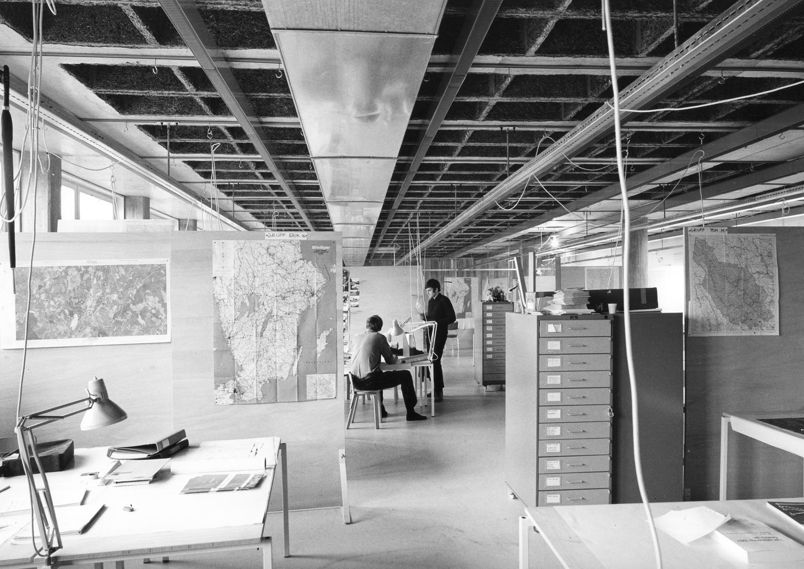
For one, it is a pedagogical tool. Building elements are exposed and laid out like an anatomical chart. No, not the simplified tectonics of columns and beams playing in the light, while pipes and ducts hide behind the corner. This is architecture without shortcuts. In the ceilings the electrical gutters – also designed by the architects – are on display, running overhead through corridors and studios. Steel components are a weird reddish orange or bright turquoise, the tints of off-the-shelf anti-corrosion paint. And the original scheme even had the exposed ventilation shafts color-coded blue and red for exhaust and intake in accordance with the conventions of technical drawing at the time.

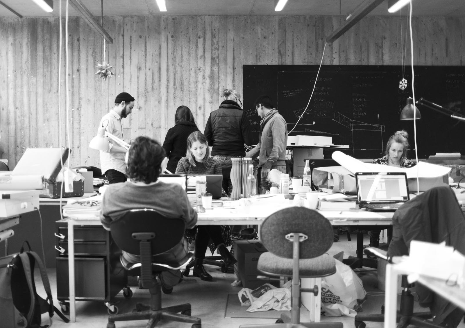
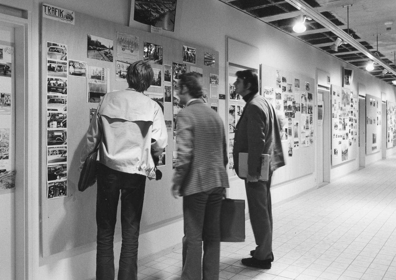
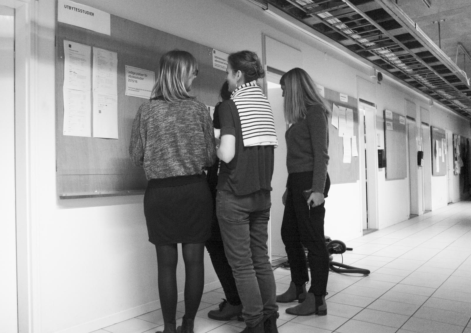
As a piece of institutional architecture, another of its notable features is how it does away with corridors. Faculty offices, facing the street, open directly into the students’ studio spaces, which face the courtyard. The area in-between became a space for students and teachers to have chance encounters and engage in informal conversation. A radical architectural idea wedged into the social order of late 1960s academia, but one that would pass unnoticed for a first-time visitor.

The feature most distinctly illustrative of the ideology of the design also requires inhabitation to be appreciated. In the ceiling of the studio spaces, interlaced with rows of minimalist tube light armatures – designed by the architects – is a grid of hooks. The ceiling system is filled with them, alongside plenty of electrical sockets. You probably do not event notice them until the day you look up from your studio project, desperate for something to hang your model from or to connect your lamp to. Most likely, there is a hook right where you need it.

...others have gone up in smoke. (Photos: Sten Vilson, 1970 and Tove Freiij, 2015)

This is an architecture left raw as an invitation for addition and alteration. Much of the curriculum, for which the building was tailor-made, was replaced in time for its opening. That soon left it with a set of extra spaces – an acoustic chamber, a daylight laboratory, a full-scale construction hall with a massive mobile crane – which served as a spatial resource for unexpected activities. Some of it came in handy when the school introduced a computer lab, others when a fire destroyed the model workshop in 2011. But a loose fit in general also meant there was room for messy, bulky and awkward ideas – the kinds of things that happen at an architectural school all the time, and especially when their spaces encourage these opportunities and ideas to arise. The building was intentionally set out to be permanently unfinished, to be completed again and again by those passing through, each in their own way. It will now be spared from the mess and the noise, but will it then degenerate into a state of restlessness? It seems to need the friction.

Although this building was designed to take a beating, few could have imagined how much of a beating it would actually take. The first generation of students, in the early 70s, complained about a lack of cosiness and added flowery curtains. In the 80s and 90s, it became a venue for clandestine parties. By the 2000s, institutional downsizing meant one of the wings was rented out as office space. In 2011 the fire destroyed the courtyard pavilions, which were replaced by temporary structures and container barracks. And throughout, during 45 years of service to architectural learning, it got pounded on, smoked in, spray-painted, bumped into, glued to, hammer-drilled and had coffee spilt all over. And each semester, as a new generation of architects-to-be came through the door, it was ready for another round.

Björn Ehrlemark is an architect and editor, and co-founder of Neighbours of Architecture. He directed the public programme of the KTH School of Architecture between 2013 and 2016, and curated the exhibition Ugly Duckling about the old KTH-A, on display during the school’s final semester in the building. 

arch.kth.se/en

Further reading: For more brutalist bastions under threat head to #SOSBrutalism, a database of mid-century concrete structures around the world powered by uncube.

RECENT POSTS

more

Recent Magazines

25 Apr 2016

Magazine No. 43
Athens

  • essay

    From the Bottom and the Top

    Powering Athens through collectivity and informal initiatives by Cristina Ampatzidou

  • photo essay

    Nowhere Now Here

    A photo essay by Yiorgis Yerolymbos

  • Essay

    Back to the Garden

    Athens and opportunities for new urban strategies by Aristide Antonas

  • Interview

    Point Supreme

    An interview by Ellie Stathaki

>

03 Mar 2016

Magazine No. 42
Walk the Line

  • Essay

    The Line Connects

    An essay on drawing and architectural education by Wes Jones

  • Essay

    Drawing Attention

    Phineas Harper sketches out new narrative paths with pencil power

  • Essay

    Gotham

    Elvia Wilk on a city of shadows as architectural fiction

  • Interview

    The (Not So) Fine Line

    A conversation thread between Sophie Lovell and architecture cartoonist Klaus

>

28 Jan 2016

Magazine No. 41
Zvi Hecker

  • essay

    Space Packers

    Zvi Hecker’s career-defining partnership with Eldar Sharon and Alfred Neumann by Rafi Segal

  • Interview

    Essentially I am a Medieval Architect

    An interview with Zvi Hecker by Vladimir Belogolovsky

  • viewpoint

    The Technion Affair

    Breaking and entering in the name of architectural integrity by Zvi Hecker

  • Photo Essay

    Revisiting Yesterday’s Future

    A photo essay by Gili Merin

>

17 Dec 2015

Magazine No. 40
Iceland

  • Viewpoint

    Wish You Were Here

    Arna Mathiesen asks: Refinancing Iceland with tourism – but at what cost?

  • Photo Essay

    Spaces Create Bodies, Bodies Create Space

    An essay by Ólafur Elíasson

  • Focus

    Icelandic Domestic

    Focus on post-independence houses by George Kafka

  • Essay

    The Harp That Sang

    The saga of Reykjavík's Concert Hall by Sophie Lovell & Fiona Shipwright

>

more

SUBSCRIBE TO OUR MAILING LIST Close

Uncube is brandnew and wants to look good.
For best performance please update your browser.
Mozilla Firefox, Internet Explorer 10 (or higher), Safari, Chrome, Opera

×