-
Magazine No. 42
Walk the Line
-
No. 42 - Walk the Line
-
page 02
Cover
Walk the Line
-
page 03
Editorial
Walk the Line
-
page 05 - 10
The Line Connects
An essay on drawing and architectural education by Wes Jones
-
page 11 - 13
Moon Hoon
Seoul
-
page 14
Drawn to Scale
Chalking the line with Vardehaugen
-
page 15 - 20
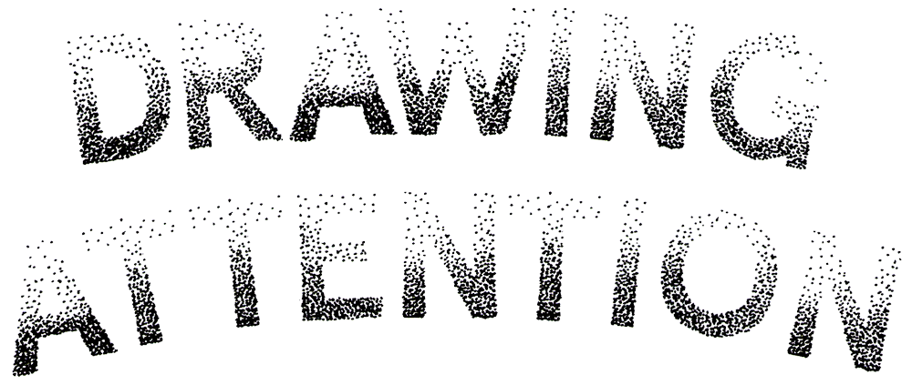
Drawing Attention
Phineas Harper sketches out new narrative paths with pencil power
-
page 21
Event Horizon
Walking the lines of a 4D doughnut
-
page 22 - 24
Drawing Architecture Studio
Beijing
-
page 25 - 26
Studio Weave
London
-
page 28
Narrative Illusions
The tricksy art of trompe l'oeil
-
page 29 - 35
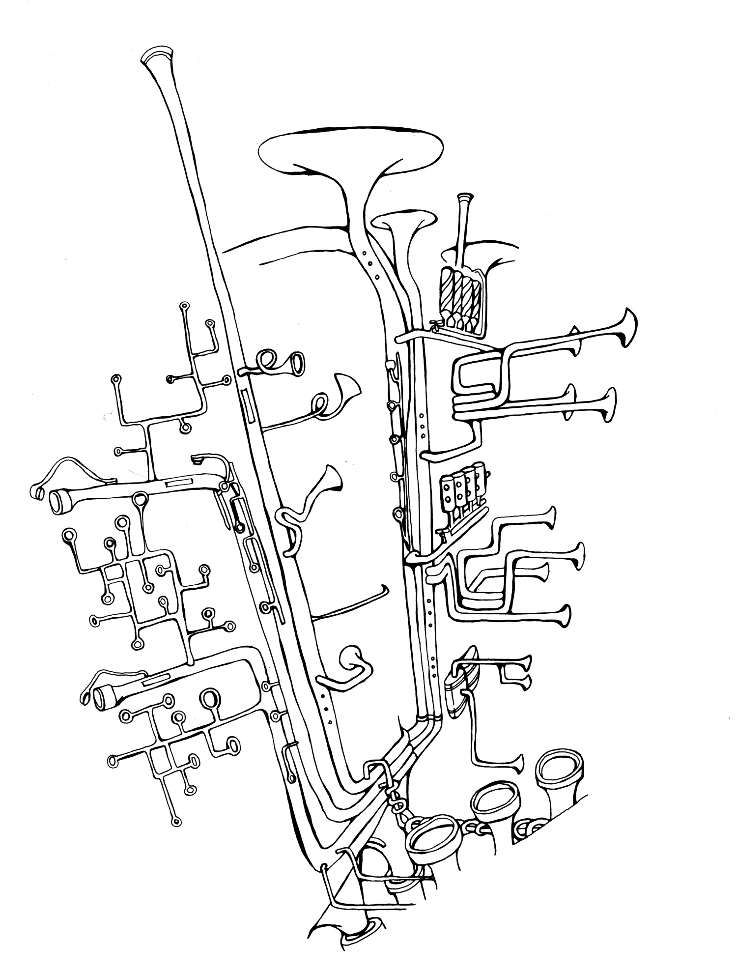
The Illustrated Architect
Rob Wilson talks graphic passions with Sergei Tchoban
-
page 36
Planes & Elevations
Welcome to Shenzhen 2028
-
page 37 - 38
The Map is Not the Territory
Larissa Fassler’s sketched psychogeographies
-
page 39 - 44
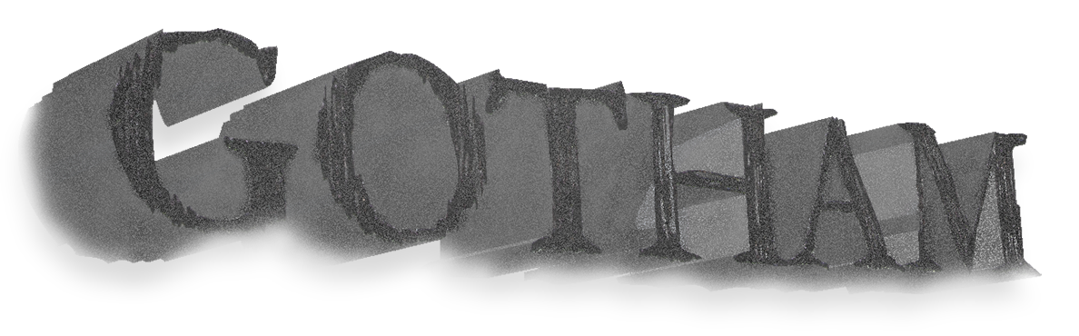
Gotham
Elvia Wilk on a city of shadows as architectural fiction
-
page 45 - 47
Raumlabor
Berlin
-
page 48 - 50
Kosmos
New York, Moscow, Basel
-
page 51 - 60
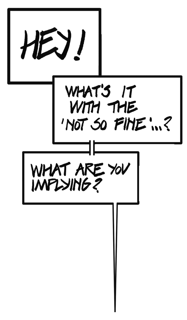
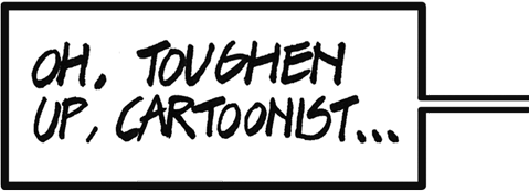
The (Not So) Fine Line
A conversation thread between Sophie Lovell and architecture cartoonist Klaus
-
page 61
Wall-to-Wall
Mapping the densest settlement on Earth
-
page 62 - 64
Bookmarked
Asterix, Batman and more
-
page 65
Further Reading
-
page 66
Next
Athens
-
-
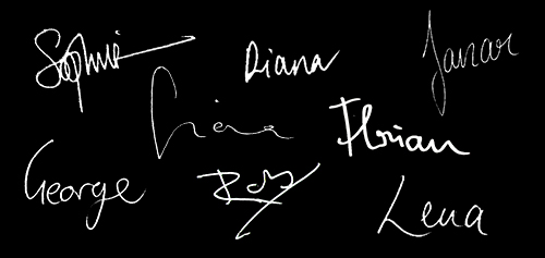
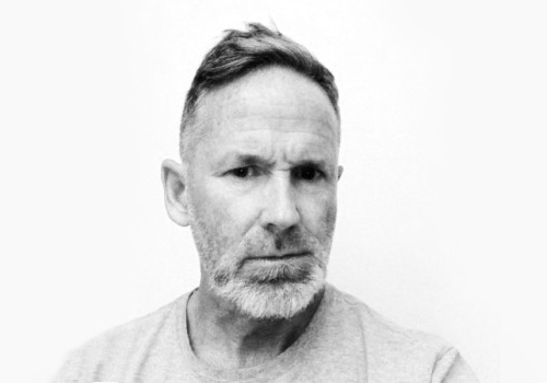
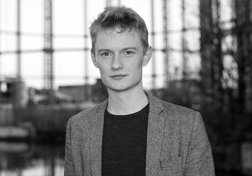
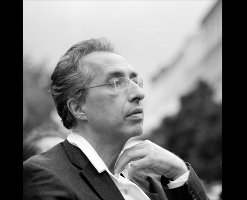
uncube’s editors are Sophie Lovell (Art Director, Editor-in-Chief), Florian Heilmeyer, Rob Wilson and Fiona Shipwright; editorial assistance: George Kafka; graphic design: Lena Giovanazzi, graphic assistance Janar Siniloo and Diana Portela.
uncube is based in Berlin and is published by BauNetz, Germany’s most-read online portal covering architecture in a thoughtful way since 1996.
Welcome to another bumper edition of uncube, this time digitally devoted to the act of drawing.
Walk the Line is no Luddite love letter to all things analogue. Despite all our hyper-real, technical image-making capabilities, drawing remains an extraordinarily flexible medium and one that a whole new generation of architects are making their own.
So join us as we take a line for an extended amble through our 42nd issue and discover how drawing continues to set loose our ability to speculate and experiment, to educate and communicate, to explore and share ideas with clinical precision, or capture a thought with a rough sketch.
uncube – always quick on the draw.
Cover image: “Stick On City” (detail), 2008, raumlaborberlin.
-
![]()
![]()
![]()
-
![]()
The haptic bond between drawing by hand, time, architecture and education
-
![]()
uncube asked the American architect, educator and author Wes Jones to sketch out his thoughts on the continued value of teaching and practicing drawing by hand in architecture. The result is this well drawn and thought-provoking essay on the tactile connection between the mind and representation.
![]()
![]()
-
![]()
The point of drawing, for an architect, is to convey or discover design. These are different, but both involve communication – with other humans or with the design itself. Drawing has been central to this practice for most of history, but it is not essential to it (in many cases physical models have been more useful). In fact, drawing’s role in documentation and design is a pragmatic convenience that reflects the available technology and the means of the client. Lately of course technology has taken both drawing and modelling from the board to the screen, and loosened the tactile connection that had for so long been forged between the thought and its representation. This haptic bond has been around since the beginning of design, so its disappearance seems cataclysmic to some. Yet, the hand’s true value to both the practice of architecture and production of design is unmasked by the fact that it survives today for the most part as a boutique offering of predominately nostalgic effects.
Because of its historic centrality to architectural production, however, drawing has been equally important to architectural education, and here its value may be more easily defended, and even its tactile practice proven useful still. Since drawing is not transparent to its represented subject it has been largely supplanted by the exact, index-like nature of the digital. But drawing’s blurry, lower resolution also enables it to carry the argument behind the design, giving it educational value in both vocational and disciplinary arenas long after the digital model has obsoleted its role in practice.
![]()
-
![]()
Further, the possibility of isolating intention from effect in drawing makes it particularly useful for gauging the student’s earned progress and spotting the accidental, or “found” effect. Finally, “hand” drawing in particular also provides a record of the student’s relative confidence and mastery.
Vocational drawing is not exploratory; its interest is clarity. It has long abandoned the hand for this reason. But clarity is not the same as transparency. The standard of clarity can be applied to the thinking behind the design as well as the representation of the design. Even when the medium is digital, the drawing that is constructed is easily distinguished from the drawing that is excerpted directly from the model, and the differences are often telling. The student’s understanding of their own design, so easily assumed in renderings and forgiven in found linework, is unmasked in constructed drawings. In such drawings the student’s decisions are visible and directly correlated to the situation depicted; it is possible to get it wrong. Renderings and found line work, in contrast, exhibit no judgement beyond choice of view, and their graphic faux pas are excused as modelling errors or accidents of that view choice.
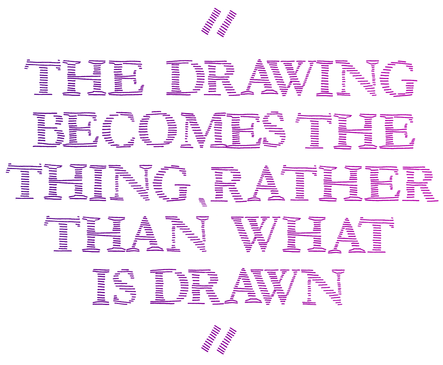
Disciplinary drawing shares vocational drawing’s respect for clarity, but it is also intensely concerned with issues that divide the hand and the digital. As an abstraction drawing introduces a third term to the conversation between the author and the audience (whether that is the object, in design, or the audience, in representation). The medium forces the author to pay closer attention to what she is saying. When pursued as hand drawing, the opacity of this thickened intentional space – the space of translation – becomes absolute, and the two-dimensional object comes to stand in for the thing represented and intercepts judgments directed toward the thing. The drawing becomes the thing, rather than what is drawn.
-
![]()
But this allows the student, otherwise deprived of realising the depicted three-dimensional reality at full scale, to experience the connection that would be forged through the object between the author and the user, to feel architecture’s mandate to place us in the world.
Drawing is inherently educational because it records the intensely private design process, as amanuensis to the conversation between the author and the emerging object. Through drawing this dialogue is made public. Louis Kahn’s brick, Heidegger’s Greek chalice and Michelangelo’s Prisoners are all examples of how the object can evolve during this exchange and the importance of the medium as a participant. What makes these thoughts visible in each of these cases and in drawing generally is the evidence in the object of the duration of this conversation – the time it took to tease the thing into existence. In hand drawing this is epitomised by the “searching line”, or “artistic handwriting”, but it can also be seen in the idealised diagram that traces the primitive’s path to specificity, and the elaborated diagram that hopes for some automatic payoff beyond that horizon.
What is revealed in the drawing’s record of this duration are the emotions of the designer – the confidence, hesitation, curiosity, excitement, confusion, doubt, discovery that make the journey human. The temporal dimension exposing such feelings cannot be faked.
Though it works through the opacity of translation, drawing is as “natural” as speech because it directly catches the gesture. But unlike writing (we will take Derrida’s reversal of precedence as given), in which all of time can be compressed into the production of a single miraculous sentence, the gesture happens in time, and that duration remains palpable in the drawing.
![]()
-
Wesley “Wes” Jones is an American architect, educator and author. Founding partner of Holt Hinshaw Pfau Jones, in 1987 and then Jones, Partners: Architecture in 1993, Jones is a leading architectural voice of his generation, advocating for a continuing appreciation of the physical side of technology within a world increasingly enamoured of the virtual. Wes Jones has taught in the schools of Architecture at Harvard, Princeton, IIT, Columbia, UCLA, the Ohio State University, SCI-Arc and now USC. Most recently he held the Frank Gehry Chair at the University of Toronto, and Howard Friedman Professor of Practice at UC Berkeley. He is currently Professor of practice at the USC University of Southern California.
![]()
When the moment expands, the hand deliberates; the drawing might become as dense or complex as an overwrought sentence, or it might instead show evidence of hesitation. The critical narcissism of the art scene has lately cultivated clumsiness as representing greater authenticity (maybe in contrast to the easy self-assurance of technology, but certainly in critique of mastery) and depends on this interlude to guarantee the auratic value of its investments. And when that time speeds up as the designer senses discovery or incipient conclusion, the bolder stroke declares pleasure and satisfaction.
Through all this, the hand provides evidence of the author’s mind in a way that strictly digital representation cannot. They communicate differently and the stories they can tell end differently. The hand scribes the author’s intentions into the page like Edison’s needle in the wax cylinder, and that visual music is replayed in the viewer’s appreciation of the work. It takes time at both ends. Ultimately, this temporal dimension speaks of the limitations of that time, of finitude, and it is this that cements the relationship between the author, the object, and the viewer, the student and teacher, because all share that finitude – in contrast to the digital, which takes no time and asks for none. Architecture’s charge as an elective humanist enterprise is abetted by the natural humanity of this representational, gestural medium. So what is lost in the digital is not the connection forged between the author and the object in the making, which even a mouse or trackpad keeps (relatively) immediate, but the connection through the object, between the author and the reader, who is not yet a “user.” The line is always a line for someone as well as for something. The line connects.
![]()
-
![]()
Moon Hoon
Location: Seoul, South Korea
Founded: 2001 -
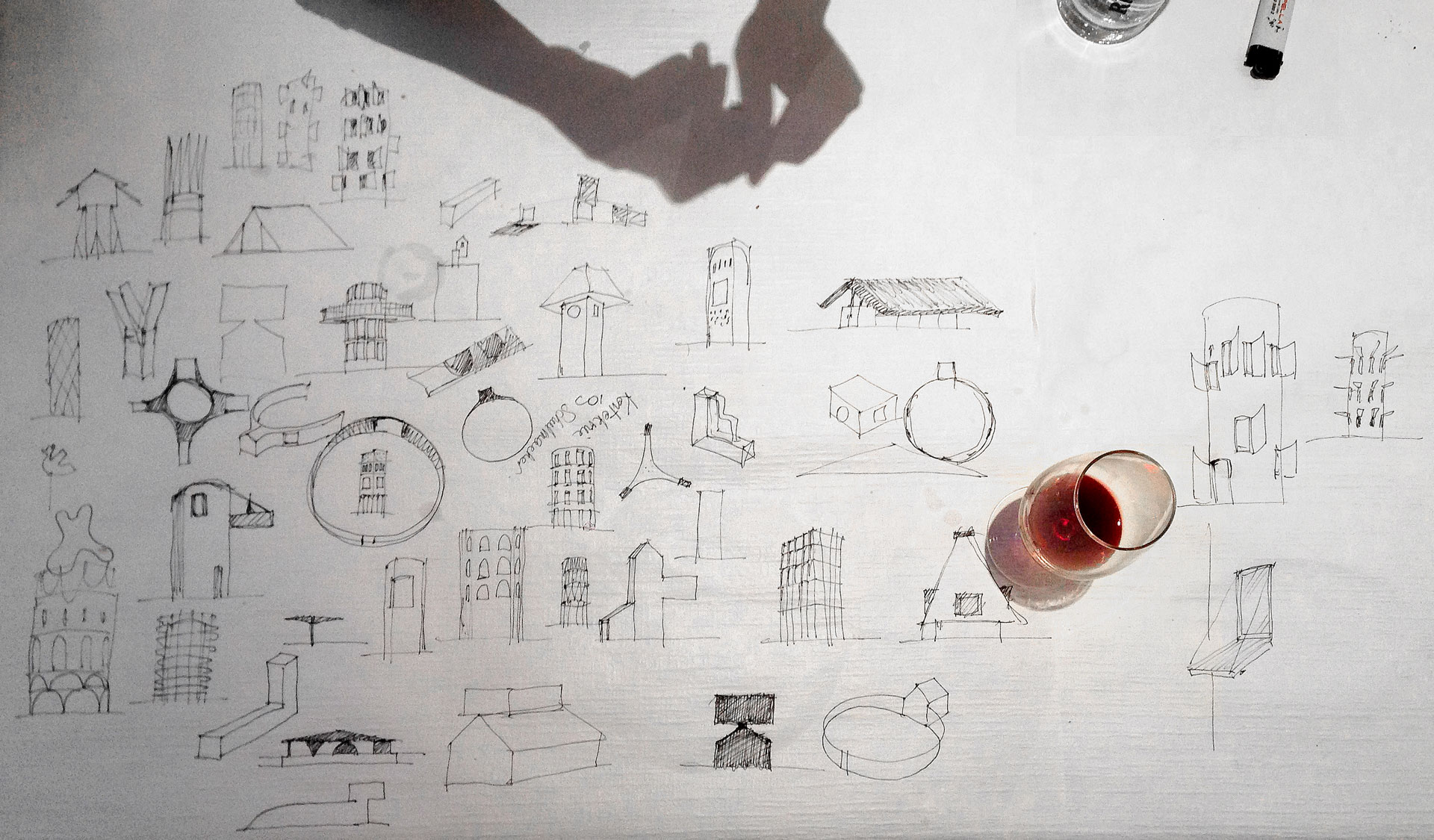
The architect Moon Hoon has been drawing the world around him for as long as he can remember. As a child he drew pictures of his neighbourhood and to this day he continuously scribbles in his ever-present companion, his notebook, drafting out imaginary add-ons to his built projects and alternative options or fantasies which might turn into architectural forms at a later point. He uses his notebook as a visual diary for his surroundings – “Sometimes I even draw my lunch in detail” – but also as “a test bed for expanding architectural possibilities to their outer limits without actually building them”. In fact Hoon goes so far as to consider his paper architecture to be as important, or valid, as his built projects.
Previous page: Moon Hoon's working sketchbook. This page: Bundang from 2014 Venice Biennale (Image courtesy Moon Hoon)
-
Moon Hoon spent his childhood in the mining town of Sangdong-eup, in Korea, and his adolescence on the island of Tasmania, Australia. He founded his Seoul-based practice Moonbalsso in 2001. Recent works include Wind House, Two Moon House, K-Pop Curve, Starwars House and Rock It Suda, a weekend retreat for a Korean rock band. Since his website does not appear to function at present, we suggest taking a look at his work here:
dodooba.com
Hoon recalls being “showered” with the illustrious draughtsmanship influences of Libeskind, Tschumi, Hadid, Gehry and Eisenman while studying architecture at Cambridge University. Indeed there are references to their styles in his work if you look closely (Lebbeus Woods and Alexander Brodsky also come to mind), yet he mixes it all up with traditional Asian styles of painting, as well as classic comics, sci-fi movies and even elements from Manga and Anime art.
Hoon’s drawings were exhibited at the Korean pavilion of the 2014 Venice Architecture Biennale and, more recently, at Chicago’s first Architecture Biennale in 2015. Anyone interested in seeing more of his drawings should beg, borrow or steal to get a rare copy of his book Doodle My Way to the Moon (2014) – which unfortunately exists only as artist’s catalogue in a strictly limited edition. I (fh)Temple of Wind. (Image courtesy Moon Hoon)
-
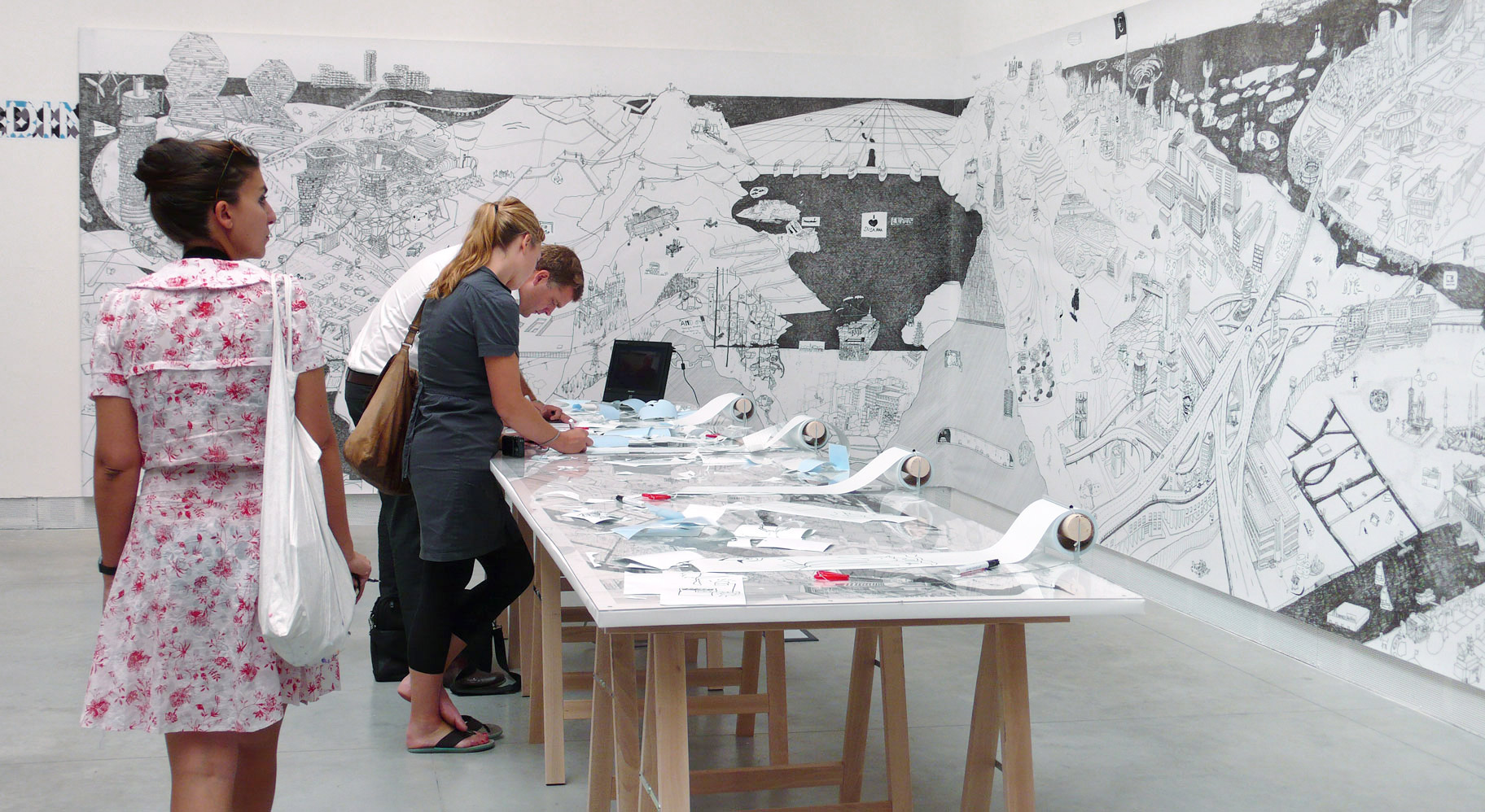
Drawn to Scale
![]()
“Architecture is not an abstract geometrical size, but something concrete that relates to our bodily experience and the world around us”, argues architect Håkon Matre Aasarød, founder of Vardehaugen. In order to replicate this bodily experience, the Norwegian studio are literally walking the line between drawn and built structures by constructing real scale drawings in their Oslo courtyard. The drawings, made of tape and chalk, are intended to convey the scale and space of their future projects in a way that traditional 3D visualisations and scaled models cannot; namely by allowing Aasarød and his team to stroll through their projects before a single mark is made on site. p (gk)
Sketch of Mountain Hill Cabin project. (Image courtesy Vardehaugen)
-
![]()
Sketching out new narrative paths using the power of the pencil
-
![]()
Architecture critic Phineas Harper, co-initiator of the recent Turncoats series of architectural debates in London (where photography is banned), reflects upon – and argues for – the continuing relevance of drawing as a critical mode of reportage.
The drawing is a wide dark rectangle tapering to a curve at one side. Within the outline, hundreds of silhouette figures are packed, rotated in places to fill the space completely. It looks like a survey of a mass grave but is something even more horrifying: the infamous plan of eighteenth-century British slave ship, the Brookes. The sharp realisation of precisely what you’re looking at is gut-wrenching. How, you wonder, could the draughtsman of this terrible image have slept at night, knowing their work was complicit in such ghastly trade? However, that very feeling of revulsion is exactly what the drawing’s creators intended – they sought not to profit from slavery but to end it.
Previous page: Drawing courtesy Refugee Republic. This page: “Stowage of the British slave ship ‘Brookes’ under the regulated slave trade act of 1788”.
-
The drawing was commissioned in 1788 by a Plymouth-based group of abolitionists who, after obtaining accurate schematics of the Brookes, enlisted an engraver to make the plan. Under new regulations Brookes was legally permitted to carry 454 slaves and the abolitionists wanted to shock the public with what that looked like. (In fact the engraver could only fit in 400 figures, making the reality of slave transportation even more appalling). The group ran off 7,000 posters of the image, after which it spread rapidly, reproduced in pamphlets, newspapers and books on both sides of the Atlantic. Both harrowing and fascinating, the drawing tapped into the public and political psyche, causing widespread outcry, ultimately playing its part in abolition.
The Brookes plan was a remarkably early and successful piece of drawn propaganda but the power of drawing to effect and document political change is enduring. Indeed, in an era of Instagram-style ubiquitous “citizen journalism” the drawing, cartoon and sketch seem to be reclaiming territory from the photograph as instruments of activism.
Refugee Republic is an interactive documentary with drawing as a means of communication at its heart, initiated by artist Jan Rothuizen, multimedia journalist Martijn van Tol, photographer Dirk Jan Visser and web developer Aart Jan van der Linden. Focusing on Domiz refugee camp in Northern Iraq but resonant with similar sites the world over, it traces four routes through the dense camp, delving into the lives of the people who call Domiz “home”. Somewhere between a film, a website and an architectural survey, the project stitches together a web of stories in an attempt to change public perceptions around the reality of long-term refugeedom.
Image courtesy Refugee Republic.
-
Video trailer courtesy Refugee Republic.
-
In June 2015, the UN reported that worldwide displacement had hit an all-time high with 59.5 million people forced to flee their homes. The resulting camps are vast, the largest among them comparable to cities – Dadaab in Kenya for example accommodates over 400,000‚ making it larger than Zurich. Yet as we continue to think of such camps as temporary stop-gaps, worldwide refugees live in some form of relief care for an average of 17 years. What it means for an ostensibly impermanent settlement to host deaths, births, education, religion and the full spectrum of human life is the subject of many books including Manuel Herz’ Camp to City (2012, Lars Müller) but rarely is it so engagingly conveyed as in Refugee Republic.
The central use of drawing is critical – Jan Rothuizen’s sketches are overtly friendly in quality. Photography and film is used selectively to tell specific chapters but the surrounding context is all drawn, with curious details annotated as if in the pages of a journal. The effect is upbeat and while the overarching political context is distressing, the authors want their audience to engage with the documentary’s protagonists first and foremost as fellow humans with backstories and passions. Through drawing they achieve something conventional multimedia reportage fails: a sensitive, three-dimensional portrait of a complex, fraught setting, raising much-needed awareness without resorting to dumbed-down narratives.
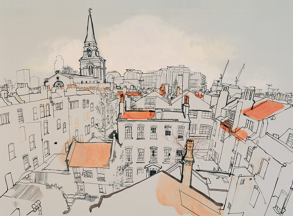
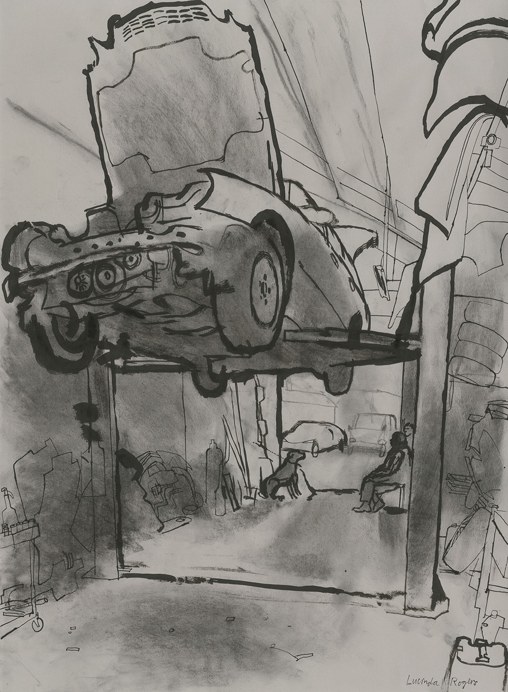
The act of drawing can be a political statement in itself. Lucinda Rogers’ large ink drawings of London’s urban realm, for instance, often focus on the working class businesses which make up the real economy – the kind of unsexy traders that waves of gentrifying property development displace. Yet what might appear through the barrel of a camera lens to be dirty and dilapidated, Rogers reveals to be thriving in messy productivity. Architect and former head of Design for London, Mark Brearley uses drawings similarly, forensically mapping every business (registered or otherwise) in an area with door to door surveys. Both Brearley and Roger’s work celebrates marginalised communities in a way that photography struggles to.
![]()
“View over Spitalfields Looking West” by Lucinda Rogers.
-
Phineas Harper is a designer, editor and critic. He is Deputy Director of the Architecture Foundation and former Deputy Editor of the Architectural Review. He is co-creator of the bombastic architectural debating society, Turncoats and author of the Magma Architecture Sketchbook (2015, Laurence King).
Some argue drawing is flawed on account of its subjectivity whereas photography is objective – Bronx-born street photographer Garry Winogrand even claimed “Photos have no narrative content. They only describe light on surface.” Yet for Bertolt Brecht writing in the 1931 Threepenny Lawsuit, photography is entirely artificial: “A photograph of the Krupp Works or the AEG reveals almost nothing about these institutions […] The reification of human relations, the factory, for example, no longer discloses those relations. So there is indeed ‘something to construct’, something ‘artificial’, ‘invented.’” Making a photograph then is just as manipulative as drawing and potentially more so because of the photographer’s invasive impact on their subject.
In recent months we have become used to seeing photographs of small boats overflowing with people trying (and all-too-often failing) to cross the Mediterranean sea. These images are terrifying and wretched yet in their ubiquity we have become numb to the suffering they capture (as Ai Weiwei’s bizarre impersonation of a drowned refugee child illustrates). The echoes of the eighteenth century slave ships are obvious but the roar of public outcry needed to secure humanitarian action seems distant. Where photography has failed to galvanise political will, could drawings, created and deployed with campinging intent, make a meaningful mark? I
![]()
![]()
Above: “Under a Mercedes”; Below:“Workshop at DW Wood Machinists”, both by Lucinda Rogers.
-
Event Horizon
![]()
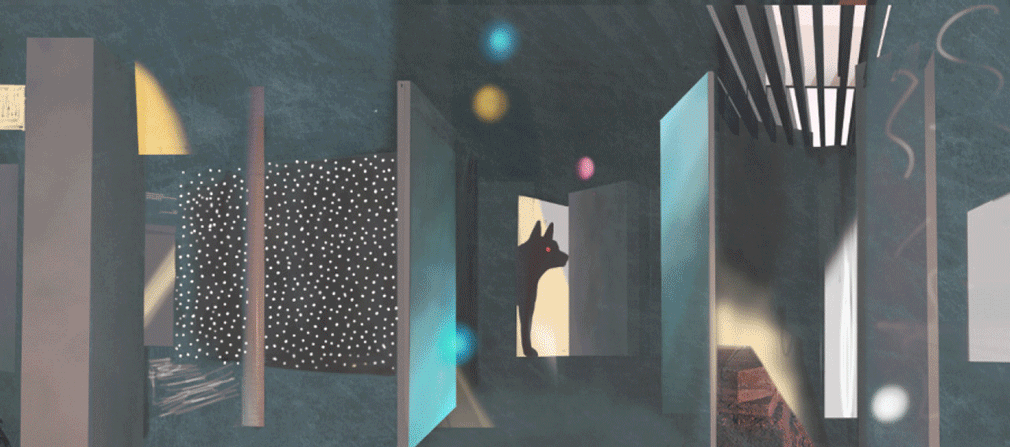
“Basically, in Manifold Garden, you’re a 3D being on the surface of a 4D doughnut,” is how artist William Chyr, the creator of these dimension-defying architectures describes the physics between the lines. Inspired by a 1953 M.C. Escher drawing entitled “Relativity”, Manifold Garden is a video puzzle game in which an alternative set of physical laws allows for the kind of architecture long frozen in place on paper to become “real”, navigable constructions. Chyr cites as his influences: “Tadao Ando for the macro aspect, the way space is divided and the larger scale structures, and Frank Lloyd Wright for all the details.” The game is due for official release in late 2016. We can’t wait. I (fs)
manifold.gardenVideo courtesy William Chyr Studio.
-
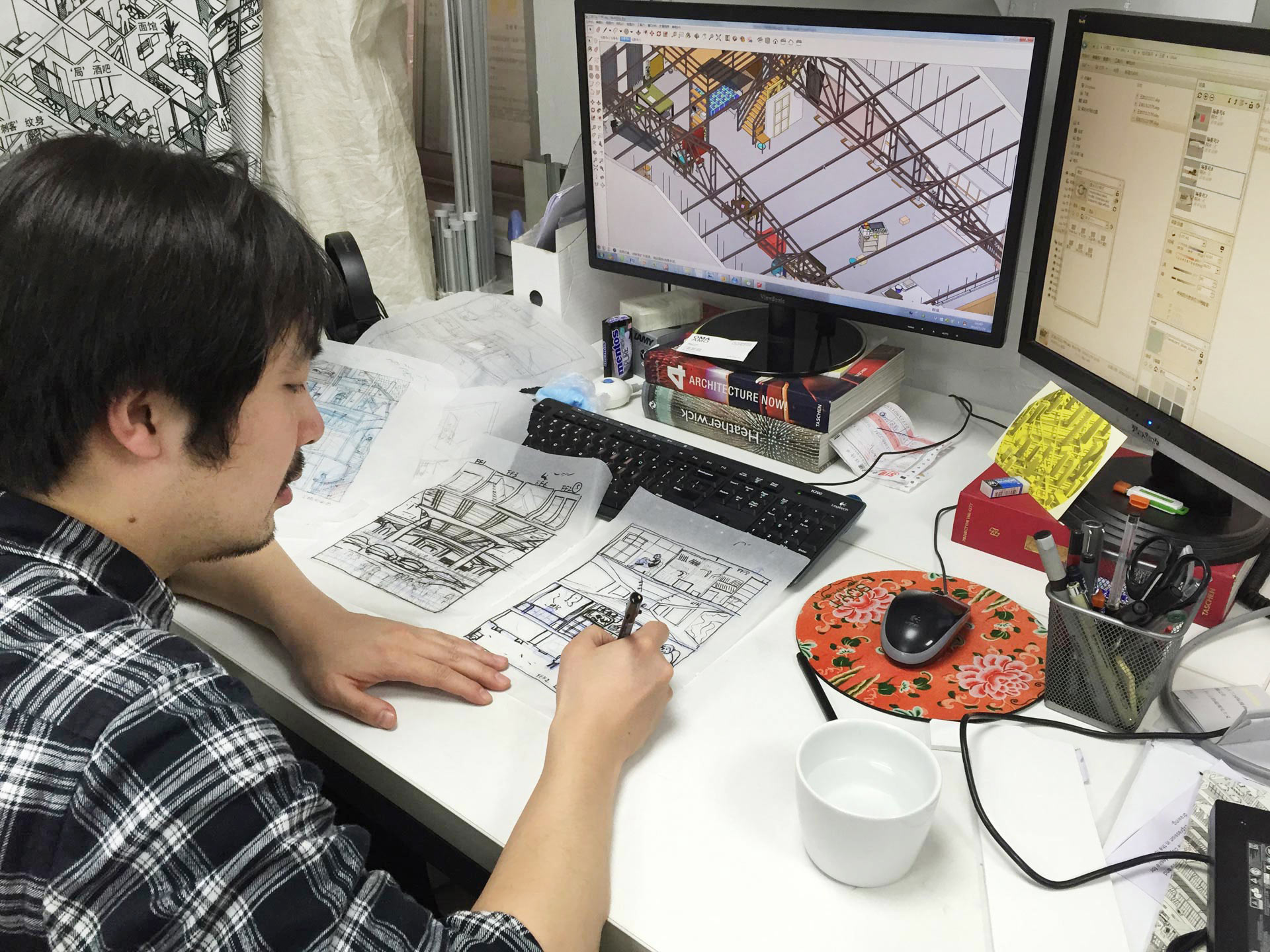
![]()
Drawing Architecture Studio
Location: Beijing, China
Founded: 2013 -
Drawing Architecture Studio does what it says on the tin. Using comic book aesthetics, as well as Zaha Hadid-inspired axonometric projections, the studio create images to portray their projects in a riot of colour and divergent angles that are at once explanatory and imaginative.
Take their Yan Yu Art Space in Hangzhou, Eastern China for instance. The studio’s drawing communicates the multi-functional nature of the venue by cutting it away into separate entities – projecting the gallery, bar and storage facilities above the main structure to show finer details – while keeping the overall scheme of the building legible at ground level.Previous page: Li Han at work. This page: detail from “A Little Bit of Beijing”. (Images courtesy Drawing Architecture Studio)
-
Founded by architect Li Han and designer Hu Yan in Beijing, Drawing Architecture Studio (DAS) is a creative platform integrating architecture, art, design, urban study, pop culture, and aiming to explore the new models for the creation of contemporary urban culture.
d-a-s.cn
Designer Hu Yan explains: “The representation of the architectural design, depiction of the surrounding environment, and layout of the drawing itself are organically integrated into one unit.”
Similar is the studio’s drawing of the Dalishar neighbourhood in Beijing. All intricacies of human activity – from bickering couples to streetside foodstalls – are packed into the drawing, framed by the low-rise residential blocks and warehouses that protrude in all directions from the city floor. It’s disorienting yet engaging; a fitting reflection of the dynamics of urban space. I (gk)Detail from “A Little Bit of Beijing”
-
![]()
Studio Weave
Location: London, UK
Founded: 2006 -
Studio Weave was founded in London in 2006. They balance a joyful, open-minded approach with technical precision to create a diverse body of work in the UK and abroad. Recent projects include exhibition design at Rainham Hall, Havering and Smith, a pavilion at Clerkenwell Design Week, London.
studioweave.com
![]()
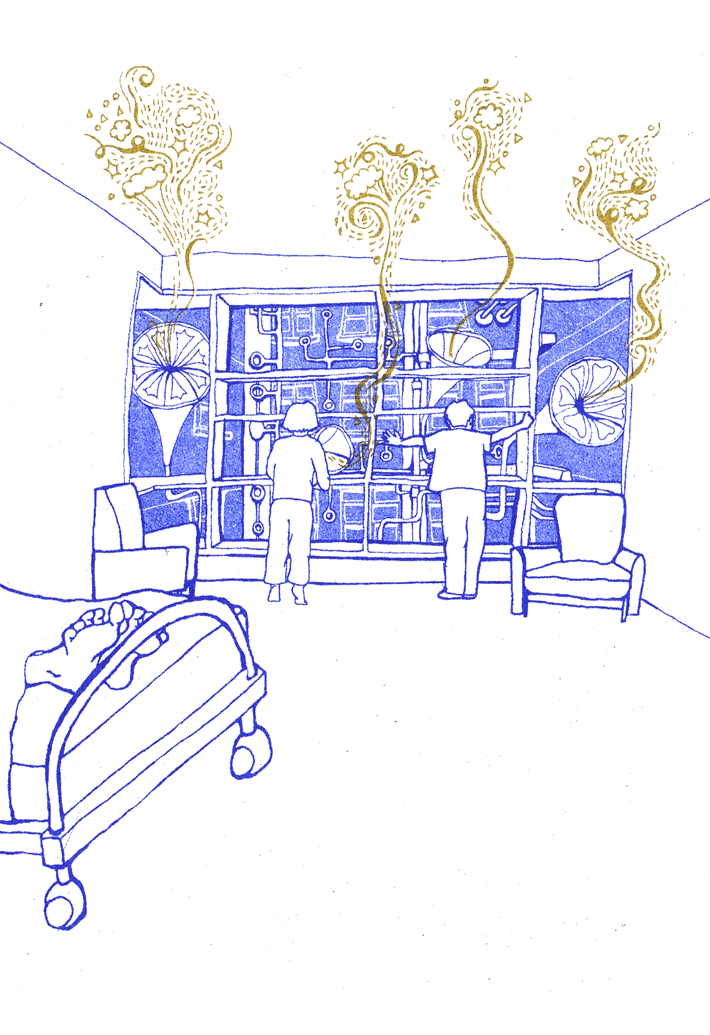
Joy and whimsy are at the heart of Studio Weave’s work. Their built projects are often manifestations of fictional tales, leaving their structures flirting between the fantastic and the functional. Freya and Robin, for instance, are two huts in northern England which represent two characters in a fairytale love story that includes the fingerprints of elves and a fair bit of skipping. Another, the Lullaby Factory, is an installation on a hidden façade of London’s Great Ormond Street Children’s hospital run by “Mr Lambert Echo and his Whispersonnel”.
Unsurprisingly, drawing is fundamental to spinning the narratives that form the bases for these built projects. So much of Studio Weave’s work plays with the imagination of children (and so-called “adults”) that their illustrations become an essential part of their architectural mise-en-scène – making visible the fictional worlds woven by the studio. “To us, hand drawing is a funnel for the transfusion of raw ideas from vapoury puffs into tangible blobs”, explains architect Amelia Hunter. Their drawing process allows for the “accidental conquests and failures” to emerge from “characterful lines of lead and masses of biro”, and eventually into “pragmatic form”. It’s all very sweet – maybe too sweet for some – but the kids love it. I (gk)![]()
Previous page: Life Drawing (in a car park). This page: Sketches for the Lullaby Factory, London. (Images courtesy Studio Weave)
-
![]()
![]()
![]()
![]()
-
Narrative Illusions
![]()
From mannerist illusions on the ceilings of ancient palaces to extrovert embellishments on PoMo facades, the painting technique of trompe l’oeil has provided popular visual entertainment since the age of the ancient Greeks. California-based artist John Pugh is something of a modern master. The idea for his giant 1980 mural “Academe” at his alma mater, the Chico State University, came to Pugh in a dream as he obsessed about how to depict the ancient roots of the Greek educational systems that underpin modern educational models. “Ultimately” says Pugh, “the goal is to conjure fresh feelings and perceptions, and evoke a sense of connectivity with the mural, within us, and the world around us.” p (sl)
Image courtesy John Pugh.
-
![]()
The graphic passions and drawing foundation of Sergei Tchoban
-
uncube’s indefatigable interviewer Rob Wilson spoke to the Russian-German architect Sergei Tchoban, founder of the Tchoban Foundation and Museum for Architectural Drawing in Berlin, about his passion for the haptic of the hand-drawn.
All images courtesy of the Tchoban Foundation. Previous page: Ivan Leonidov, detail from “Design for the United Nations building” (1947-1948). This page: detail from Alexander Brodsky’s “Landscape” (1995).
-
Where does your fascination with drawing and architecture come from?
I came to architecture through drawing. When I was a child what I always loved drawing spaces and textures – and creating within those drawings new abstract forms. Then when I started studying drawing at the Academy of Arts in St Petersburg, I noticed that what I found most enjoyable was drawing my built surroundings. Only later did I come to realise that I was also interested in building.
What do you like about the act of drawing?
For me drawing is like a language through which I try to understand and talk to myself about what I like or where my focus is. It’s a means to finding my own language.
Detail from Hugh Ferriss’ “Founded on Insurance” (c.1929).
-
In your own work as an architect how does drawing feed into your built projects?
It is complementary to them: for me drawing and building are two more or less parallel roads. I often draw just in order to create a drawing and often in designing a building I would not necessarily produce a conceptual drawing for it. But with the Tchoban Foundation’s museum building I specifically made drawings to explain the idea. A good building is a good building and a good architectural drawing, a good drawing. They can connect but not necessarily.
When did you start collecting architectural drawing and which was the first one you bought?
It was fifteen or sixteen years ago. There’s an old auction house called Galerie Bassange, in Berlin: a very traditional one for drawings. I opened the catalogue and saw a wonderful drawing by Pietro Gonzaga (1751-1831), a very important stage designer for La Scala in Milan in the second half of the eighteenth century, who later emigrated to Russia. There he designed a lot of important theatre installations and even some architectural projects. I saw the drawing, loved it, and it was the first one I bought.
How large is your collection of drawings now?
Not so large. The Foundation’s collection is maybe 1,000 pieces and my own collection about 200 pieces.
Is there are any type or period that you are most interested in?
In my private collection, the drawings are mostly from the end of the eighteenth century and beginning of the nineteenth century, while those at the Foundation are from the twentieth and twenty-first centuries.
Façade detail of the Tchoban Foundation Museum for Architectural Drawing in Berlin. (Photo: Roland Halbe, courtesy Tchoban Foundation)
-
Why did you decide to create your own foundation and museum for architectural drawing?
Well the major step was just thinking: if drawing’s so interesting for me, I’d like to be able to show how interesting it can be to lots of other people too. So I created the Museum as a platform, not only for the Foundation’s drawings, but also for other museums such as the Sir John Soane Museum in London and the Albertina in Vienna to exhibit their drawings too. By providing the perfect conditions for drawings, the building enables exhibitions that many larger institutions often can’t hold, even in their own museums, where drawing shows are often sidelined.
Tell me about the building’s design and its façade with its clear representation of drawing inscribed on the outside.
The concept was to try to explain the function and contents of the building through its skin; and the idea was to reflect the drawings in my collection on the façade, so the marks on it actually come from that first Gonzaga drawing I bought. I like the depth to the skin that it gives, which also comes from my wanting to give the architectural form a type of hapticity that often got lost in the twentieth century; so the building’s detail will get more interesting as it ages.
Gonzaga, Pietro di Gottardo, “Set Design. Arcade with a Flat Roof on a antique Town Square” (detail), (c. Early 19th century).
-
Is this quality of physicality and texture also what attracts you to hand drawings: the interest in the thing itself, in the actual object?
Yes, I am very interested in the haptic nature of a drawing.
So how do you view digital drawing; are there some digital drawings that you admire?
I don’t collect digital drawings. But of course I think it’s a very important tool and technique, not only as an aid to accuracy in drawing or rendering a building and its surroundings but also of course for free compositions made on the computer – like MVRDV’s Pig City for example – something not designed to be built: a type of computer fantasy which I really like. But that’s not the focus of the Foundation, and for me it’s not real architectural drawing. It’s an architectural fantasy, like in a Jacques Tati film, but not a drawing.
Do you think it’s problematic that architects rarely now hand draw to design? Has this changed the way they design?
No, I don’t think it’s a problem. Everybody has their own way of creating work: just as not every artist paints today. There are still very good artists, as good as in the past, but only some of them are painters.
Detail from Sergei Tchoban’s “Design for the Museum for Architectural Drawing in Berlin” (2010).
-
Sergei Tchoban (*1962) is a Russian/German architect. He studied architecture at the Imperial Academy of Arts in St. Petersburg before moving to Germany in 1991. In 1995 he became managing partner of the nps tchoban voss office in 1995 and headed the Berlin office. Since 2015 he is the leading partner of the office together with Ekkehard Voss. In 2006, he also founded the SPEECH architectural office together with Sergey Kuznetsov. In 2009 he founded the Tchoban Foundation - Museum for Architectural Drawing.
Tchoban’s graphic works have won numerous prizes and have been exhibited in leading galleries and museums throughout Europe, and there are several monographs devoted to his drawings, including one by Image Publishers (2013) and Skira (2015).
He was twice curator of the Russian pavilion at the Venice Biennale of Architecture: in 2010 with Russia Factory and in 2012 with i-city/i-land.
tchoban-foundation.de
So the digital just provides further tools for people to use to express themselves?
Yes exactly, to make their own fantasy…
You have your own large architecture practice too. How do you manage to run the Foundation too?
Being the creator of this Foundation is a part of my practice as an architect because for me architecture, architectural drawing and popularising architectural drawing are three parts of the same thing. Of course it takes time but if it is part of your life, of your interest, it also makes for a lot of fun. I
-
Planes & Elevations
![]()
The year is 2028. China controls 90 percent of the Earth’s mineral market and has just founded the Lunar Economic Zone, joined in physical space and economic partnership by a 10,000-metre tall space elevator to Shenzhen. That’s the fictional background to this lush animation, produced by creative coder, animator and spatial designer Zhan Wang for his 2014 diploma project at the Architectural Association in London. Framed as “an Olympic opening ceremony style media report”, the 2028 Lunar Mineral Parade depicts not only speculative architecture but also speculative geopolitics. It’s not strictly pen and ink work but this animation marks a stunning step up in visionary megastructure illustration aesthetics – plus it includes the best space elevator design we’ve seen to date. I (fs)
zhanw.workVideo courtesy Zhan Wang.
-
![]()
What can a set of lines on a map possibly tell you about that most complicated of human systems: the contemporary city? In the case of those drawn by Larissa Fassler, a huge amount. The Canadian artist’s consciously subjective work is influenced by the urban exploratory practice of psychogeography first spearheaded by the Situationists in the 1950s.
Images courtesy Larissa Fassler
-
She spends days on end at a location, documenting by hand what she sees before her, from passing cars to music spilling out of open windows, notes on temperature, rainfall and shadows and even which street corners smell of urine. Her maps provide not only a body of information that evokes urban space, but also serves as an accurate representation of place. Seen here are Fassler’s 2008 and 2010 mappings of the Neues Kreuzberger Zentrum in Berlin, built in 1974 as part of an urban regeneration plan that was never completed. See more of Larissa Fassler’s documentation of Kotti on the uncube blog. I (fs)
-
![]()
A city of shadows as architectural fiction
-
![]()
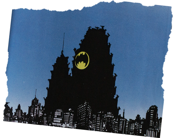
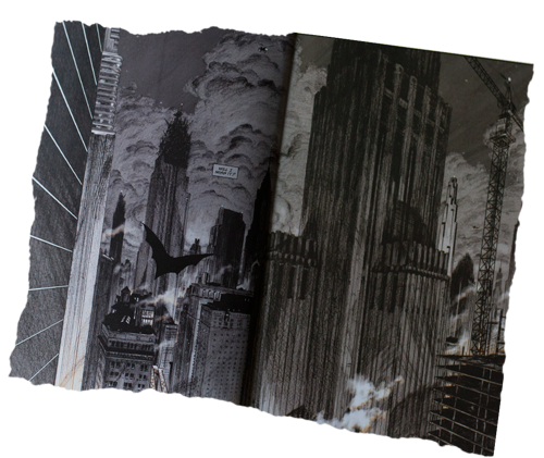
Beginning as the sum of some lines on a page, buildings usually take on a life of their own when manifest in physical form. But there are cases when whole cities manage to do that without ever having left the paper. Elvia Wilk braves the noir shadows that are the haunt of a certain nocturnally inclined caped crusader to explore a fictional city captured in ink by several generations of comic book artists. A city that very much exists in the collective memory and imaginary of millions: Gotham.
![]()
![]()
Visions of Gotham: Frank Miller, Klaus Janson and Lynn Varley (1986); Greg Capullo (2012); Chip Kidd and Dave Taylor (2012); Juan Ferreyra (2015) . Collage by Janar Siniloo.
-
In The Dark Knight, the second movie of Christopher Nolan’s high-budget Hollywood trilogy resurrecting Batman’s classic storylines, the masked hero announces during the final climactic scene: “I’m whatever Gotham needs me to be.” From Batman’s earliest comic book days in the 1940s to the multimedia DC franchise in the twenty first century, the caped crusader has been synonymous with his city. Gotham is the place he loves and protects, and it’s also the place that constantly thwarts his heroic attempts.
The nickname of “Gotham” was applied to New York City long before DC Comics picked it up. The moniker was first introduced by the American author Washington Irving, who used it jokingly in reference to a village in England of the same name, said to be inhabited by “fools”. In other words, Gotham is the fool’s New York, the city of two-faced con artists and tricksters perhaps best personified by Batman’s arch-adversary the Joker. The architecture of Gotham, as depicted by countless comic book artists, represents and relies on the sinister aspects of early Manhattanism, the shadowy side of those grand visions of what a city could and should be. As DC Comics artist Frank Miller is reputed to have said: if Metropolis (the home of Superman) is New York by day, then Gotham is New York by night.![]()
![]()
-
Detail from “Founded on Insurance” by Hugh Ferris (c.1929). (Image courtesy the Tchoban Foundation)
-
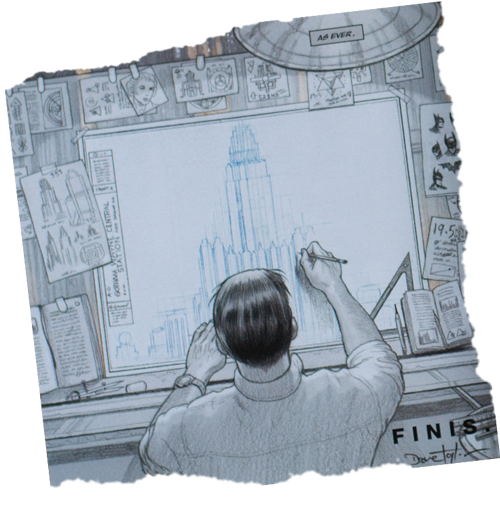
It was the striking early twentieth century drawings of artist Hugh Ferriss that in many ways planted the seed of the collective visual imaginary of Gotham. In his artwork one can see a certain link between Batman’s city and the residues of modernism. Ferris, who originally wanted to be an architect, was disappointed by the lack of ideological purpose in the profession, and he decided to become a renderer instead, drawing his future ideals instead of dwelling on contemporary realities. In the early 1920s he moved into an artist studio and was creating not only renderings for architectural offices in his soft, blended Conté crayon style, but dramatic visions of Manhattan on oversized canvasses.
The effect of Ferriss’ aesthetic cannot be underestimated – not just on the DC Comics universe, but on urbanism itself. Rem Koolhaas went as far as to call his idea of space the “Ferrissian Void”, a phantasmagoric envelope for any design vision (or superhero storyline) to be projected upon. But Koolhaas also called Ferriss “Manhattanism’s automatic pilot”, and even “the Master of Darkness”– a blind devotee of modern architecture whose art “remains subconsciously critical”. What Ferris thought he was showing (the brilliant utopian future) was not what we see now in his work, and which has since been picked up on by generations of comic book artists: a steamy dystopian zone where covert action goes down in back alleyways, the negative spaces either misused or unaccounted for by the master planner.![]()
![]()
-
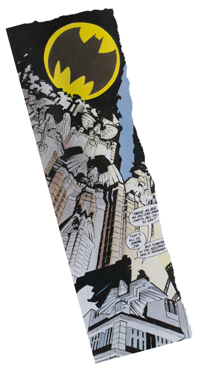
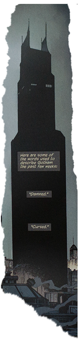
Ferriss’ expressionistic sketches tell us what modernism was meant to feel like – monolithic, singular of vision, maximal, and unadorned – but Batman’s Gotham is no modernist city of glass and steel. It’s uneven and post-industrial, with neoclassical remnants of crested, crumbling brick façades wedged alongside gleaming skyscrapers. It is undoubtedly a city where the authorities haven’t been able to control growth, and the modernists haven’t won out against the rise and decline of industry or managed to erase the layers of architectural history. Batman’s Gotham may be highly futuristic, but it’s also deeply nostalgic.
Though Gotham is a clear expression of Manhattanism gone rogue, the question of whether Batman’s city is indeed New York is hotly contested. Some, like comic book artist Neal Adams, think Chicago is a more likely urban comparison, with its varied architecture and gangs of mobsters. Others see in the geography a clear echo of Newark, New Jersey. (Christopher Nolan shot parts of The Dark Knight Trilogy in all three of those cities.) But as most comic book aficionados understand, Gotham is both nowhere and everywhere: it is not a city or even the city as such – it is the shadow of the city. It is the metropolis that, despite all efforts, cannot be planned or accounted for. The best artists of architecture, from Piranesi to Ferriss to Lebbeus Woods, have all shown us ideals of architecture not in presence but in relief, in the shadow of the image. It is only by being shown the shadows of our possible futures that we are able to decide whether we want to build them or not. I -
![]()
Raumlabor
Location: Berlin, Germany
Founded: 1999 -
Each project by raumlaborberlin is based upon the idea of collaboration. This involves changing formations within their office for each project, as well as bringing in external experts and involving future users, neighbours or inhabitants of their architecture as early in the design process as possible. Within this broad, participatory method – that aims to include laymen and professional planners alike – hand drawings have become one of the key communicative tools. They help to make ideas visible and plausible to a wide audience and build the foundations upon which the discussions and visions of the collective can actually be developed.
In their 18 years of practice, raumlaborberlin have developed a remarkable style of architectural drawing, executed collectively and by hand.Previous page: Stick On City at the Venice Biennale 2011. This page: World Fair poster, 2012. (Images courtesy raumlaborberlin)
-
Raumlaborberlin was founded in Berlin in 1999 by a group of friends who happened to also be (mostly) architecture students. It continues to be a collective with changing collaborators, although current members of the collective are Andrea Hofmann, Axel Timm, Benjamin Foerster-Baldenius, Christof Mayer, Florian Stirnemann, Francesco Apuzzo, Frauke Gerstenberg, Jan Liesegang and Markus Bader.
raumlabor.net
In a style somewhere between Yona Friedman, Archigram and Keith Haring, they mix quick sketches, pop-art collages, storyboards, comics and utopian drawings of extraordinary structures. It is important to them that these drawings do not focus on the built structures alone, but also on what’s happening within and between them; i.e. their architecture acts as a backdrop to human actions.
The imperfection of their drawings, even when showing completed projects, makes it clear that raumlaborberlin don’t pretend to offer fixed solutions to spatial problems. Rather, they point out problems and potential opportunities to activate the users of urban space towards collective action. I (fh)raumlaborwelt, 2008.
-
![]()
KOSMOS
Location: New York, Moscow, Basel
Founded: 2012 -
![]()
Kosmos is a young “virtual practice” that relies heavily on the process of drawing in order to understand a project. “Drawings are like the first reality checks”, says partner Leonid Slonimskiy, “You learn from the sketch, you continue with a more detailed image, refine it, and so on, until it gets built in reality.”
The drawing process also serves as a form of communication for the team’s four partners who, despite all being Russian, work in architecture offices scattered around the globe: in Basel, New York and Moscow. Beginning with fast, dirty sketches, the team find and communicate the concept and shape of a project together, before using more detailed sketches to finalise materials, techniques and colours.Previous page: Kosmos at work. This page: Working sketches for exterior and interior of EMA cultural centre in Moscow. (Images courtesy Kosmos)
-
K O S M O S Architects is a virtual office, which collaborates from different continents and brings together 4 partners who are based in New York, Moscow and Switrzerland. The office designs projects of all types and scales: from a door handle to a city; from hardcore architecture to pop-up art installations. K O S M O S combines art and technology, global experience with respect to local context, European professionalism and Russian drive.
k-s-m-s.com
The resulting images are charming yet precise. The progression of ideas is clear in drawings that become increasingly populated with detail; as though the illustrations themselves – such as the EMA, a pop-up art space in Moscow – are under construction.
The studio’s images for a proposal for the Hans Christian Andersen Museum in Odense, Denmark (which won first prize) are equally dynamic. Shown from multiple angles and in different levels of detail, the project comes alive with a fairytale force – way more exciting than your average render. I (gk) -
![]()
![]()
![]()
All illustrations by Klaus.
-
![]()
-
First things first: You're an architect, aren't you? Or at least you studied architecture at some point.
Yes, I've been a registered architect for about 15 years now. I'm getting over it, though.
I'm well aware that there are very elastic boundaries between architecture and (let’s say) beyond, but how does cartooning fit into your practice?
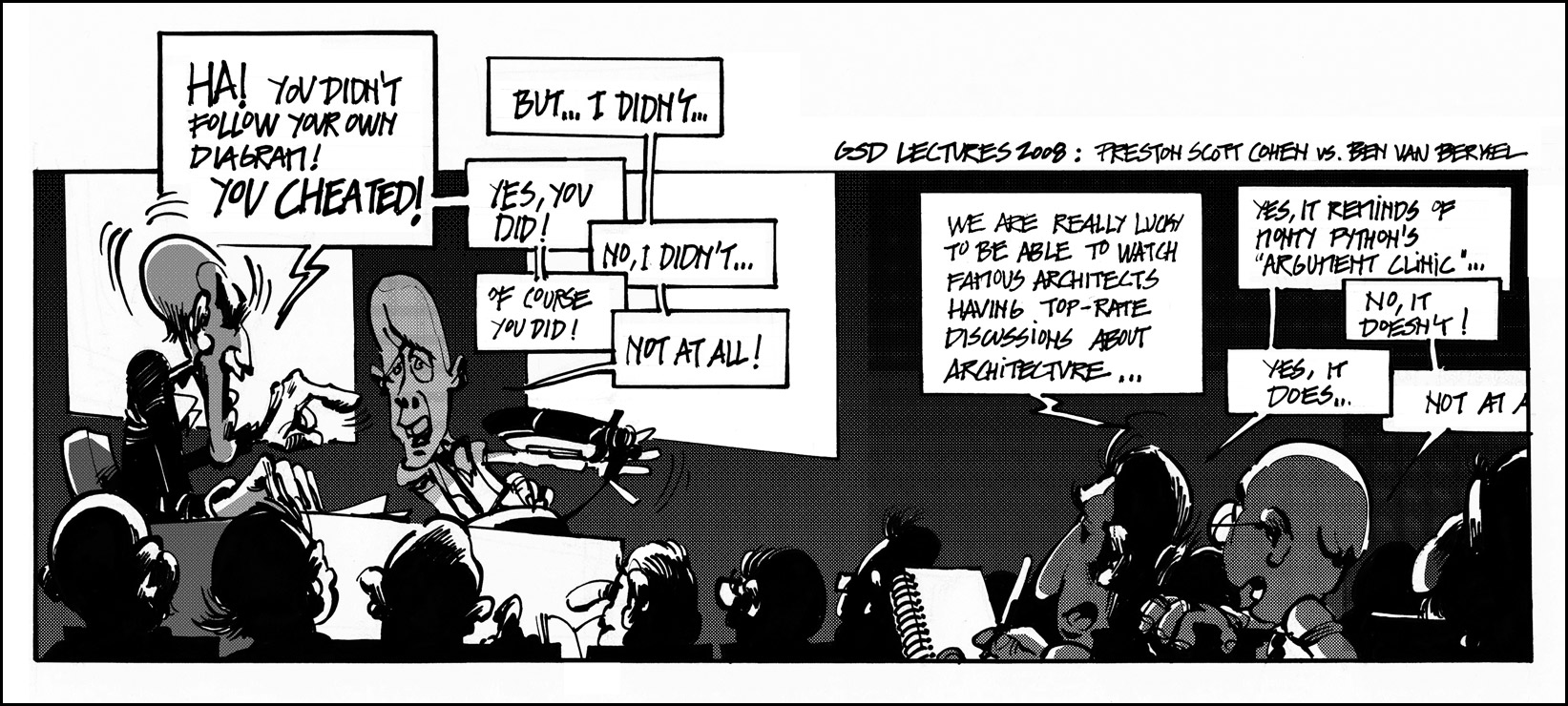
It started when I was at the Harvard Graduate School of Design (GSD). I was about to start my PhD dissertation, which meant I was desperately looking for excuses that kept me away from it, and the GSD was a great provider of those: you had all these vedettes walking around, lots of stressed students living in their pods, loads of models piling up... it was eminently cartoon-isable. Then, one day Preston Scott Cohen had a hilarious conversation/argument with Ben Van Berkel, and I thought: “ok, I have to make a cartoon of this”. And that was that. Thanks, Preston. But, going back to the elasticity you pointed out: yes, there is definitely a lot of disciplinary promiscuity nowadays, due to the decrease in “traditional architect” work. However, I think that the 2008 crisis exposed something that has always been there. Historically, if you had drawing skills and were good at maths, you were often automatically directed towards architecture, so over time, many learnt to vent their artistic urges through architectural design... sometimes more successfully than others. I think that nowadays, many people with an architectural background are just exploring the intersections between architecture and passions they sublimated through architecture, or some other ones they discovered at architecture school.
What does it mean to be an architect, then?
Many things. Many different things, that's the point. And you don't necessarily have to be all of them. In fact, you cannot be all of them. Whenever someone brings in that idyllic metaphor of “the architect as an orchestra conductor”, I feel the urge to ask the speaker to point me towards all these orchestras waiting to be conducted. The profession – and even the discipline – is changing and we need architects specialised in different fields, or people with an architectural background in other professions.
Is that the reason why starchitecture is usually the target of your satire? Because it represents this malign understanding of the architect?
Well, yes, but also because it’s so easy to make fun of. Egocentric characters have great comedic potential, and architecture education teaches you about narcissism. Also, we love trashing those who are more successful than us at – what we’ve been told is – our own game.
-
![]()
-
So you believe in the idea of the architect as critical thinker or provocateur?
There are cases we all know where the simple ability to think would be asking too much. But yes, I do believe in the architect as an intellectual. The main problem is that we are usually taught to work with evocations: architects are great at appropriating concepts, images, strategies from other disciplines and turning them into form or discourse. This is an attitude that many of us take into whatever we do, so our approach to everything tends to be very superficial: just a hint at the surface and we begin to extrapolate. That’s why architects usually make mediocre poets and terrible philosophers (I think I'm making many friends today).
I remember listening to Peter Eisenman ranting once about the lack of “close attention” paid by today’s students; however, I think that’s something endemic to the profession. Derrida himself thought that Eisenman’s approach to deconstruction had nothing to do his own understanding of the concept. I like architects thinking out loud, but most of the time they’re just posturing, and bleating the same archibabble – or recombinations of it – again and again.
What you do in your role as a cartoonist, or caricaturist, is a quite blatant form of criticism, so are you not just hoisting yourself with your own petard?
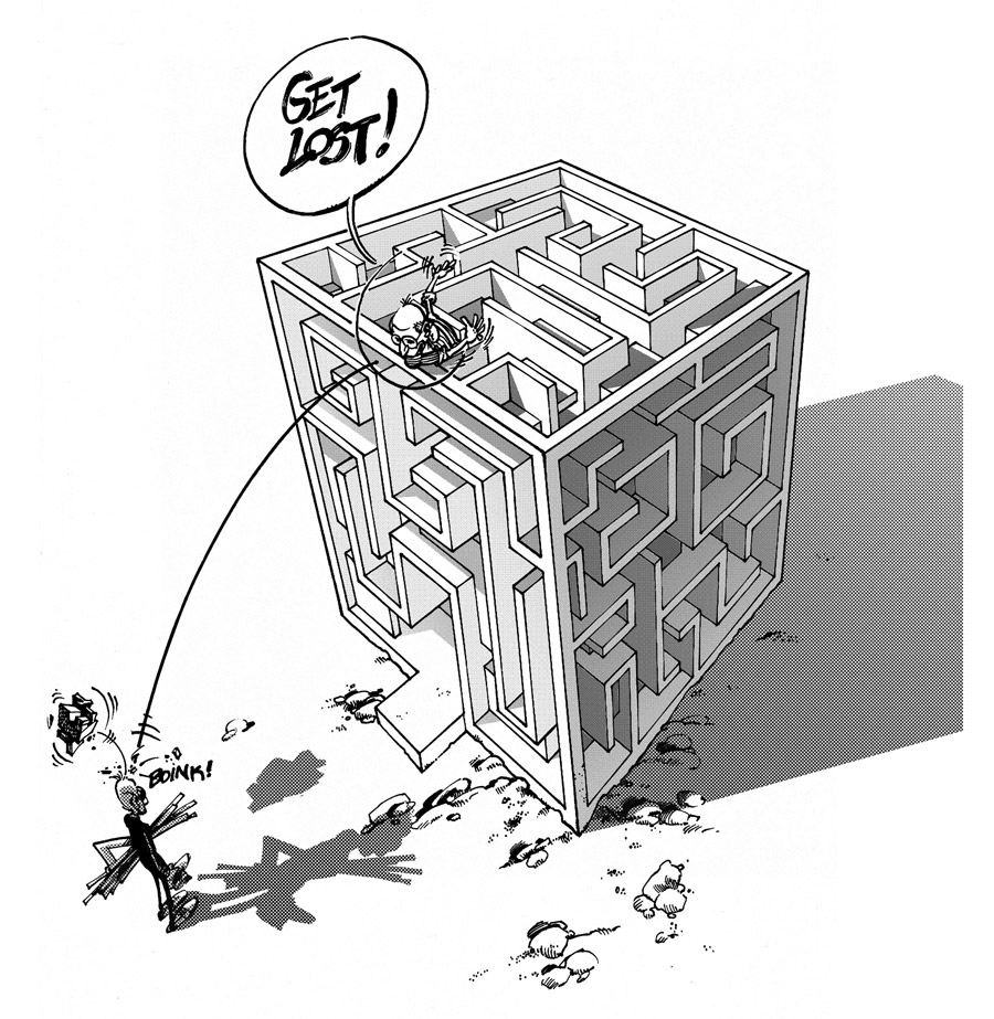
There’s a critical attitude behind it, that’s obvious. However, I’m not trying to provide constructive criticism. I’m not even trying to be fair. There is no consistent attitude, or overall unifying discourse: I’ll criticise one thing and then its opposite. It’s all about having fun. I think you mentioned the word “jester”, at some point, which is pretty accurate, because jesters’ humour can be self-deprecating, if needed, and they are also great pranksters.
So, anything goes in your view including offence, if necessary?
Sure, although I think my cartoons are very tame, usually. Of course, I come up with much harsher stuff, but I don’t have the time anymore. My current collaborations take up most of my spare time, so I have to choose. And, believe me, you wouldn’t want to publish the things that creep inside my head. So, there: I sold out. I’ve always been very partial to money.
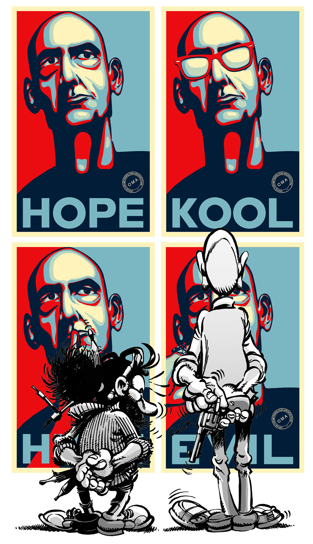
![]()
The “Kunst Haas” series, made just after the US presidential election of 2009. “Shepard Fairey hasn't sued so far” says Klaus, and hopefully Mr Koolhaas has a good sense of humour.
-
![]()
“Eisenmania, or the Corruption of the Modern” (February, 2010). One of Klaus’ many takes on Peter Eisenman and his trademark obsessions.
A colleague of yours, Jimenez Lai, said that humour, parody and exaggeration can also be very productive as form-givers, that one can tread new paths through exaggeration.
Oh, absolutely. We are not born as abstract thinkers, so we obviously learn through imitation, by copying. Some people may have abstract minds, but most of us rely on reactive mental processes, so we react to what we are shown either by copying it, negating it, twisting it (that's when caricature enters the equation). What’s interesting to me is that, if you copy something sufficiently poorly, or you take exaggeration too far, it becomes something different. Double meanings work very in much the same way: humour is mostly based on twisting words, or looking at things from a deliberately twisted angle, which may provide new, interesting perspectives that you would not come upon through realistic, or fair thinking.
I see: the hyperbolic distortion machine, architectural caricature and distortion as a design force. You’ve spoken elsewhere about the “suspended reality of the cartoon” as a freeing design environment. You certainly have a penchant for fantastic architecture/architecture of fantasy. In contrast, in your architect persona, do you experience designing actual buildings as a straight jacket?
Not a straight jacket so much as a task that requires too much effort in my case. Designing on a paper or with models and actually building something are related but they’re not the same thing and you have to be willing to invest a lot of energy. I’m less and less interested in it as time passes. However, built architecture can compensate for all the things you lose when working in the free rein of theoretical design. That said, unbuilt, or even unbuildable architecture, paper architecture, visionary architecture, whatever you want to call it, does encapsulate a inexhaustible capability for fascination. Many of us have a penchant for the visionary (not utopian, please) proposals of the 1960s, and the megastructural scene, in general. And, of course, it has to do with the fact that it was never (supposed to be) built. Almost 20 years ago I remember drooling over Zaha Hadid's book The Complete Buildings and Projects. Each of those crowded drawings suggested so many possibilities... Then she started building, then AutoCad entered her office, and that was that. Except for her stadium in Qatar – that was excellent cartoon fodder.
-
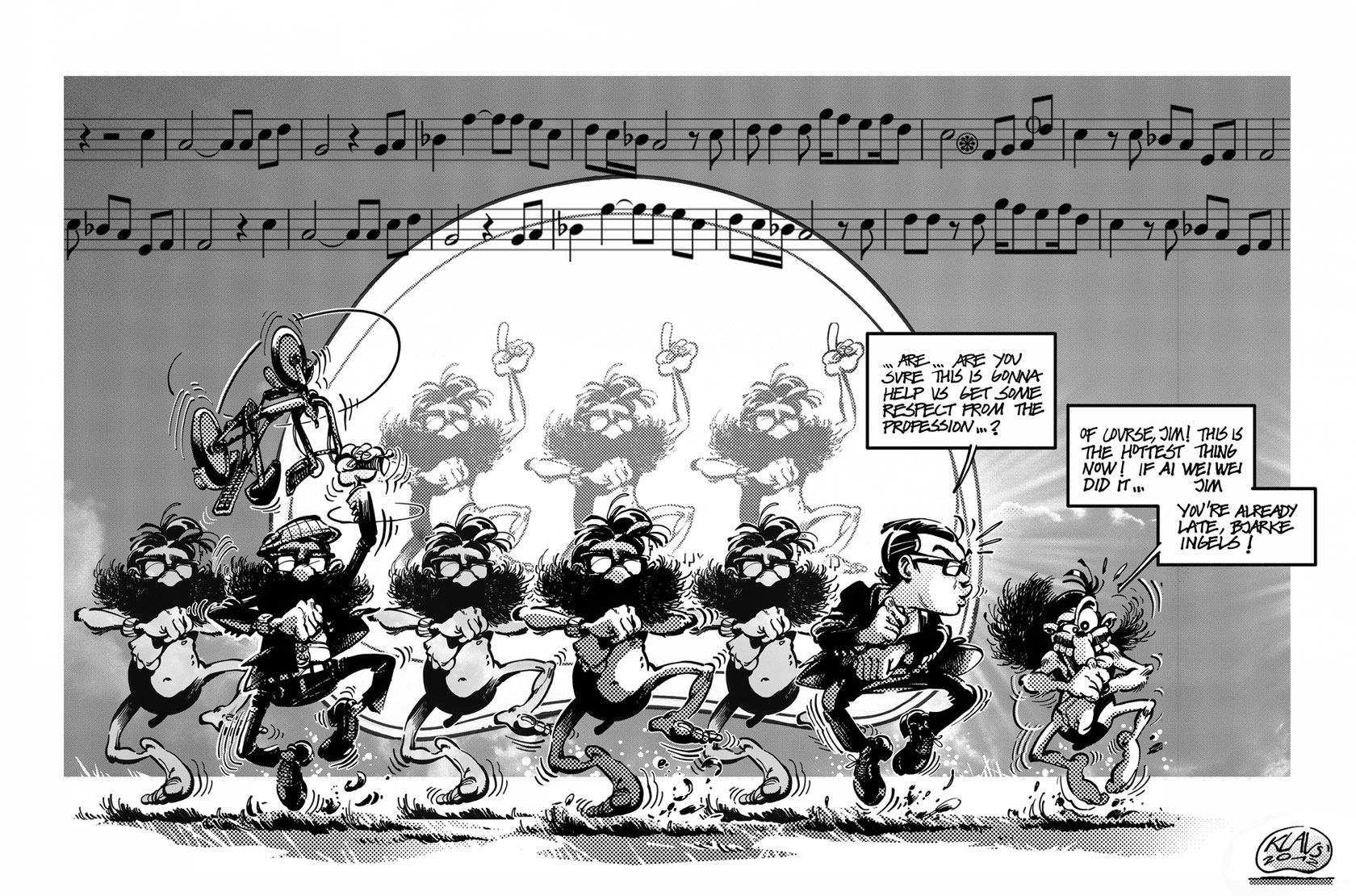
![]()
Klaus and Jimenez Lai (also featured in this issue) dance along with a bunch of Reyner Banham clones in front of the Environment-Bubble, another recurring image in Klaus’ cartoons. ('Banham Style', 2012)
-
Does being a great draughtsman make you a better architect?
No, I don’t think it does necessarily. Obviously, you need certain graphic skills to represent architecture. Also, sketching is a great way to organise and visualise your thoughts. However, having impressive graphic abilities doesn’t guarantee an equal capacity to design impressive architecture. Being too enthusiastic about drawing can even be counter-productive: a beautiful plan does not necessarily produce a good building, and if you’re too focused on making the drawing look good you may take decisions that work well for the plan as a drawing, but not for the building itself.
-

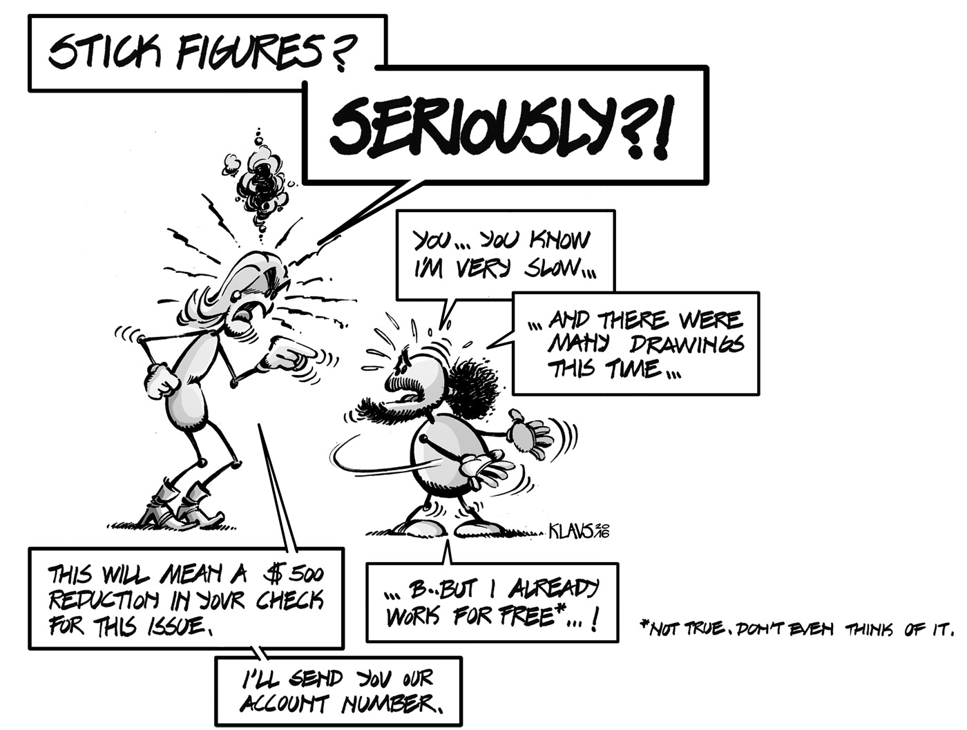
Klaus is a frustrated cartoonist who lives in an old castle in Europe, intermittently uploading his cartoons in Klaustoon’s Blog since 2009. Much to his surprise, his work has been featured in architectural publications such as A10, Arquine, The Architectural review, Clog, Harvard Design Magazine, MAS Context and Volume, among – he stresses – many others. It has also been exhibited in places such as Barcelona, Cambridge, Chicago, London, Naples, New York, Portimao, or, most rejoicingly, OMA’s canteen. He has been the in-house cartoonist of uncube since issue 7.
In his other life, he is also an architect, architectural scholar and university professor. His work, mostly focused on the unbuilt and the history of the image of the future, has found publishing within the same established media he mocks.
He is not Rem Koolhaas.
(Photo © Simone Florena)
You have been drawing under the Klaus moniker for about 12 years now. Why the pen name? Does anonymity simply give you freedom to be more critical? Or is it a way to keep different jobs in different boxes?
Both, actually. “Klaus” is an anagram of my given name. When I started publishing comic strips in an local architecture magazine, I thought it would be a good way to avoid compromising my real name with less-than-serious stuff, because I was also starting to produce academic work. Years later, when I took it up again and went online, people started contacting me as Klaus, and I started writing under the Klaus persona. I enjoyed the freedom it gave me, but also the fact that it had a very distinct voice from my official, academic fare. So I kept both personalities. We get on pretty well, as a matter of fact. And it provides nice threesomes, too.
What does Klaus’ “old castle in Europe”, where he lives, look like?
Oh, when the crisis struck, the bank took it from me. I think they’re selling it to install an Apple store.
One last question: Are you Rem Koolhaas?
No. He’s much taller. I
![]()
Klaus takes advantage of the liberties of the jester to the full even when it comes to biting the hand that feeds [ed.].
-
Wall-to-Wall
![]()
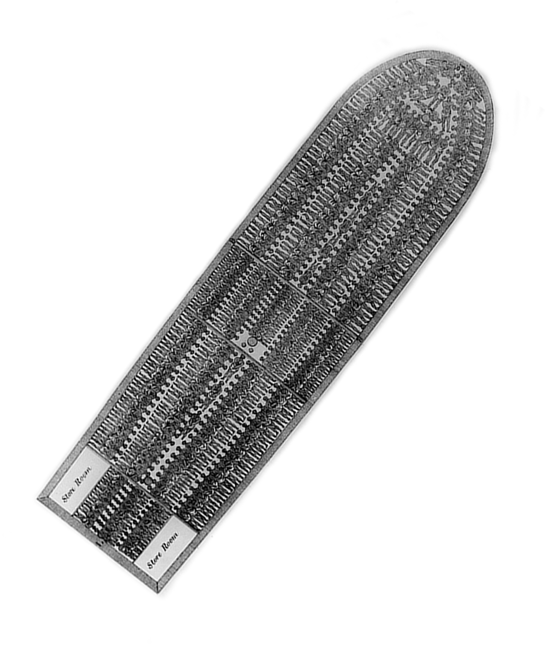
By the early 1990s, Kowloon Walled City in Hong Kong was the densest place in the world with 50,000 people packed into its 2.6 hectare area. The city was demolished in 1993 but not before a group of Japanese researchers, under the leadership of cultural anthropologist Hiroaki Kani, undertook the marathon task of documenting its hive-like interior. The result of their survey was a book (sadly only in Japanese) containing this mind-bogglingly detailed cross-section illustration by Kazumi Terasawa. Take a look at our exploration of the drawing; ten points for those who spot the handstander, the “gentlemen’s club” and the small figure relieving himself from a rooftop. p (gk)
-
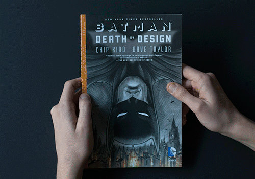
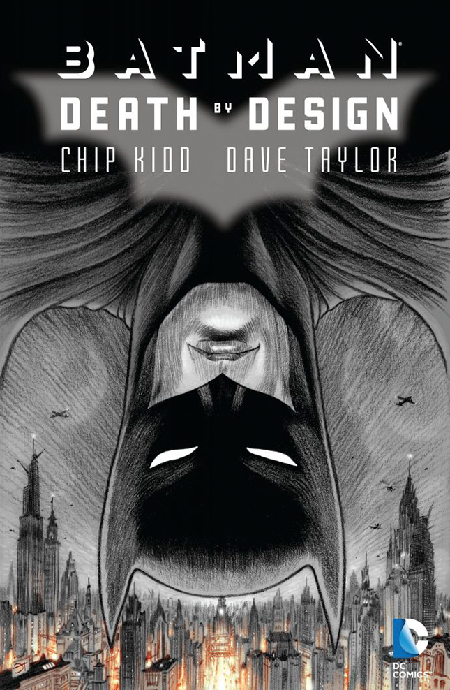
Batman: Death by Design
by Chip Kidd (story) and Dave Taylor (artwork)
DC Comics, 2012
112 pages
ISBN-13: 978-1401234539
![]()
We managed to drag ourselves away from our “research” (read: fighting over a wonderful pile of books and the comfiest chair in the office library) just long enough to share our favourite titles related to the Walk the Line issue – in which the line between fictional tales and architectural realities is a very fine one indeed.
![]()
Wayne Central Station is to be torn down and replaced by an organic supermegastructure designed by Gotham City’s dodgy starchitect Kem Roomhaus. It’s up to Batman to dive deep into the murky world of the construction business and discover who is at fault for the derelict state of “the single best example of patri-monumental modernism in America”. Classic comic book tropes abound alongside solid glass rooftop bars, Hugh Ferris references and a device to “present 3D architectural models to clients too far away to visit”. p (fh)
-
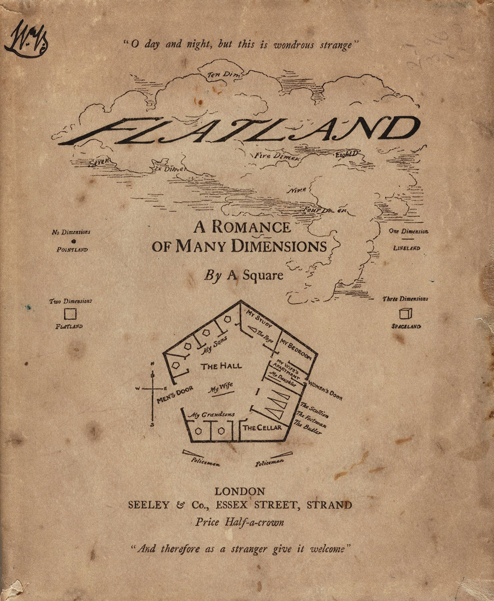
Flatland: A Romance of Many Dimensions
Edwin Abott Abbott,
Seely & Co.,1884
124 pages
E-book: gutenburg.org
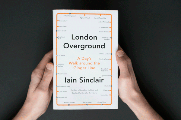
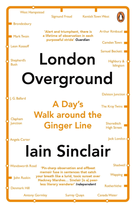
London Overground
Iain Sinclair
Hamish Hamilton , 2015
272 pages
ISBN-13: 978-0241146958
![]()
![]()
A perpetual line walker, Iain Sinclair’s most recent adventures in all things psychogeographic saw him wandering around what is locally known as the Ginger Line, a recent orbital addition to London’s public transport network. London Overground abounds in Sinclair’s effervescent prose, turning the quotidian into the mysterious, the salacious and the hilarious. He may not be an architect, but no one constructs a city quite like this. p (gk)
![]()
Dedicated to “the inhabitants of space in general” Abott’s 1880s novella is Euclidian geometry as social satire. On the last day of 1999, Flatland resident A Square dreams he visits the singularly dimensional realm of Lineland where he vainly tries to explain to its king the nature of life in 2D. Later he receives a visitor from Spaceland: a sphere, who challenges Square to comprehend a world lacking not only the restriction of two dimensions but also Flatland’s “linear” class system in which men are multi-sided polygons (more sides = higher status) whereas “our women are straight lines”. p (fs)
-
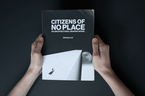
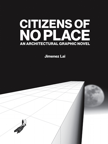
Citizens of No Place: An architectural graphic novel
Jimenez Lai
Princeton Architectural Press (2012)
96 pages
ISBN-13: 978-1616890629
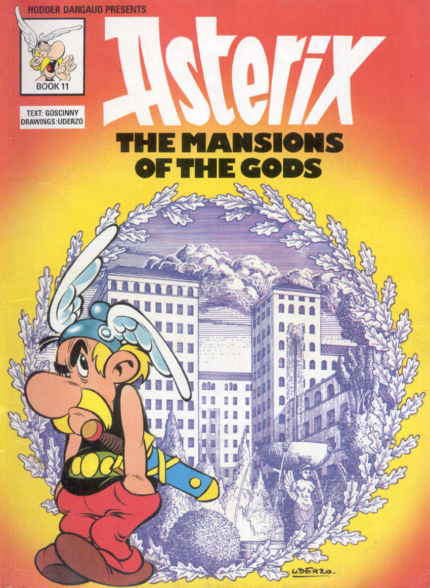
The Mansions of the Gods
René Goscinny & Albert Uderzo
First published in English in 1973.
(Originally serialised in French in 1971 in Pilote magazine).
Orion
Paperback, 48 pages.
ISBN 13: 9780752866390
E-book: asterixonline.info
![]()
![]()
The 1970s Asterix book that got this architect hooked. Julius Caesar tries to finally conquer Asterix’s village – the last bastion in Gaul – by employing not force, but soft power: building a huge residential “Colonia” development on its doorstep packed with Roman patricians and all the luxuries of Roman life. Needless to say the attempt backfires but only after a story that’s not only a beautifully pitched critique on imperialism, colonialism and property development, but also on the workers strikes of 1968-era France and the modernist “villes nouvelles” of the time. p (rgw)
![]()
Constructions only on paper are the literal architecture of the non-place. But a lot happens in the non-existing places drawn by Bureau Spectacular founder Jimenez Lai. Ranging from a vast floating slab of a city in space (“Noah’s Ark”) to New York’s stratosphere-scraping Tower of Babel (completed in 2200) and the perils of fornicating with (the wrong) architectural forms, these ten graphic short stories highlight the limits of language when it comes to communicating – and imagining – our built environment. p (fs)
-
FURTHER READING
Blog Freehand02 Apr 2015
Portrait Painter of Cities
The genius of illustrator Miroslav Sasek
Magazine viewpoint41
I Draw Because I Have to Think
The mind of the architect artist
Blog Freehand13 May 2015
Architecture of Enigma
The Work of Alexander Brodsky
Blog Review04 Sep 2014
Architecture is War
Lebbeus Woods Exhibition at the Tchoban Foundation, Berlin.
Blog Berlin15 Mar 2016
Future Perfect
The fantastic 70s architecture collages of Dieter Urbach
Blog Berlin03 Mar 2016
Unchartered Ground
Larissa Fassler's psychogeographic cartographies
Search our archive! -
Photo courtesy Atenistas.
![]()


-
Search
-
FIND PRODUCTS
PRODUCT GROUP
- Building Materials
- Building Panels
- Building technology
- Façade
- Fittings
- Heating, Cooling, Ventilation
- Interior
- Roof
- Sanitary facilities
MANUFACTURER
- 3A Composites
- Alape
- Armstrong
- Caparol
- Eternit
- FSB
- Gira
- Hagemeister
- JUNG
- Kaldewei
- Lamberts
- Leicht
- Solarlux
- Steininger Designers
- Stiebel Eltron
- Velux
- Warema
- Wilkhahn
FEATURED


-
Follow Us
Tumblr
New and existing Tumblr users can connect with uncube and share our visual diary.
»I don’t mistrust reality of which I hardly know anything. I just mistrust the picture of it that our senses deliver.«
Gerhard Richter
Keyboard Shortcuts
- Skip Articles
- Turn Pages
- Contents