

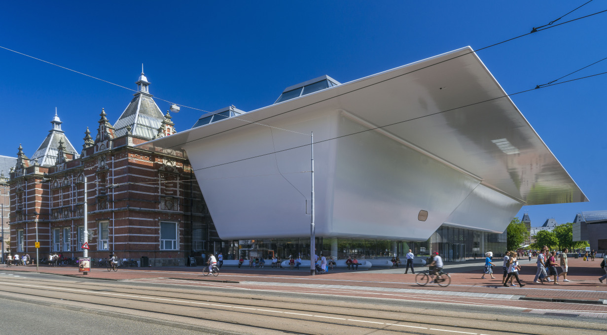
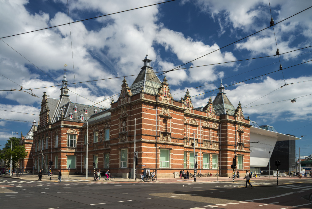
Last weekend, the Stedelijk Museum in Amsterdam – once one of the most important museums of modern art in Europe – opened its doors again, after nine years of refurbishment. Its new extension, designed by Benthem Crouwel Architects, has been nicknamed the ‘bathtub’. Sprouting from the rear of the old brick museum building, the bulky new structure with its glossy white skin has already proven a bone of contention. While the Dutch press is full of praise, the LA Times calls it "an oversized, antiseptic and mismatched design", German newspaper Die Welt speaks of “another insult of architecture against art”, and comments on Dezeen range from “a bad joke” to “looks like a stage set from a Kubrick film”.
Most inhabitants of Amsterdam, though, are simply relieved to finally have their Stedelijk back. After all, the reopening was preceded by two decades of haggling about the renovation and extension project. It all started in the early nineties, when the old museum proved to be too small and in dire need of renovation. A first design by Robert Venturi and a second one by Alvaro Siza were deemed too expensive, but it was only in 2002 that these plans were finally abandoned. A year later, the museum was shut down because of safety concerns, and moved temporarily into two storeys of a disused highrise office. In 2004, when funds were finally granted, a new design competition was held and won by Amsterdam-based office Benthem Crouwel. But due to difficulties during construction and the bankruptcy of one contractor, the refurbishment again got delayed for four years during which the museum had to leave its temporary home and disappeared completely – until it was finally reopened two weeks ago. Is this now the happy end to a long, tragic story?
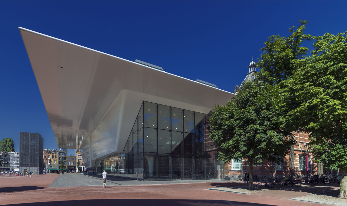
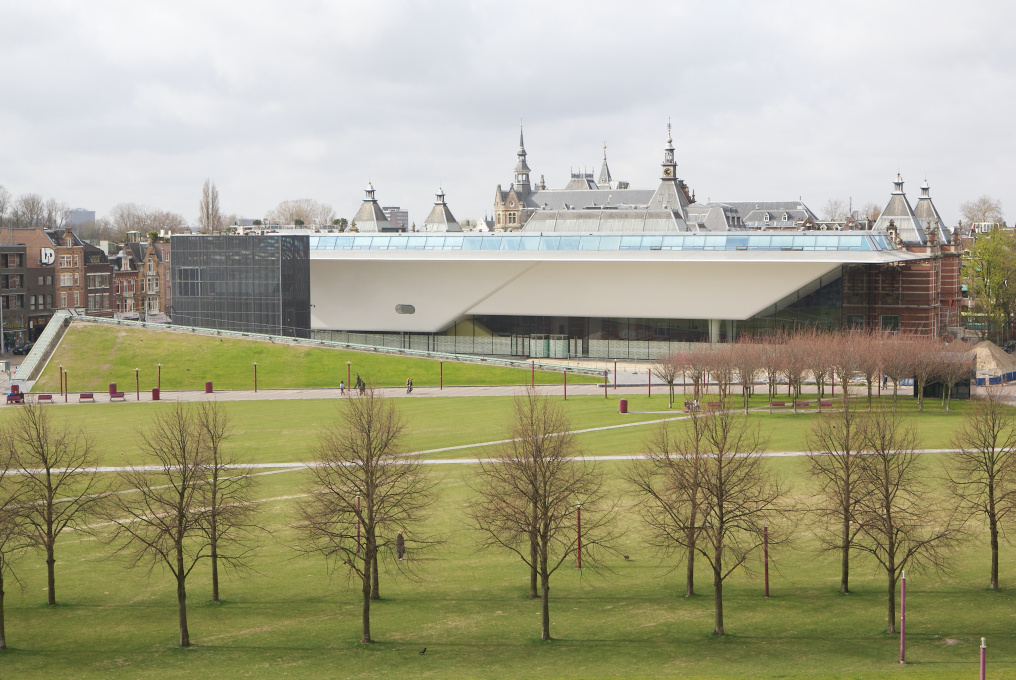
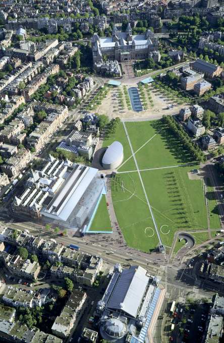
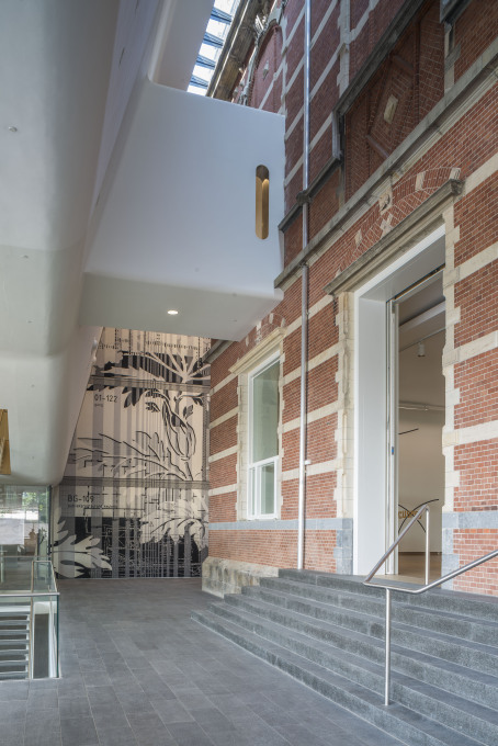
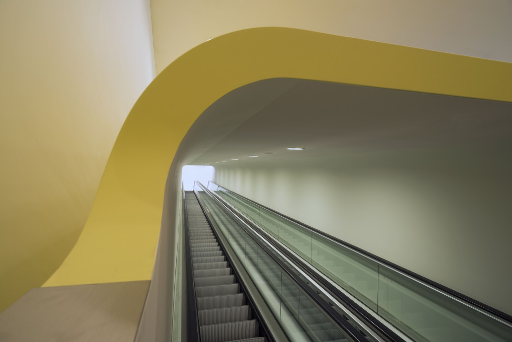
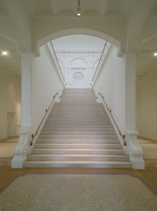
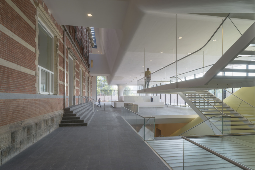
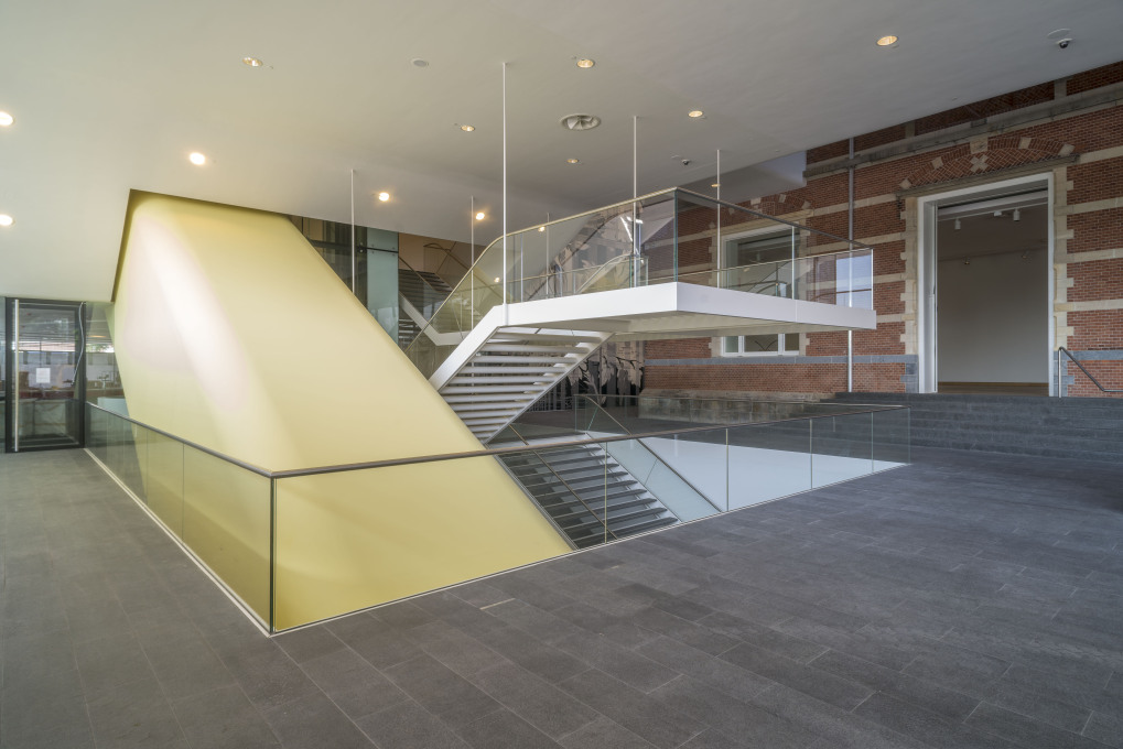
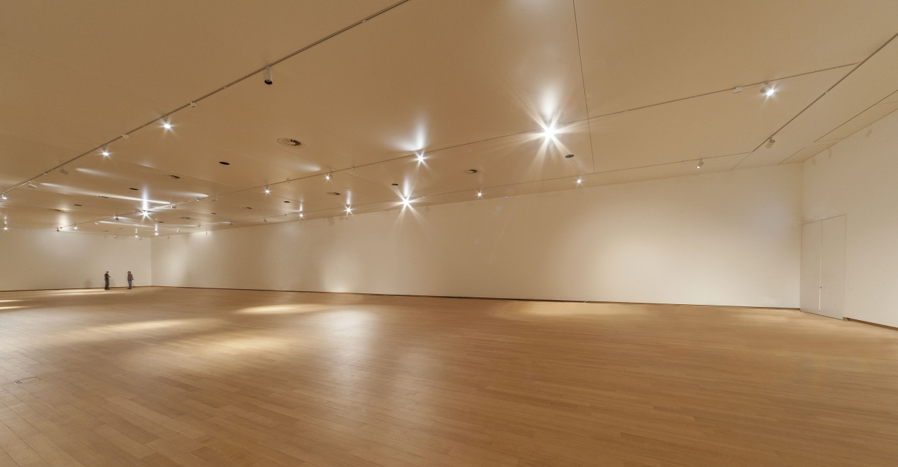
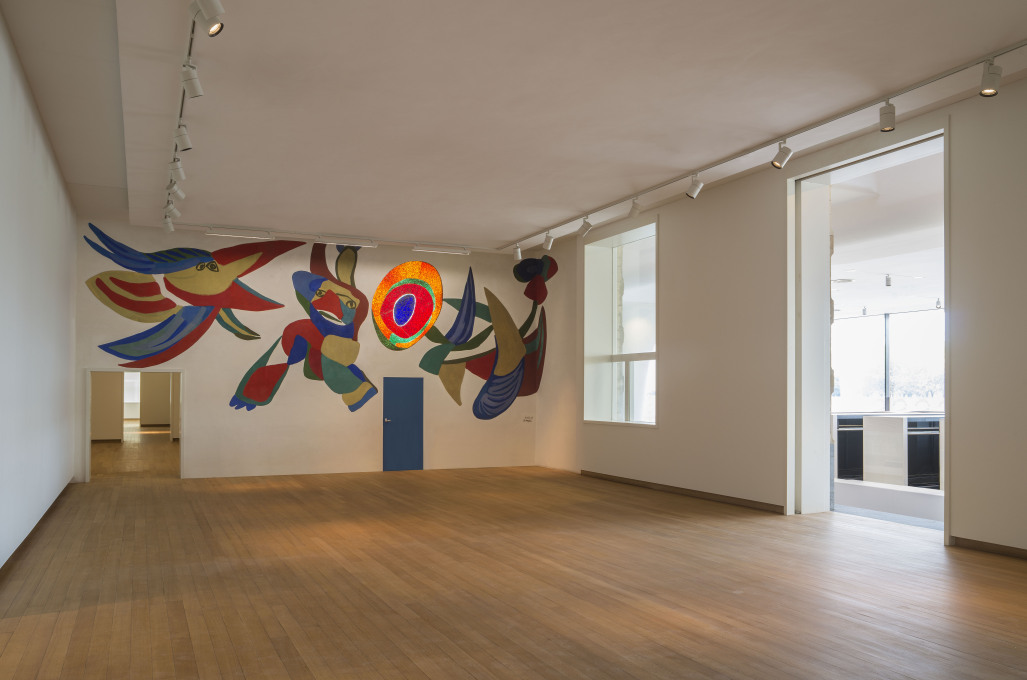
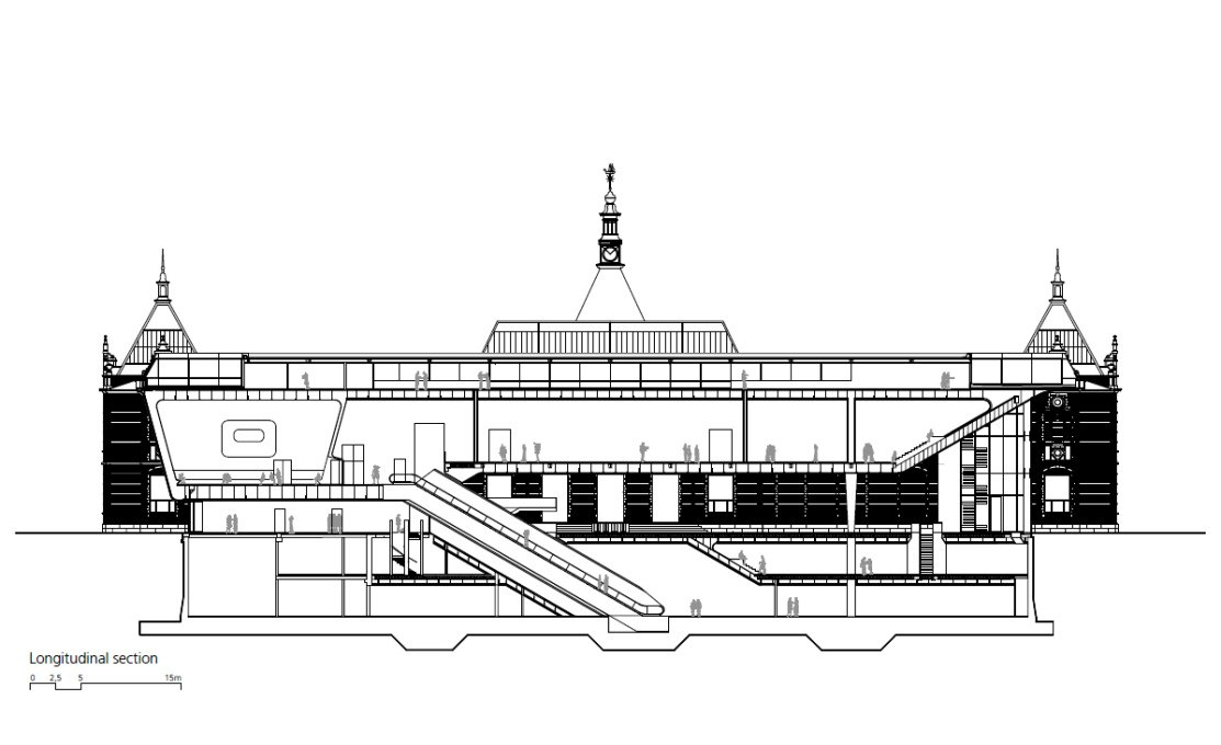
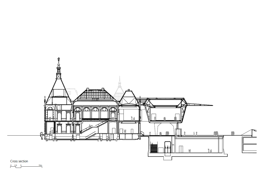
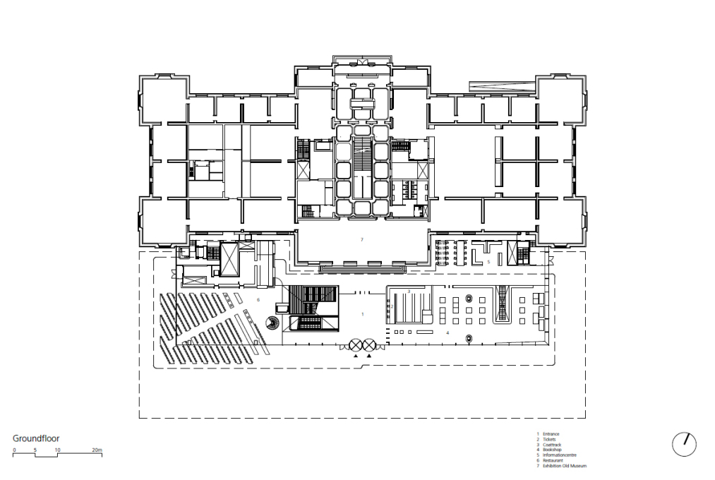
Maybe. A huge white volume now floats behind the old building, comprising the entrance hall, restaurant, gift shop, library, info centre, offices, auditorium and two large exhibition halls. The main entrance has been relocated to the new addition, moving it from the street to the so-called 'piazza' – which is, in fact, a euphemism for a leftover space between the museum extension, the shaft of its goods elevator and the back of a neighbouring supermarket. As the elevator shaft illustrates, routing and logistics are the main hitches of the design. The foyer is crossed by an awkward yellow tube, containing an escalator that connects the new exhibition hall underground with the one on the first floor. Not only because of this pragmatic solution, but also due to the colours and materials used, the foyer has the feel of an airport terminal rather thana museum entrance. However, once you are inside, the extension and the old building seem to blend into each other almost seamlessly. Old and new halls have been painted uniformly white and feature the same wooden flooring, providing a perfect White Cube experience.
This subtle treatment of the interior stands in stark contrast to the obtrusive overall shape of the extension, which seems to be quite arbitrary – with the exception of the bevelled roof storey, which houses the offices and is a formal reference to the rooflights of the old building. The new Stedelijk Museum is one of those buildings which inspire either love or hate, leaving little room for indifference. It's clearly a building which aspires to become an icon, but it's also clearly a building created by architects who have a knack for airports and offices rather than cultural projects. That said, buildings with ambitions are always intriguing, and what's more fun than a good dose of controversy? One thing is for sure: this bathtub is anything but lukewarm.
- Anneke Bokern, Amsterdam