-

Hans Hollein’s Museum for Modern Art
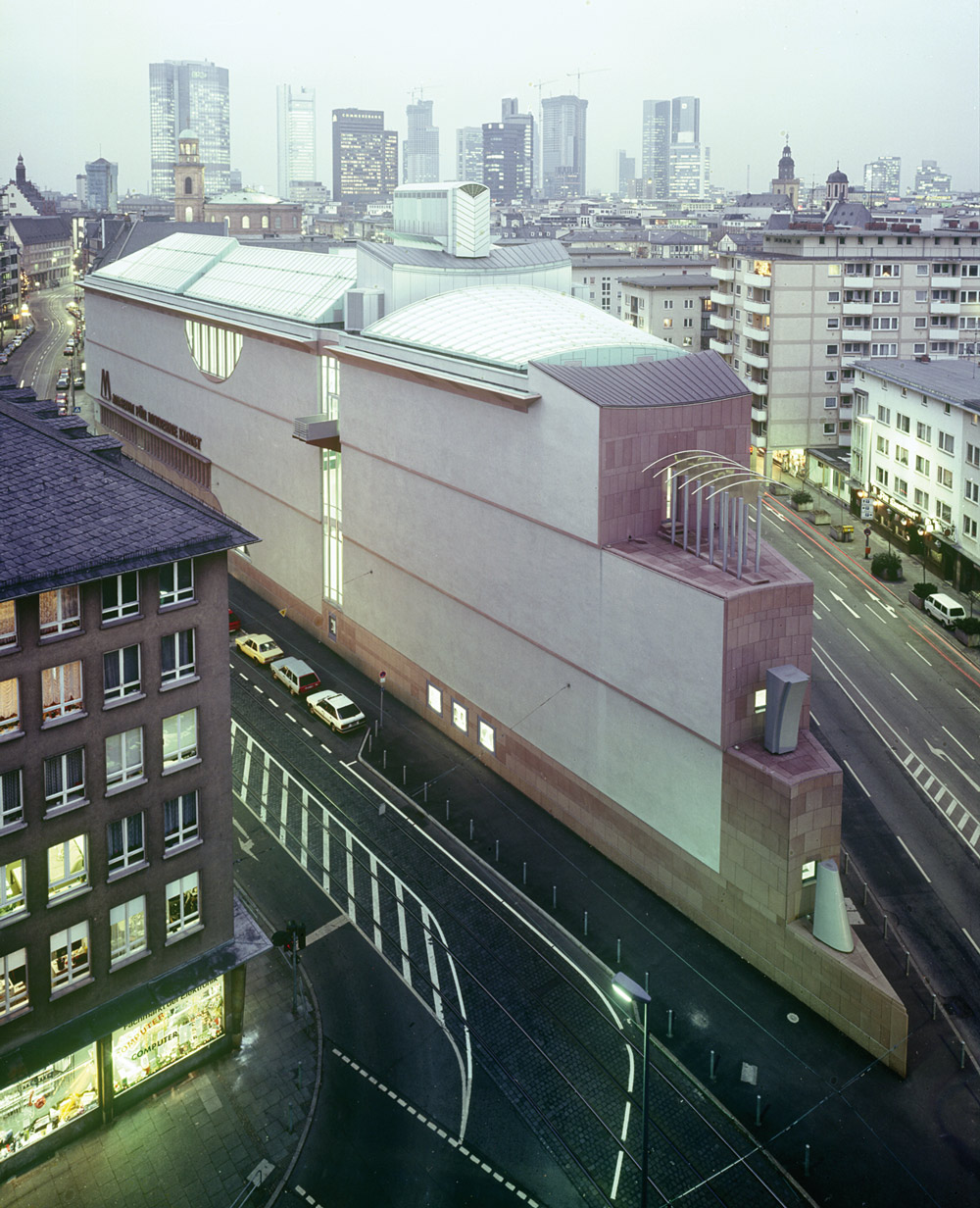
in Frankfurt am MainMMK Museum für Moderne Kunst Frankfurt am Main. (Photo © R Örlimans, courtesy Hans Hollein archive)
-
Oliver Elser, Po-Mo fan, architecture critic and a curator at the Deutsches Architekturmuseum (German Architecture Museum), gives an insider view on one of Hans Hollein’s best-known museums, the MMK in Frankfurt, its pitfalls and plus points and the ongoing politics relating to its construction.
As of October “there will be three of us” announce the billboards for the Museum for Modern Art (MMK) in Frankfurt. Three of us? Is the museum expecting offspring? It is indeed. In the German financial capital where growth, yield and quantifiable success are familiar terms even in the cultural sphere, the MMK is expanding its exhibition space across three locations.
The MMK 1, the Hollein building, is the original, which was inaugurated in 1991 and was far too small from the outset. Even at the opening, the first director, Jean-Christophe Ammann, wished for nothing more than another building. Which is one reason why he was always at loggerheads with his architect, Hans Hollein. But we'll get back to that in a moment. Today, just over two decades later, the current director, Susanne Gaensheimer, is at last getting a new annexe, which will be known as MMK 2.
Looking west from Berliner Street. (Photo © R Örlimans, courtesy Hans Hollein archive)
-
And since it‘s in Frankfurt, a banking city, it will be housed at the base of a new skyscraper, the Taunus Tower. The architects of the 170-metre-tall office tower are Gruber + Kleine-Kraneburg of Frankfurt; the 2,000 square metre exhibition space has been designed by Kühn-Malvezzi, Berlin. This location, in the centre of the financial district and some way off the beaten cultural path, will house temporary exhibitions from the permanent collection, while highlights of the collection and important special exhibitions will be presented on the main site, the Hollein building. And then there is MMK 3, situated opposite MMK 1, in the former central customs office designed by Werner Hebebrand in 1927, and where, for the past few years, works by mostly younger artists have been on show.
The Hollein Museum was, as mentioned before, never big enough for Ammann, its first director – and he never liked it architecturally either. Hans Hollein won the competition in 1983 but that was under his predecessor, Peter Iden. Heinrich Klotz, director of the new Germany Architectural Museum and an outspoken defender of postmodernism had sat on the jury, and was dead set on pushing though Hollein’s design, having failed to get his way with Charles Moore or Venturi, Rauch + Scott-Brown elsewhere in Frankfurt. Hollein not only had powerful backers – at least at the start – but his was also the best design (the competition included the young Rem Koolhaas). Then Iden threw in the towel and Jean-Christophe Ammann came from Switzerland to take over.
Top photo © Alex Schneider, courtesy MMK. Bottom photo © R Örlimans, courtesy Hans Hollein archive.
-
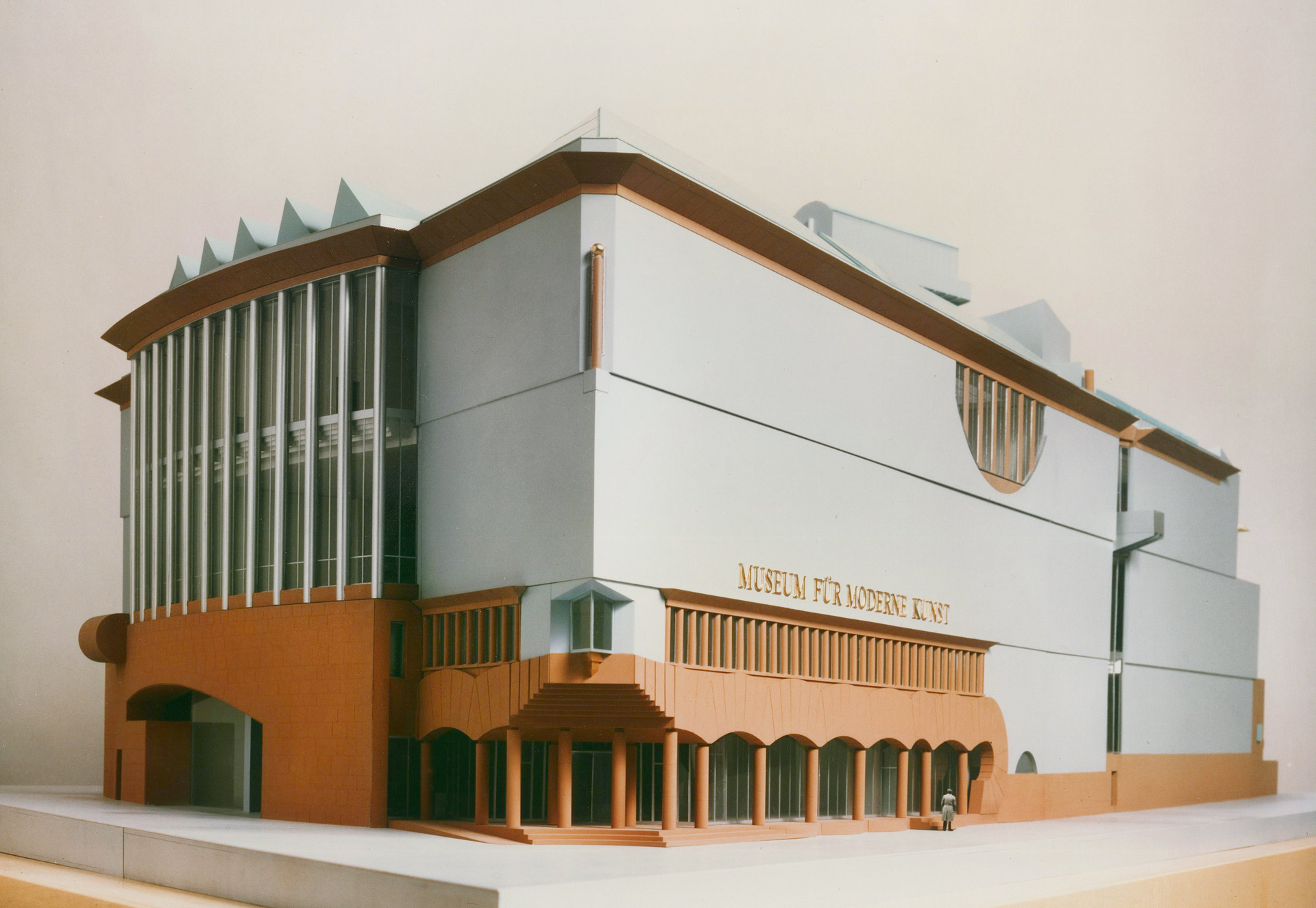
Model photo © Alex Schneider, courtesy MMK
-

All he wanted was a big white box with neutral rooms. The opposite, in other words, of Hollein’s design, which was by then already so far into the planning process that only details could be changed.
Yet you only have to abstract a little and the MMK starts to look like a big white box, at least from the outside. The two long sides of its isosceles triangle shape (it is known locally as “The Piece of Cake”) are huge, bare, dirty white plaster façades, onto which Hollein daubed a few architectural elements (here a window, there a bay front, here a balcony, at the bottom an arcade) in a spacious composition. It was as if he had wanted to take Brian O’Doherty’s famous white cube formula, which automatically elevates everything exhibited within it to a work of art, and test it out on the building’s exterior. As if to say: “Look at what I’m showing on these bare white exterior walls, it’s certain to spark off a dialogue with the art inside!” But even the most well-meaning critics such as Joseph Rykwert, who at the opening wrote a cover story about the MMK for domus, reserved their compliments for the building’s interior qualities.
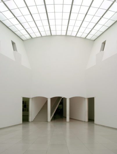
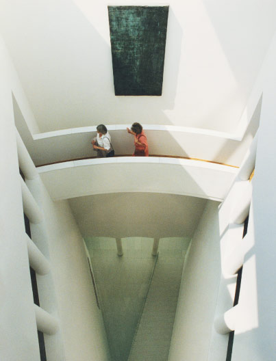
Everything inside the MMK is white, but there’s nothing remotely neutral about it. It’s all acute angles, interior balconies, surreally shaped stairways and footpaths across dizzying drops. Hollein talked about rooms with character. There’s a nice anecdote about the huge model that he constructed at 1:50 scale to convince the doubtful director that his collection would fit perfectly into the plethora of exquisite exhibition rooms. The model was designed to be taken apart so that you could look into each room at the eye level of the museum visitor. Several dozen photographs of scaled-down art works in the collection were arranged on the walls.
-
Oliver Elser is a curator at the Deutsches Architekturmuseum (DAM) in Frankfurt. His current exhibition is Mission Postmodern – Heinrich Klotz and the Wunderkammer DAM.
See his blog interview about Heinrich Klotz and postmodernism here
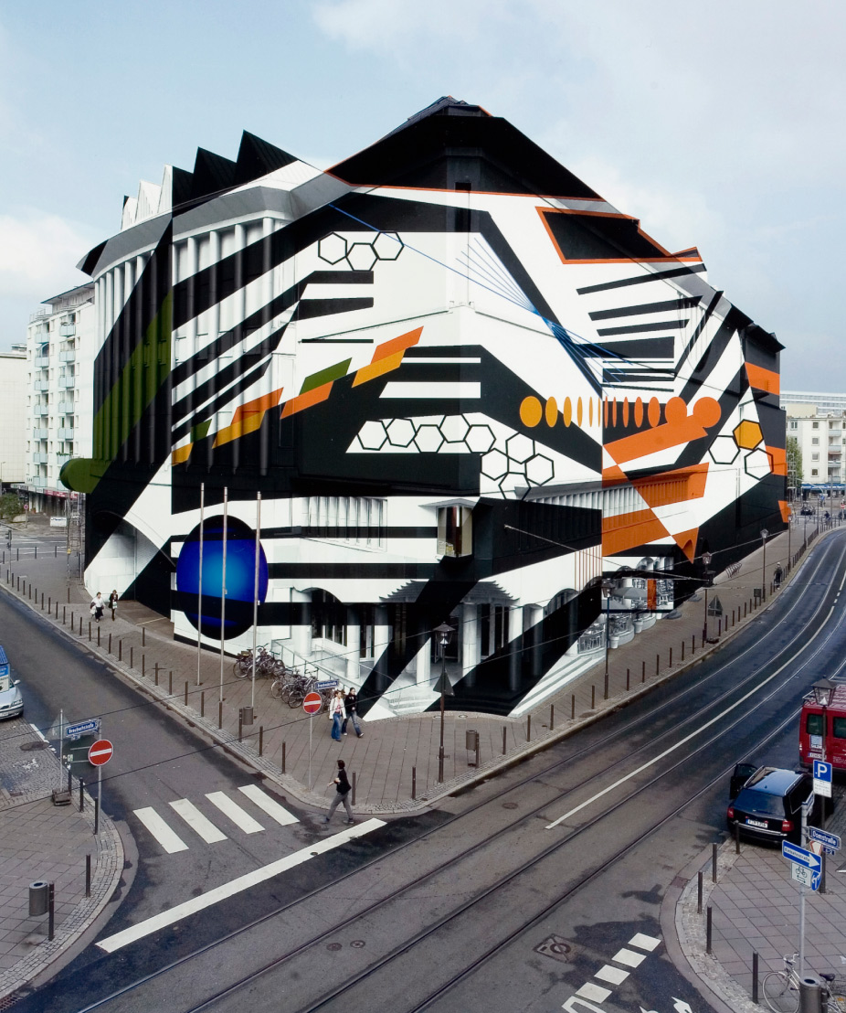
Hollein’s team had also lovingly recreated the sculptures as miniature models within the model. Ammann literally exploded when he saw it. He was outraged that Hollein was now trying to play curator and sticking his nose into the hanging of the collection. How dare he! When the model was returned from Paris slightly damaged and in need of repair, Ammann gave instructions to have all the art stripped out of it. Yet the MMK is one of the few museums where room and artwork merge into powerful symbiosis. Katharina Fritsch’s Tischgesellschaft looked as if it had been made especially to be shown in one of the arrow-shaped rooms of the museum’s 30-degree prow. And anyone who saw Thomas Ruff’s ultra-cool portrait series in the ice-cold central hall with the balconies will have it burned into their retinas forever.
The rooms between the art, mountainous and gorge-like staircases, are similarly unforgettable experiences. Hollein always dreamed of creating archaic spaces for his architecture, spaces not created by building, which is generally understood as the addition of elements, but through its inverse: carving out, removal and embedding. For the MMK he created a landscape of craggy cliffs. Most people will agree that its suite of rooms are among the most magnificent in Hollein’s oeuvre.
Of course, they will say, it is his spatially most exciting work, in spite of its postmodern façade. But the façade, hmm. In 2009 the arts editors at the Frankfurter Allgemeine Zeitung even suggested dazzling it away with a camouflage pattern by the artist Tobias Rehberger. But isn’t it time to finally take the disturbing exterior at face value? As an attempt to form from fragments a building, which in its bittiness has all the unruliness that we’ve learned to appreciate in good art? There‘s still a long way to go. The postmodern revival has only just begun.
 (Translated by Lucy Powell)
Tobias Rehberger, “Dazzle”, design for the MMK. (Image © Tobias Rehberger, courtesy MMK)
-
Search
-
FIND PRODUCTS
PRODUCT GROUP
- Building Materials
- Building Panels
- Building technology
- Façade
- Fittings
- Heating, Cooling, Ventilation
- Interior
- Roof
- Sanitary facilities
MANUFACTURER
- 3A Composites
- Alape
- Armstrong
- Caparol
- Eternit
- FSB
- Gira
- Hagemeister
- JUNG
- Kaldewei
- Lamberts
- Leicht
- Solarlux
- Steininger Designers
- Stiebel Eltron
- Velux
- Warema
- Wilkhahn
FEATURED


-
Follow Us
Tumblr
New and existing Tumblr users can connect with uncube and share our visual diary.
»Architectural interpretations accepted without reflection could obscure the search for signs of a true nature and a higher order.«
Louis Isadore Kahn
Keyboard Shortcuts
- Skip Articles
- Turn Pages
- Contents